A successful real estate branding strategy is essential for building a recognizable, trusted brand. From logo design to copywriting and website design, there are many elements to consider when creating an effective branding strategy.
To help inspire your next branding project, we've rounded up some of the best real estate branding examples worldwide. These companies, in collaboration with a talented branding agency, understand why branding is important, leading them to create an impactful brand image that resonates with their target audience.
Table of Contents
- Compro.CASA - Real Estate | BRANDING by Antonio Morsillo
- Oakbridge by Firedrake
- Homely by Unfold
- Residential complex logo design by 4studio
- ile de vue - luxury residence by Real Identity, a part of Studio Frey
- FLEX by SEVEN studio
- ALHUDA BRANDING by TAREQ OSAMA
- Nido Real Estate by Robert McConnell
- RAHAF&AZAL GROUP by Visual Arts Agency
- Fluence by Walace Designer
- Diehlgasse 47 by andwithout
1. Compro.CASA - Real Estate | BRANDING by Antonio Morsillo

Standout Features:
- Striking color story
- Simple yet meaningful logo
- Reliable brand image
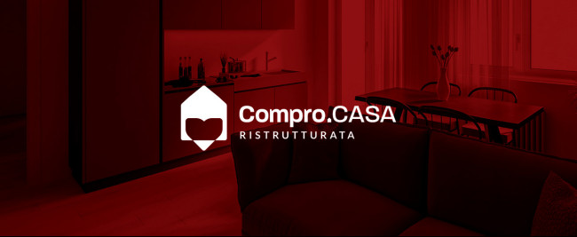
The first entry on our list of best real estate branding examples is an Italian agency specializing in flipping and selling properties.
Branding designer Antonio Morsillo captured the brand's personality without overdoing it through a rich, striking color story reminiscent of its passionate Italian roots.
Their logo is also a noticeable feature, combining modern art and professionalism elements and making them work together. It features a simple drawing of a man wearing a bowtie and the company name beside it.
The branding design is straightforward, with a strong sense of reliability. Through this branding strategy, the brand succeeded in making their customers feel that choosing a newly renovated house is the best option, especially when living in the culturally rich atmosphere of northeastern Italy.
2. Oakbridge by Firedrake

Standout Features:
- Streamlined logo design
- Rich royal blue color
- Polished and professional
One goal of many branding kits is to ensure that whatever personality the brand has, professionalism should still be visible in the branding identity. Firedrake perfected that angle for this next-best real estate branding example.
Everything feels polished and professional, from the logo design with its notable metallic polish to the rich royal blue color story they employed for this company. Real estate agencies need to look polished to have that reliable feel because selling houses is not the same as selling cookies from a bake sale.
It requires a certain degree of professionalism that makes people believe you mean business, and they should trust you for their real estate needs. This real estate branding example nailed it.
3. Homely by Unfold

Standout Features:
- Witty logo design
- Friendly approach
- Sensible catchphrases
Sometimes, we need to make people feel that buying a house is similar to building a home you enjoy going to after a long day outside. Homely is an excellent real estate branding example of this concept.
Unfold stepped up its game in creating a branding strategy for Homely. The logo design features a small house with a smile in front of the house and the company name in rounded letters.
Rounded letters add a sense of comfort and friendliness. It assures people who might feel intimidated about buying a property that the brand can offer them a space they can call home.
Its witty tagline is also a significant part of the branding strategy, which rounds up the friendly approach the company wants its customers to feel.
4. Residential complex logo design by 4studio

Standout Features:
- Leaf-designed logo
- Thin typography
- Minimalist design approach
This next real estate branding example uses the minimalist approach. 4studio created a leaf-inspired logo design that symbolizes life. It complements the real estate industry, where life starts and flourishes.
The agency used a leaf outline rather than a complete picture of a leaf to show that life should be a framework of every home.
Coupled with the thin font style, this ties in with the simplistic yet dynamic approach the company is after as a part of its branding goals.
Learn more about the different branding elements here.
5. ile de vue - luxury residence by Real Identity, a part of Studio Frey

Standout Features:
- Chill luxury vibes
- Sleek typography
- Overall sophisticated feel
Luxury real estate is a niche that is often challenging to penetrate since it requires an additional level of flourish to attract customers. This is why having an excellent branding strategy is essential.
Real Identity, a part of Studio Frey, did a great job developing a spectacular branding strategy for this luxury real estate property. It has a tremendously sophisticated feel since it means they have reached their goals.
The sleek font styles, the metallic, earthy color scheme and the polished logo design all harmonized, working so well for the company.
Indeed, branding is vital in establishing a company's online and offline identity, and Real Identity nailed it.
6. FLEX by SEVEN studio

Standout Features:
- Creative logo design
- Neutral color story
- Polished aura
Sometimes we need a real estate agent to help us find the best house for our needs without any frills and fringes attached. In short, we need a real estate agency that works.
This is why SEVEN studio conceptualized this branding package for FLEX, a Russian real estate company. With its polished aura, people tend to gravitate towards them when looking for prospective properties.
Neutral color stories often push the narrative of sleek professionalism forward, which means people tend to rely on you because you look trustworthy.
Finally, the sleek font styles used in the logo design sealed the deal in this masterpiece.
7. ALHUDA BRANDING by TAREQ OSAMA

Standout Features:
- Professional and luxurious feel
- Creative design concept
- On-brand design approach
Catering to those needing a new property to live in or to invest in the Middle East, ALHUDA BRANDING aims to look respected in a sea of competitors with similar facades.
TAREQ OSAMA did a great job in making this work by combining visual elements that work so well together yet are very striking in their ways.
The logo design looks very innovative, with the letters' silhouette forming its symbol. Added to the white font color, it exudes a trustworthy and reliable image. The logo fits so well with any website because it looks versatile.
Check out some of the best real estate website designs here.
Everything looks so prim and proper that you can't help but trust them to find the suitable real estate space for your needs.
8. Nido Real Estate by Robert McConnell

Standout Features:
- Symbolic
- Prominent visual of the brand's namesake
- Sophisticated font face
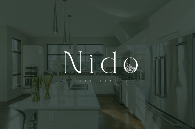
Nido takes much, if not everything, from its name. Coming from Italian, Nido signifies the structure or place where birds hatch or give birth and look after their young. It's basically a fancy word for the nest, but just as it emanates an air of sophistication compared to its English counterpart, so does the Nido brand stand tall among its peers across the industry.
Designed by Robert McConnell, Nido branding opts for evocative visuals and delicate typography to represent a brand that unites comfort and featheriness with a robust expertise that supports them.
9. RAHAF&AZAL GROUP by Visual Arts Agency

Standout Features:
- Robust and minimal design
- Logo symbol as seal of quality
- Luxurious palette
With the unique branding solution for Rahaf & Azal Group, Visual Arts Agency proves that streamlined simplicity beats anything else while retaining multilayered connotations.
Namely, the agency masterfully combines client partners' initials, simultaneously erecting a symbol that captures the exteriors of their luxurious and modern properties. The tagline 'We build trust' supports this practice perfectly, acting as a robust and trustworthy foundation.
Visually, the choice of gradient golds put the brand at the top tier of the realty industry enveloping the brand with the air of exclusivity.
10. Fluence by Walace Designer

Standout Features:
- Symbolic color scheme
- Embodiment of the brand's values
- Modern and versatile visuals
Fluence is a construction company that aims to revolutionize the world of construction through creativity and innovation. Cutting through all the bureaucracy, difficulties, and client headaches, Fluence needed sharper branding. That's where Walace Designer came to the stage!
The agency introduced a visual solution that is modern, versatile, agile, and creative. The brand logo represents movement, strength, and direction (forwards and upwards), translating the pillars of Fluence - trust, commitment, and long-lasting customer friendships so that they feel safe in the entire process of construction.
The colors were inspired by the palette of the book “Psicologia das Cores” by Evan Heller, the palette of “modernity.”
11. Diehlgasse 47 by andwithout

Standout Features:
- Contemporary visuals and icons
- A friendly and edgy color palette
- Humorous messaging
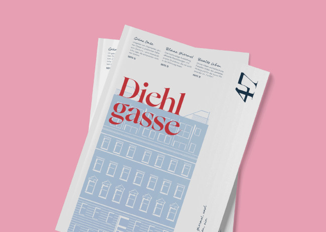
Diehlgasse 47 caters to a unique market segment in the real estate industry: the creative and contemporary urbanites.
Branding agency andwithout has done an excellent job creating a brand identity that reflects the brand's sophisticated values and target audience. Genuinely deserving to be one of the best real estate branding designs!
The logo is simple yet stylish, with a contemporary typeface that is easy to read and memorable. The color palette combines warm and edgy colors that add a sense of playfulness to the brand.
The illustrations are creative and eye-catching, showcasing the brand's properties. The design elements are minimalist yet attention-grabbing, with a touch of humor and wit that makes them stand out from other real estate brands.
The use of white space also creates a sense of openness and elegance, making the text even more legible. Plus, the visuals are site-bending! That means they can adjust to different platforms, making them versatile and adaptable.
That's A+ real estate branding right there!

Our design experts recognize the most innovative and creative designs from across the globe. Visit Design Awards to see the:
- Best Logo Designs
- Best Website Designs
- Best Video Designs
- Best Print Designs
- Best Packaging Designs
- Best App Designs
Our team also ranks agencies worldwide to help you find a qualified agency partner. Visit our Agency Directory for the top Logo Design Companies, as well as:
- Top Web Design Agencies
- Top Video Production Companies
- Top Print Design Companies
- Top Packaging Design Companies
- Top Mobile App Development Companies


