Airbnb Uses The Video To Promote A Sense Of Belonging
Airbnb is an online marketplace where people can put their properties up for short-term and long-term rentals. This hospitality organization has accumulated thousands of properties from around the world — from beds, to rooms to entire houses.
Founded in 2008, this company has grown from a simple house-sharing service to a multi-faceted company that helps travelers create their own personalized travel experience in more than 191 countries around the world.
In recent years, the brand has become more personal, participating in discussions about social issues, becoming more aware of itself and its user and taking a stand on issues that have become important to the brand.
An issue that has become of increasing importance has been the question of belonging and what it means to feel like you belong. To promote these values and the brand’s dedication to making sure everyone feels like they belong, they created a symbol they call Bélo.
Here’s what the company has to say about its new symbol:
Belonging has always been a fundamental driver of humankind. So to represent that feeling, we’ve created a symbol for us as a community. It’s an iconic mark for our windows, our doors, and our shared values. It’s a symbol that, like us, can belong wherever it happens to be. It’s a symbol for people who want to try a new tea they’ve never heard of from a village they couldn’t find on the map. It’s a symbol for going where the locals go—the cafe that doesn’t bother with a menu, the dance club hidden down a long alleyway, the art galleries that don’t show up in the guidebooks. It’s a symbol for people who want to welcome into their home new experiences, new cultures, and new conversations. We’re proud to introduce the Bélo: the universal symbol of belonging.
The question of belonging is a powerful one that Airbnb hopes to answer through its services and within its guests. They do this by fostering a community of forward-thinkers, happy travelers, and compassionate guests.
Airbnb redesigned its website, logo and more to match this blossoming brand identity and promote more positivity and inclusion. They are providing users with the tools they need to create an experience all of their own.
And to aid in promoting this new identity, they created a stunning video that eases, excites and inspires.
Airbnb’s Soothing Video Introduces Its New Brand Image With Motion Graphics And Clever Animations
Airbnb introduces Bélo — its symbol of belonging — in this peaceful promotional video.
The video opens up with a map made up in a greyscale color scheme with lighter, brighter dots that create the map of the world. Pleasing movement plays in the background while bold, bright words dance across the screen and give context to the overall design.
The design zooms forward, and colors dance across the screen. Cities, towns, and rural landscapes pop up while paper planes glide. Postcards appear with the Bélo message.
The Bélo symbol appears, as more illustrations and designs dance across the screen. It’s bright. It’s playful. It’s nostalgic.
This video informs without overwhelming. It is full of depth, enlightening, and inspirational. Motion graphics add fluidity, music sets the tone and these subdued illustrations further promote positivity and belonging.
These illustrations are simple, cute and crafty. They add an approachable edge to the design that educates with flair and drama.
The story of Bélo is beautifully outlined, and the illustrations paired with the clear typography ties this design together in a perfectly wrapped bow.
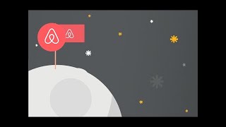
Everyone should belong — wherever they are, whoever they are and whatever they’re doing. Whether they’re in a new city or vacationing on the moon. Belonging is part of the destination. Belonging is part of the journey. Belonging is an integral part of it all.
Towards the end of the video, the Bélo symbol becomes more prominent. It dances and draws itself on the screen accompanied by the message: “Wherever you see it, you’ll know you belong.”
And this video makes you believe it.
Airbnb’s Promotional Video Design Sheds Light On Inclusivity, Acceptance And Belonging
Airbnb’s exciting and inspiring video promotes positivity through subtle and sophisticated colors, clever illustrations and an overall tone that fosters community and belonging. This serene and seductive video is the perfect design for a brand identity facelift that’s full of heart, character, and values.
The color palette is in line with the Airbnb brand, and it offers a soft and peaceful backdrop to the video and its overall message. These colors inspire and engage. They add a subtlety and a dream-like quality that promotes positivity and inclusivity.
The motion graphics add subtle and fluid movement. It feels wonderful and dreamy and open. It’s clean and quaint and exciting. This video promotes a welcoming world of wonder and simplicity — it promotes belonging. And watching these cities dance, planes fly and shapes swirl, you feel like you belong too.


