
Ruffling feathers within the industry one client at a time… that’s exactly what Bellwether aims to do with each and every client they create work with.
Settled over a GIF of a brewing cup of coffee, Bellwether Brands' organized website design introduces potential clients to their company and what they strive for by means of a scrolling effect.
As potential customers scroll their way down, the previous words disappear into the top of the page, while new words fade upwards and into clarity from the bottom of the site.
After the brief introduction to Bellwether, potential clients are given a preview of each of the pages on the website rolled into one on the homepage. They will learn a few simple things about the company, as well as see samples of the company’s work in use.

Through the left-side hamburger menu, potential clients can access the “Chronicle,” which is where Bellwether keeps all news articles, insights, and opinions they may have.
The area takes a dynamic approach to combining the company’s blog with their newsletter. Making use of a white negative background, all articles and posts are on display in a timeline format based on newest to oldest.
Inside each article and post, Bellwether utilizes a sharp photograph as a header to the page. Inside this header image, the company uses large serif font to display the title of the article or post.
Images are centered on the page and used as a way to create the border of the article. The entirety of the text is written underneath the header image in a smaller serif font. Paragraphs are left-aligned within an inch of the left edge of the image and end within an inch of the right edge for a clean format and appearance.
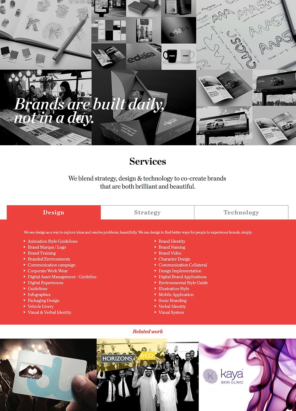
Bellwether breaks down the information about the company into two pages, making it easier for potential clients to find the information they want. As part of this, the company creates a separate page for their services rendered.
Services are separated into one table with three different tabs. The use of a vibrant color allows the list of services to stand out on the page. Beneath each of the three tabs, a grid of service-related portfolio pieces are put together in a list for potential clients to see.
All in all, Bellwether Brand's amazing website design combines clever animation, subtle design effects, and an organized layout to create an engaging digital experience for users and potential clients alike.


