Brand House takes strategic planning and brilliant design to the next level by combining them with powerful emotions to create a user experience meant to transform the growth of their clients.
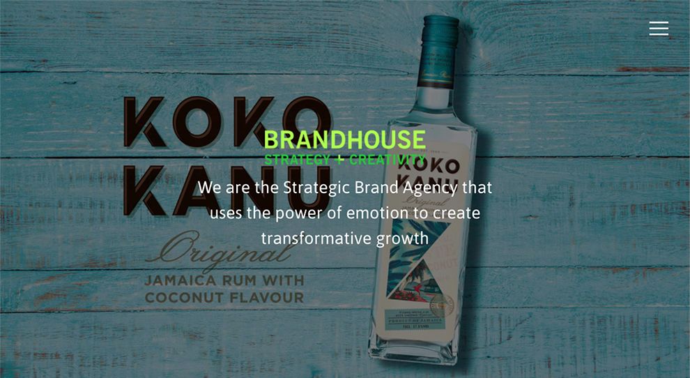
Upon landing on the website, potential clients are greeted with the use of a vivid photograph from one of Brand House’s projects. The photograph becomes the intricate background for the page’s simple introductory message.
Brand House uses a dual green color scheme to showcase the name and motto of the company. Beneath the combination, the introductory message makes use of a white sans-serif font to stand out against the background image.

Through the no-scroll homepage, potential clients must utilize the hamburger menu available on the right side. From the menu, Brand House showcases two different blogs for users to read. In the Thinking Room blog, potential clients can see articles focusing on business and branding strategies as a way to help them further their business through self-learning.
The blog uses a side-by-side grid format to organize articles. Each article contains a single image with a see-through white text box center-aligned within the middle of the image. Keeping with the center alignment, the titles of articles are bolded in sans serif font with a brief article description underneath.

Brand House works with a number of clients both big and small, but each project receives the same attention. Within each portfolio project, the company uses a product image as a header to the page before guiding potential clients through the project piece-by-piece.
Using a combination of italicized, normal, and bold fonts, the company informs potential clients about the project as a whole, challenges of the project, and more. This information is left-aligned on the page in a design reminiscent of a newspaper article.
Along the right side of the page, the company creates a contrasting black and white table to briefly showcase what skills were used and what services were rendered for the previous client as a way to summarize the project as a whole. Like the rest of the paragraphs on the page, the lists are left-aligned within the borders of the table.
Brand House is a colorful website design in the Professional Services industry.


