Capital One’s Clean Design Promotes A Productive User Experience
Capital One is one of the largest banks in the world. And as one of the top leaders in the financial industry, it’s a brand that is innately intuned with its audience, providing them with the necessary platforms for them to complete their required financial dealings.
And in this modern day and age, one of the quickest and easiest ways to give users immediate access to all the features your brand has to offer is by creating a mobile app.
Capital One wanted to offer a mobile app that gave their customers the power of their bank right in their hand. Of course, the app also needed to be clean and easy-to-use.
The result was a beautiful example of how mobile banking apps should look — and feel, for that matter.
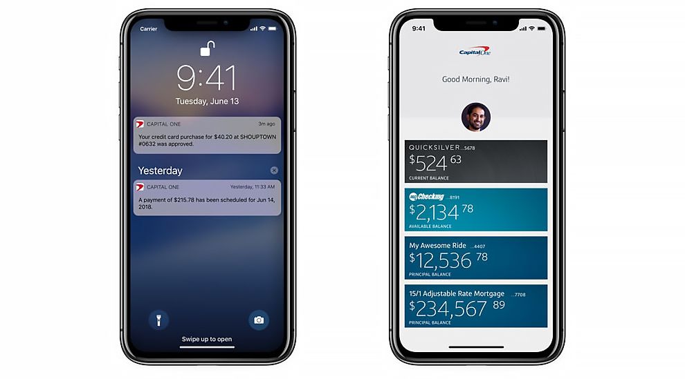
The Capital One app puts an emphasis on clean design. Everything is clear and easy to read. Large buttons show basic details, and they can be selected by the user to reveal more information. This allows users to quickly consult the app for important information they may need without having to sort through a bunch of menu options. After all, who wants to use an app that makes them jump through hoops to keep tabs on their own money?
When a customer uses the app to do something like pay a bill, the visual aspect remains very clean and intuitive. Paying bills is one of the most unpleasant financial transactions we all have to go through. Capital One makes paying them fast and easy, so you can get back to your life.
Bright colors and clean text make the page look very professional, as well. There’s a simplicity to this design, but that doesn’t make the app look unprofessional or less credible. Instead, it actually elevates the trustworthiness of the brand because it shows that they can provide users with a modern, functional app that is quick to give users the satisfaction they’re looking for.
A clean aesthetic has become commonplace in app and web design. Consumers don’t want to work too hard and brands don’t want to exhaust their audience — so it’s a win-win for all parties involved.
And in the case of Capital One, this clean design actually works to eliminate the stress of financial transactions right off the bat. The brand knows that banking is difficult, and it uses its app to create a stress-free environment for its consumers as a result.

Special Features Make The Capital One Brand A Leader In Financial Services
The Capital One app is a clean, open and sensational interface that makes it easy for consumers to navigate and complete the necessary financial actions. Thanks to a streamlined design, intuitive navigation and an overall modern and simple aesthetic, users of the app don’t have to guess where to go or how to learn more.
It’s all right there in front of them.
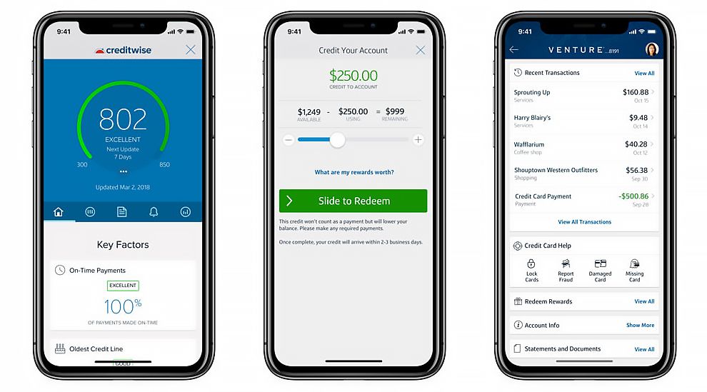
However, the Capital One app also offers users the ability to dive deeper into their finances through the use of a number of extra, more intricate features. Consumers can even view individual transactions complete with details about the business and their location on a map. The app shows off its clean simplicity when you need it, and it offers extra features when you want them, as well.
Instead of keeping this design flat and two-dimensional, the pros at Capital One went with a full-functioning design complete with all the bells and whistles the brand is known for providing its consumers.
The bank didn’t just want to infuse one functionality into this app, but several so that consumers could get a more well-rounded experience — one they are familiar with expecting from the Capital One brand.
The extensive nature of these additional features gives the brand more credibility in its industry and aligns itself as a brand consumers can trust. It’s a bank that puts its consumers first and keeps their wants and needs at the forefront. So it’s one that can be trusted and respected.
Capital One has found the perfect balance between design and functionality. The app is beautiful and clean, but it doesn’t give up features to accomplish that appearance.
Modern Use Of Color And Shape Keep Branding Consistent
The cleanliness of the Capital One App makes it easy for users to navigate through. And its in-depth functionalities create an interface that alleviates concerns and aligns the brand as a leader.
But the stylistic elements in the form of color and shape really give this app a modern edge that keeps its overall branding consistent and cohesiveness.
The Capital One brand is known for its iconic red and blue coloring — this comes from the swoosh-like image of the logo itself. And across collateral, these strong, regal and authoritative colors stand strong.
And the app is no different. These colors make up headers, background imagery and more. And they are given a bit of a 21st century facelift in the form of subtle color gradients and bold shaping.
Plus, these colors in and of themselves are powerful and authentic. They are colors that promote a feeling of trustworthiness, respectability and stability. And those are feelings you want to have about your banking institution.
Because of the bright, white and clean nature of the app aesthetic, these colors and shapes stand out. The geometric cutouts that represent bank accounts, user information and vital features are displayed in a creative and eye-catching way that smooths navigation a step further.
And the way even these elements are tied together really shows consumers that Capital One is dedicated to creating a fluid and functional user experience for everyone.
Color is a great way to create a consistency in your brand identity. Because colors make an impact and colors are difficult to ignore. That’s what Capital One was going with in this design, and it works.
What Is Capital One?
Capital One is a financial banking institution. It specializes in loans and credit cards as well as more traditional banking and savings services.
It was founded in 1988 in Richmond, Virginia. And today, it is the eleventh largest bank in the United States of America.
With 755 branches across the world, Capital One is a leader in the financial industry and was even ranked 101 on the Fortune 500.
It took charge in its early years, laying down the foundation for credit card marketing and building up the industry to where it is today. And it didn’t get there without a clear commitment to its community and to its users.
According to the brand:
Headquartered in McLean, Virginia, Capital One® offers a broad array of financial products and services to consumers, small businesses and commercial clients in the U.S., Canada and the UK. Capital One is committed to providing resources to help student-athletes succeed on the field, in the classroom, and in their communities. That's why we are proud to sponsor multiple college-based athletic programs. Helping to build strong and healthy communities benefits us all. We apply the same principles of innovation, collaboration and empowerment to our work in the community that we do in our business.
Capital One is deeply invested in its users and in the community at large. And that’s evident even in its app design, which was clearly designed with its audience in mind.
The intuitive nature of this simple and serene interface engages users immediately and shows an authority that lets its audience know that Capital One means business.
An Intuitive Design Elements Make The Capital One App Impossible To Live Without
The Capital One app is a stunning mobile platform that combines the brand’s essential features and functionalities into an easy-to-use interface perfect for alleviating any and all of your financial stresses.
Thanks to its clean aesthetic, the app is a bright and welcoming platform that makes it easy for users to navigate and complete their financial transactions.
Similarly, the robust nature of the app and its features gives the brand a credibility. And it also establishes a trust between consumer and brand by showing its audience that it can pack all of the features the brand is known for into a delicate and exciting mobile platform.
And the use of color in a modern and edgy way really brings branding full circle and keeps its identity cohesive and seamless across devices, mediums and experiences.
This mobile banking app ticks all the boxes and then some. It’s a straightforward, interactive and comprehensive app that gives users an easy access point to all of their financial needs, making it easier and more fun along the way.
Create your own stunning app platform when you enlist the help of these award-winning mobile app design and development agencies!


