Fanta is a brand of fruit-flavored carbonated drinks created by The Coca-Cola Company. Fanta is the Coca-Cola Company’s second oldest brand, founded in 1940. While its main flavor is orange, Fanta is available in over 100 flavors around the world and in 180 different global markets.

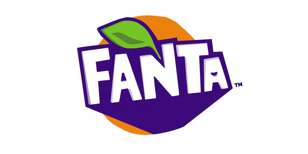
Earlier in 2017, Fanta unveiled a new logo as part of its rebranding. The new visual identity, which aims to be “fun” and “vibrant,” is based on a hand-cut pattern that has been digitized for wider use on social platforms. The previously rounded sans-serif typeface gives way to a more upright and angular-looking typeface. Details include a hidden smile, and the famous Fanta orange is highlighted by a new color palette, which has been designed to create more impact on the grocery store shelf.
The new logo inverts the colors so that the logotype is now white and the background is an updated purple-ish blue hue. The combination of purple and white works in favor of the new logo, as the letters stand out to display "Fanta" as the only choice for consumers. This use of colors is eye-catching and visually very appealing. In fact, all of the colors used -- blue, white, orange and green -- together create an excellent contrast and complement each other brilliantly.
The orange color is indicative of the brand’s signature orange flavor, while the leaf is evocative of natural ingredients. Together, the orange and green combine to give off a citrus vibe, which is very on-brand with the drink’s identity.

In Fanta's various flavors, the circular border and leaf emblem remains, but brighter shades of purple, blue, orange and green have been used.
On the beverages' packaging, there is also now an orange slice emblem. In addition, the name of each flavor is more prominent, finding a place in the logo through white typeface with a green background.
What stands out as unique in the complete logo is the fun, sly smile observed in the last letter ("A"), which immediately communicates fun, intelligence and style personified.
The logo redesign is part of Fanta’s new marketing campaign and a new Fanta recipe, which is said to have one-third less sugar than the previous recipe. The term “Made with fruit” has also been added to the logo to emphasize on the ingredients used in the updated recipe.
The logo has been designed for younger consumers who want to live life to the fullest. Fanta’s rebranding goal was to attract the attention of young audiences with vivid imagery and bright colors, enriching moments with a twist of spontaneity. The logo is intended to influence the viewers to take a chance, and it attracts and develops thirst almost immediately.
Overall, Fanta’s logo redesign positions it as a brand ready to diversify its consumer base and solidify its stronghold as a popular soda option. The design has a playful look to it, while the updated colors provide a bright and fun vibe. These elements come together for a modern and contemporary look.
Fanta is a bold logo design in the Food & Beverage industry.


