Brand. Innovation. Culture. That is the foundation of Lippincott and fuels everything they strive for when they work with clients. To change the future, they are helping businesses change for the better.
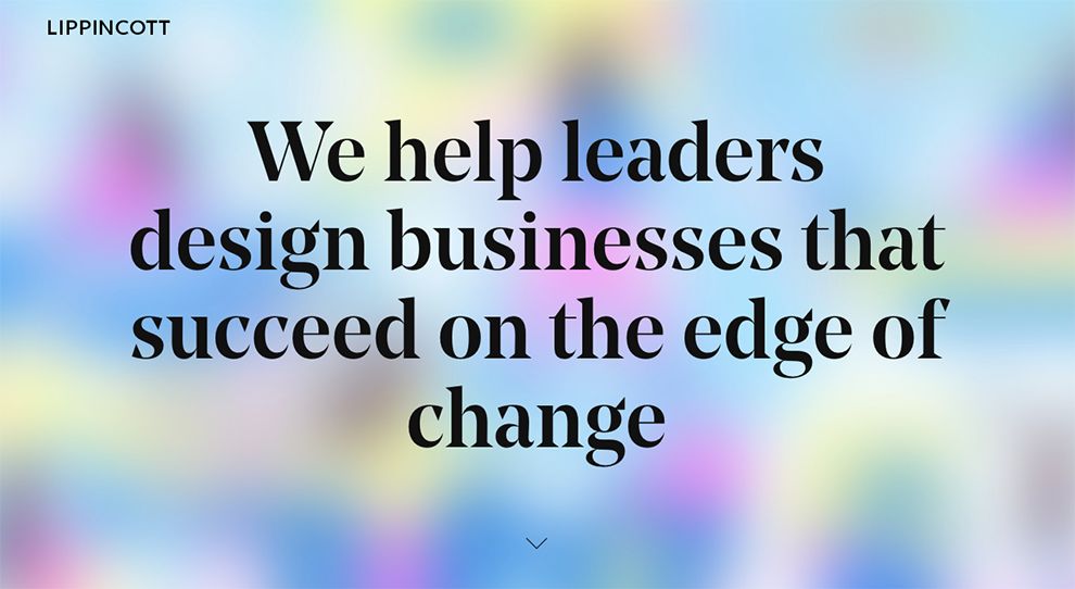
The company’s website utilizes a number of versatile design techniques to display how they are equipped to adapt. Introducing potential clients to their company, the first image is a colorful bokeh background with a powerful message about the company’s approach to their work in a bold and large serif font. The message is meant to capture attention, and it does.
As potential clients scroll down the page, they are exposed to a number of dynamic case study previews to draw them in and showcase the diversity of the company’s abilities.
Vibrant photographs are settled against a white negative space while the scroll of the page activates an effect to move the titles of the case studies across the page and down into the next one.

Letting words and images do all of the talking, Lippincott titles their blog section “Insights,” as they work to make sense of a changing world in a way that potential clients are able to follow.
The layout of the blog is diverse with no real rhyme or reason to it. Various blog posts are added to the page -- whether individually or several in a row -- with photographs or illustrations gathering readers' interest.
Alternatively, blog posts are broken up with the use of inserted quotes on the page. Quotes are given a wide breadth of space with their enlarged fonts and bold formatting so as to draw attention to themselves.
The white negative space Lippincott employs for the entirety of the page pulls the reader through to the meat of the content, making them focus on what’s most important.
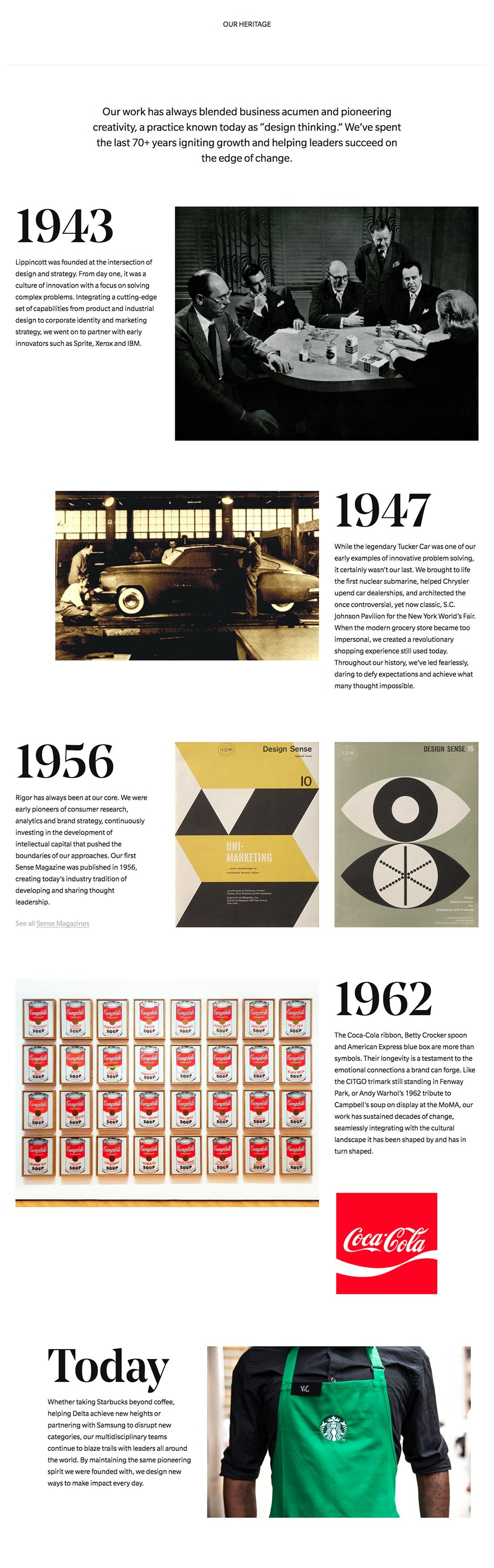
Black and white. Nothing contrasts more perfectly than the two values when placed against one another, and Lippincott utilizes the dynamic duo as an introduction to their About page.
The header of the page uses white to make the stark wording stand out as the company defines themselves to potential clients. Beneath the white header, the page abruptly transitions to a contrasting black negative space. From here on out, the company makes use of a monochromatic color combination of white and gray to tell Lippincott’s story and their values.
Lippincott is an amazing website design in the Arts & Recreation and Professional Services industries.


