
There is a Portuguese proverb that says, “The eyes eat too.” Great restaurants have come to understand this, and thus, food is now styled to let consumers know it will taste great before they even eat it.
Great food photography is the first step to a beautiful culinary website, and Mah Ze Dahr Bakery knows that. Their homepage lists their products in a clean, simple grid that negates the need for complexity. With that being said, the image blocks -- such as the main banner, "About," call to action, and "Contact" -- display images from the bakery, where the hero is the product.
Due to parallax and overlay modal windows, the user doesn't need to navigate away from the homepage in order to learn all about this New York bakery, making the user experience simple and pleasant.
Users can shop on Mah Ze Dahr Bakery's site in two ways. First, they can scroll down to the “SHOP” section beneath the banner on homepage. Or, users can click the “SHOP” button on the header navigation, which directs visitors right to the section. This two-way approach ensures the site is both trendy and user-friendly.
Visitors are initially greeted with an auto-rotating full-width image gallery. They then scroll down the parallax site before landing on a grid-based bakery shop section. The transition between these two sections creates some visual conflicts -- although, in a positive way. The page is fashionable and plumply, instead of a standard standalone product page.
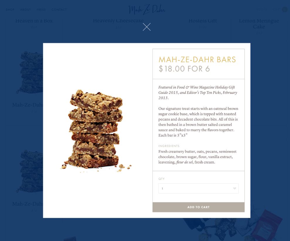
The thin grids help the organization of the page. Two-dimensional grids enrich the product presentation, and the products are beautifully shot atop a white background. This creates a modern, clean, and compelling look that makes users' mouths water. In addition, the long-scrolling feature allows the store to add as many products as possible without flinching. The view can also be filtered by the tab functionality.
To make a purchase, users simply choose a product, then complete the action through a popup overlay. Checkout can be accessed directly by clicking the “CART” on the header, then viewing an order detail overlay which slides in from the right side of the browser. In a nutshell, the continuous processes of the checkout are all well-designedand easy-to-use.
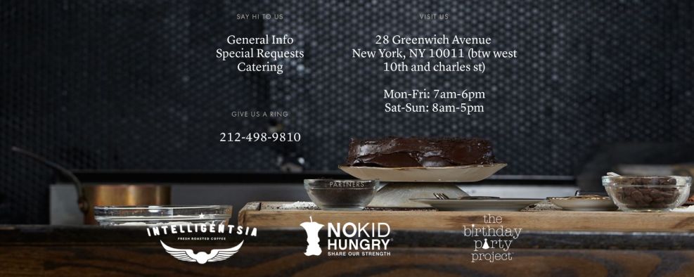
The “ABOUT” section can be found directly below the “SHOP” section, brought up by parallax scrolling effects. This section echoes the top banner with its full-width imagery. The navigation is acts like a sticky footer, and five tabs present the bakery and the people behind its success. Through the popup overlay, users gain clear perspective about all aspects of the bakery. The entire approach to this site is unquestionably easy to use.
Mah Ze Dahr Bakery is a clean website design in the Food & Beverage and Professional Services industries.


