
This is a concept packaging design from Arkadiusz Stanikowski. The packaging design is for matzOH!, a brand of Matza crackers from the Poland-based company Kupiec. Kupiec has been around since 1987 and is still going strong.
Best packaging design is based on four principles: Impact, relevance, communication, and conviction. Arkadiusz executed each of these principles. Kupiec approached him for a product redesign as they planned to export the product line for English speaking countries.
Let us break down the relevance that Arkadiusz injected into his design. Matzoh (or, matza) is a traditional Jewish flatbread. It is healthy and it is made from wheat flour. These qualities must be portrayed in the design.

Arkadiusz shows the product on the package. He highlights the healthy wheat distinction by portraying wheat on the front of the box. This shows the consumer that the product is organic and made from natural, healthy ingredients.
By using highlighting the relevance of the product in the packaging design, the consumer is engaged. They want to learn more. They want to pick up the product and see what it is all about.

The next item Arkadiusz nailed is "impact." The best packaging designs can be seen on the shelves. To accomplish this, Arkadiusz created an irregular shape, so that it stands out from the competition. The customer can see this package design from a mile away. I have never seen a cracker box designed like this. Look at this thing.
It screams “I am worthy of your selection for the consumption of crackers.”
The use of lush contrasting colors also provides impact. Arkadiusz chose a deep purple, orange, and blue to ignite the already eye-catching design. It is important to note that he did not overdo it. Everything has a nice flow.
Communication is also flawless. We see on the front of the box that this is a product based on wheat.
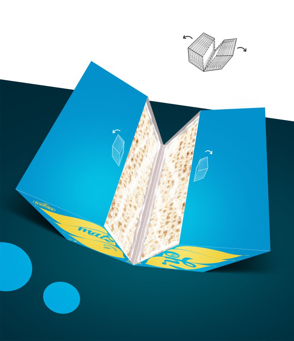
On the top of the box, we see that there are crackers. This engages the customer to open the box in a unique way as they satisfy their cracker munchies.
Finally, this product has conviction. It is bold. It does not say “Please, just maybe, come take a look.”
It screams with authority: “Come here. Pick me up. Good. Your cracker search has ended and ended with vigor.”
The best packaging designs combine impact, relevance, communication, and conviction to make the products shine, make them engaging, and make them worthy enough to be picked up from the shelf -- even if the customer was not thinking of buying it in the first place.
To do that, bold design innovation must be implemented. You must take risks in this game. Everyone is tired of the decades-old rectangular cracker boxes.
But this packaging design is not a rectangle. It’s a darned polygon. When was the last time you saw a cracker box in the shape of a polygon?
Me either.
And that is why this is one of the best package designs for crackers I have ever seen.
matzOH! is a bold packaging design in the Food & Beverage industry.


