- Home
- Best Designs
- Best Website Designs
- Max Chocolatier
- 404
- About Page
- Black and White
- Blog
- Check Out Page
- Clean / Minimal
- Colorful
- Corporate
- Footer
- Form
- Fullscreen
- Horizontal Layout
- Illustrated
- Images / Gallery
- Landing Page
- Masthead
- Menu
- Microinteractions
- Motion Effects
- Parallax Effects
- Pop Ups
- Portfolio
- Pro-loaders
- Product Listing Page
- Services Page
- Slider / Module
- Sound / Music
- Storytelling
- Typography
- Unusual Layout
- Use of Infographics
- Advertising
- Aerospace
- Agriculture
- Architecture
- Arts & Recreation
- Automotive
- Banking & Finance
- Content & News
- Distribution
- E-Commerce & Retail
- Education
- Engineering
- Entertainment
- Fashion & Beauty
- Food & Beverage
- Government
- Health & Wellness
- Hospitality
- Legal & Insurance
- Luxury
- Manufacturing
- Medical & Pharmacy
- Non-Profit
- Professional Services
- Real Estate
- Sports & Leisure
- Technology
- Travel

Max Chocolatier’s Product-Focused Website Connects Users With The Chocolate They Love
If you love chocolate, this website is definitely for you.
Max Chocolatier is a family-owned and operated chocolate retailer based in Lucerne, Switzerland. This fairytale destination is the perfect backdrop for a chocolatier dedicated to mixing his passion for chocolate and natural ingredients.
Opened in 2009, Max Chocolatier was named after the owner’s son — a chocolate lover all his own. Opening up a chocolate shop was the dream of both father and son, and when it came true, hearts melted.
The team at Max Chocolatier is dedicated to creating unique, quality, handmade and 100 percent all natural chocolates that are full of all the good things a person needs. They know that you need to use the best ingredients to get the best results, and their commitment to this cause has helped them create magnificent experiences and create tantalizing chocolates.
Max Chocolatier is a wholesome, happy team of dreamers, doers and eaters. They want to create chocolate that doesn’t just taste good but feels good too. They are committed to their cause and have spent years evolving their techniques and recipes to stay fresh, modern and delicious.
And as their popularity grew, so did the demand for their delicious delicacies. As a result, they needed an e-commerce website that could reach a wider audience and satiate their customers’ growing appetites.
The result was a stunning online platform that exudes excellence, sophistication and quality.

The Max Chocolatier Website Design Emphasizes An Intuitive Experience With Simple And Sophisticated Navigation
The Max Chocolatier website puts UX first. From its smooth transitions to its intuitive interface — this website sure makes buying your next batch of chocolate easier than you could ever dream.
And dream is right — this website looks like it’s the stuff of dreams, from its products to its design.
The main page is made with a heavy emphasis on imagery and clear CTAs. And it’s these clear CTAs that make it so easy for users to click on an aspect of the site or the product they want to learn more about and make it there with ease.
This clean website design makes use of white space, bold typography and a creatively organized layout to provide users with an experience they can’t forget.
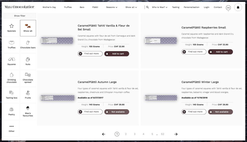
Users can learn more about the ingredients and the products with a comprehensive filter and search menu that lets users choose from a variety of categories to find the chocolate that they’re looking for.
Each product gives just enough information to inform, without overwhelming the user or overcrowding the screen.
The creative team at Max Chocolatier wanted to make this experience as light, natural and airy as the chocolate itself and it succeeded with seamless navigational tools, comprehensive options and a clean layout that is enchanting and inspiring.

Max Chocolatier’s Online Site Uses Smooth Transitions And Product Photography To Grab Attention
Landing on the homepage, you’re met with a large photograph — either of the chocolate itself or of a step in the chocolate-making process. This image takes up the entire screen, urging users to scroll to learn more. Overlaid is bright, white copy that immediately tantalizes. This copy further demonstrated the qualities the team at Max Chocolatier hold dear and is accompanied by a clear call to action.
These images slide across the screen, zooming out briefly before falling back into place. The movement and smoothness in the transitions are pleasing and captivating — almost more than the images themselves.
Throughout the website, laid out creatively and in a fairytale-esque way, are more product shots and illustrations. As you scroll down the main page, you’re greeted with the products that are new and exciting, paired with more imagery and illustration.
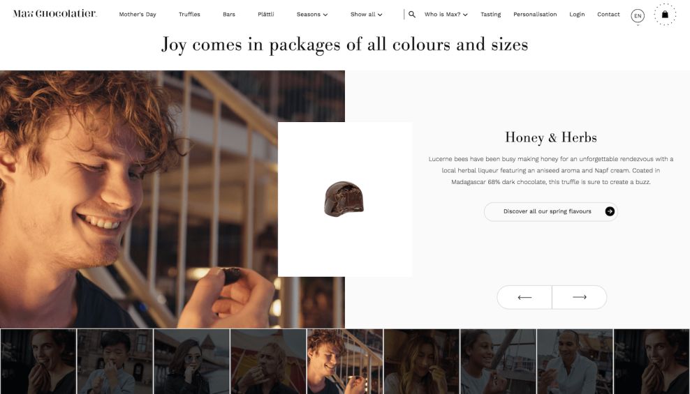
Scroll again and you’re brought to a gallery of chocolates with smiling, happy people enjoying the tiny treats. This grid-like gallery is a stunning showcase of the brand and their product offerings. And the transition and journey are beautiful as well.
Calls to actions are clear and concise. They accompany every page demanding action everywhere you turn.
The loading page is made up of the brand and it’s creative X logo, with little dots circling the symbol in a fun, modern and minimal way that keeps you engaged and interested.
The imagery, paired with the photography and smooth movement make this website a captivating and serene design with a user experience that puts you at ease.

The Max Chocolatier Digital Platform Is The Perfect Online Shop For Chocolate Lovers
This website takes users on a tantalizing journey, highlighting the rich chocolate with stunning photography, and streamlining navigation with intuitive motion and transitions, comprehensive search and filter features and thorough product information.
Whether users want to learn the story behind this inspiring chocolatier, or they want to learn more about the all-natural ingredients that go into the truffles they’re eating, the journey is simple and efficient.
Bold and eye-catching photography, matched with a clean layout and clear typography make navigation engaging and fun, and the interactive nature of the smooth transitions and bold CTAs make jumping from page to page smoother than the chocolate that will soon be melting in your mouth.
This website design takes incorporates design elements, creative layouts and clear navigation tools to help consumers learn more about the chocolates they’re eating, and urges them along their journey to absolute chocolate paradise.
- Industries:E-Commerce & Retail Food & Beverage Luxury
- Tags:Images / Gallery Motion Effects


