
Mohawk Connects is a design magazine. What began in 2013 as a celebration of makers, creativity and the culture of craft, has now become an indispensable source of inspiration for graphic designers around the world. Each issue of the Maker Quarterly seeks to push the boundaries of creative expression with insightful editorial features, carefully considered design and varied printing techniques on a diverse range of Mohawk papers.
For one of the issues, California-based designer Brett Newman was commissioned to create this beautiful piece of editorial design. The issue is a collection of posters which embraces the power of beauty writ large. From the wonder of the natural environment to the complete rejection of beauty itself, this issue expresses the power and contradictions inherent in one of the most compelling forces driving creativity: Beauty.

Each poster in the collection has been creatively and masterfully designed, keeping in mind the theme of the issue. The posters are all full-page, maximizing the space available for each design. Colors are used effectively, creating a visually appealing contrast as well as ensuring that each color in the color palette used complements the overarching theme.
A fun element in the print design is the play on words. Witty captions like “Beauty Today, Gone Tomorrow,” and “The Shock of the New, the Yawn of the Old” ensure that the design has a clever element, and each of these captions is in line with the design depicted along with it.
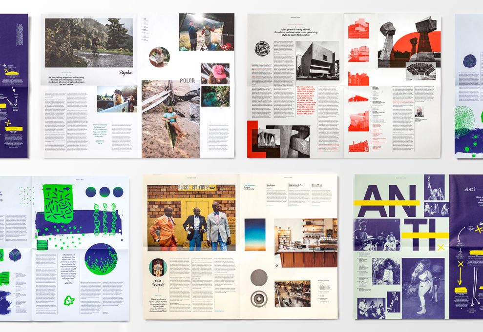
The designer also uses shapes very artfully, ensuring that there is symmetry in design. The use of geometrical shapes and designs has been highlighted, and there is also an emphasis on the beauty found in natural elements. Overall, the issue of posters is unique, creative, and cleverly executed. Each poster contains unifying design elements like symmetry and color, in order to create a visually very aesthetic experience.
Mohawk Maker Quarterly is a contemporary print design in the Advertising, Arts & Recreation and Professional Services industries.


