- Home
- Best Designs
- Best Website Designs
- Moorlands
- 404
- About Page
- Black and White
- Blog
- Check Out Page
- Clean / Minimal
- Colorful
- Corporate
- Footer
- Form
- Fullscreen
- Horizontal Layout
- Illustrated
- Images / Gallery
- Landing Page
- Masthead
- Menu
- Microinteractions
- Motion Effects
- Parallax Effects
- Pop Ups
- Portfolio
- Pro-loaders
- Product Listing Page
- Services Page
- Slider / Module
- Sound / Music
- Storytelling
- Typography
- Unusual Layout
- Use of Infographics
- Advertising
- Aerospace
- Agriculture
- Architecture
- Arts & Recreation
- Automotive
- Banking & Finance
- Content & News
- Distribution
- E-Commerce & Retail
- Education
- Engineering
- Entertainment
- Fashion & Beauty
- Food & Beverage
- Government
- Health & Wellness
- Hospitality
- Legal & Insurance
- Luxury
- Manufacturing
- Medical & Pharmacy
- Non-Profit
- Professional Services
- Real Estate
- Sports & Leisure
- Technology
- Travel

Moorlands School’s Website Was Built With Parents In Mind
The Moorlands is an independent prep school located in Leeds, United Kingdom. They are the home to dozens of children every year, fostering a community of learning, growth and bravery for each and every pupil.
Moorlands is the oldest prep school in Leeds, and it was founded way back in 1897. In 2012, the school became a member of the Methodist Independent Schools Trust which gave it added benefits and a bigger reach — giving the school even more opportunity to educate, inspire and create thoughtful individuals.
The school houses children from age two to age 11. While here, they learn new skills like independence and critical thinking and learn how to be good people with compassion, respect and kindness.
All around, this school hopes to instill within its student the values that the institution holds dear. Happiness. Kindness. Bravery. Confidence.
Here is the Moorlands’ motto:
At Moorlands, we have a simple yet beautiful motto: 'Intrepide!', or 'be brave!' In school we talk about how being brave or intrepid takes many forms. Being brave isn’t always a grand gesture; sometimes it just means ‘having a go’; attempting that difficult question, offering an answer in a lesson when you’re not quite sure - or simply trying something new.
This is an institution that cares about its students, and you can see that in the many programs it runs. But the first step in the whole process for parents is the exploratory phase. Parents want answers. Parents want reassurance. They want to know what to expect before they ever consider choosing a school for their children.
And the Moorlands website makes it easy.
With bright colors, clear navigation and bold imagery, the Moorlands website offers comprehensive and insightful information about the student experience that urges parents to take a tour to learn even more.

Moorlands’ Web Page Stands Out With Bright Photography And Stunning Videography
This website is visually-driven right from the start.
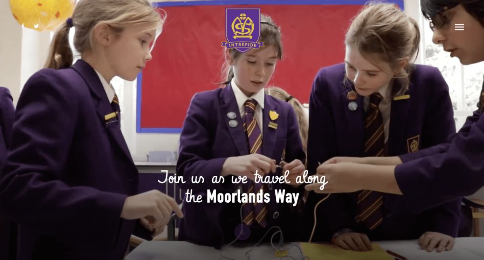
The homepage is made up of a video that depicts the school and its students. You see children laughing, playing, singing, playing sports and learning. This video plays automatically and adds a dynamic nature to the design immediately.
Similarly, bright and vivid pictures make up the overall layout of this design. Landing pages are paired with more schoolyard photography, and as you scroll, images float into existence further pushing home the point of happy, educated children who are enjoying their time at this school.
And considering parents care about their children’s school experiences, it’s imperative that a school’s website design incorporates candid shots and stages photos that show the day-to-day lives of these students.
These pictures and videos bring a fun and approachable vibe to the design. They bring it to life and make it a friendly interface that parents want to interact with. They also aid in navigation, drawing eyes and leading users on a journey from admission to graduation.

The Moorlands School’s Website Educates Parents With Ease Thanks To A Clean And Comprehensive Layout
The Moorlands website is bright, clean and efficient. Thanks to bold photography, clear landing pages, a simple menu bar and clearly-displayed menu blocks, parents can search through the web page and find the information they need with ease.
A helpful menu icon sits at the top right corner of the page. This sits on the screen as you scroll, making it easy to find the menu at all times. Once clicked, this purple menu bar slides in from the left and offers a simple and clean list of landing pages parents can choose from.
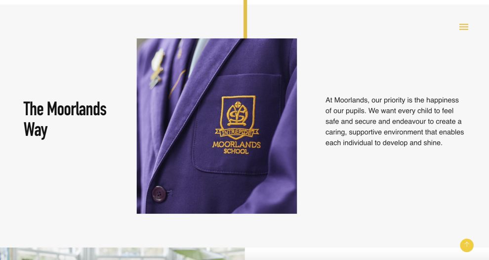
And each section of the website is clearly organized and designed. Each block of information is separated by colors, and CTAs are written out in big, bold boxes made up of photographs with a bright and exciting transparent color overlay.
The text is comprehensive but clear. And it sits creatively and cleanly on images, in menu bars and on its own. In some instances, it’s curly, cute and playful. In others, it’s clean, simple and modern.
There’s a balance here that aids in navigation, and it pairs nicely with bold CTA boxes, a streamlined layout and a simple menu.

The Moorlands Digital Destination Is An Inspiring And Easy-To-Use Website
This website is bright, fun and engaging. It strikes the perfect balance between informative and playful.
You see this in the colorful image overlays, the curly fonts and the bright clean layout. But you also see it in the cohesive and comprehensive descriptions and text boxes, the illustrative videos and the bright, happy photographs.
You get a feel for the student experience right off the bat. With helpful video and streamlined navigation, this website points parents in all the right directions to get the information about the school, its legacy, its offerings and more.
Similarly, the menu bar makes it easy for parents to learn more about each individual area that means most to them.
Whether they are more interested in events, the school calendar or the activity offerings, parents can find it with ease thanks to the ever-present menu bar icon that sits at the right upper corner of the screen. And the menu bar that slides in from the left is equally clean and clear.
This website doesn’t leave much to the imagination, but it does inspire free thought and creativity in its use of simple and playful design elements.
The Moorlands School’s online educational platform is bright, clean and comprehensive — the perfect example for other educational institutions to learn from.
- Industries:Education
- Tags:Images / Gallery Parallax Effects


