
Nike Does Website Design: Just Do It
Nike has an iconic slogan: “Just Do It.” We put this famous slogan to the test to see how the company applies “Just Do It” to their website design -- and we were pleasantly surprised. Nike’s eCommerce website combines ease of use with a simple color palette that everybody from teens to older adults can enjoy. The website uses snappy pages with animation to showcase its latest products. Below, we break down what you can learn from this legendary sportswear company’s web design.
Nike Website Design Has Instant Color Preview On Product Grids
Nike’s product listing pages -- such as the Girls Basketball shoe page -- looks like just any other organized, product page. That is until you start clicking through the different products.
Just hovering over one of the shoes on the page lets you instantly see a smaller grid under the product. This secondary grid gives you a look at product variations. You can instantly see the available color options and what the shoe looks like in different colors.

In addition, when you hover, the information switches from showing color options to showing the product’s average rating. Like other e-commerce stores such as Amazon, Nike shows a star rating for each product.
The colors on the page are conservative and the focus is on a user clicking through on the actual products. Nike has stuck to their signature design as they have on the rest of the site.
White background and plenty of white space combine with black typography. It’s a no-nonsense approach that makes it easy to examine the different products.
If you feel like "winning" yourself we have ranked the leading eCommerce web designers that revolutionize the industry at every turn.

Filters On The Left Sidebar Show Category Statistics
When you select one of the top level categories, you will also see the number of products available on the left, of all the products in that category. For example, when you select Men’s Shoes, the sidebar on the left shows you how many shoes are in the subcategories, such as:
- Lifestyle
- Running
- Basketball
- Football

Nike Website Design Product Videos Need No Clicks
It takes a strong eye for design to question longstanding practices and show us a new way of doing things. On Nike’s page for the Nike Air Huarache Drift, for example, Nike has made the information very easy to digest. First, you get the images of the product in pairs arranged side by side. There is a total of nine such products in the grid. They show you the product from the side, the front, and different angles.
In addition, the top right image featuring the model wearing the shoes is actually a video. This is where Nike’s design really shines. You no longer have to click on a product video to start watching it in use. Simply hovering over the image starts playing the video. The process is effortless and very neatly done.
If you are looking to create a high-performance website like this, check out these top-rated Los Angeles web design companies.
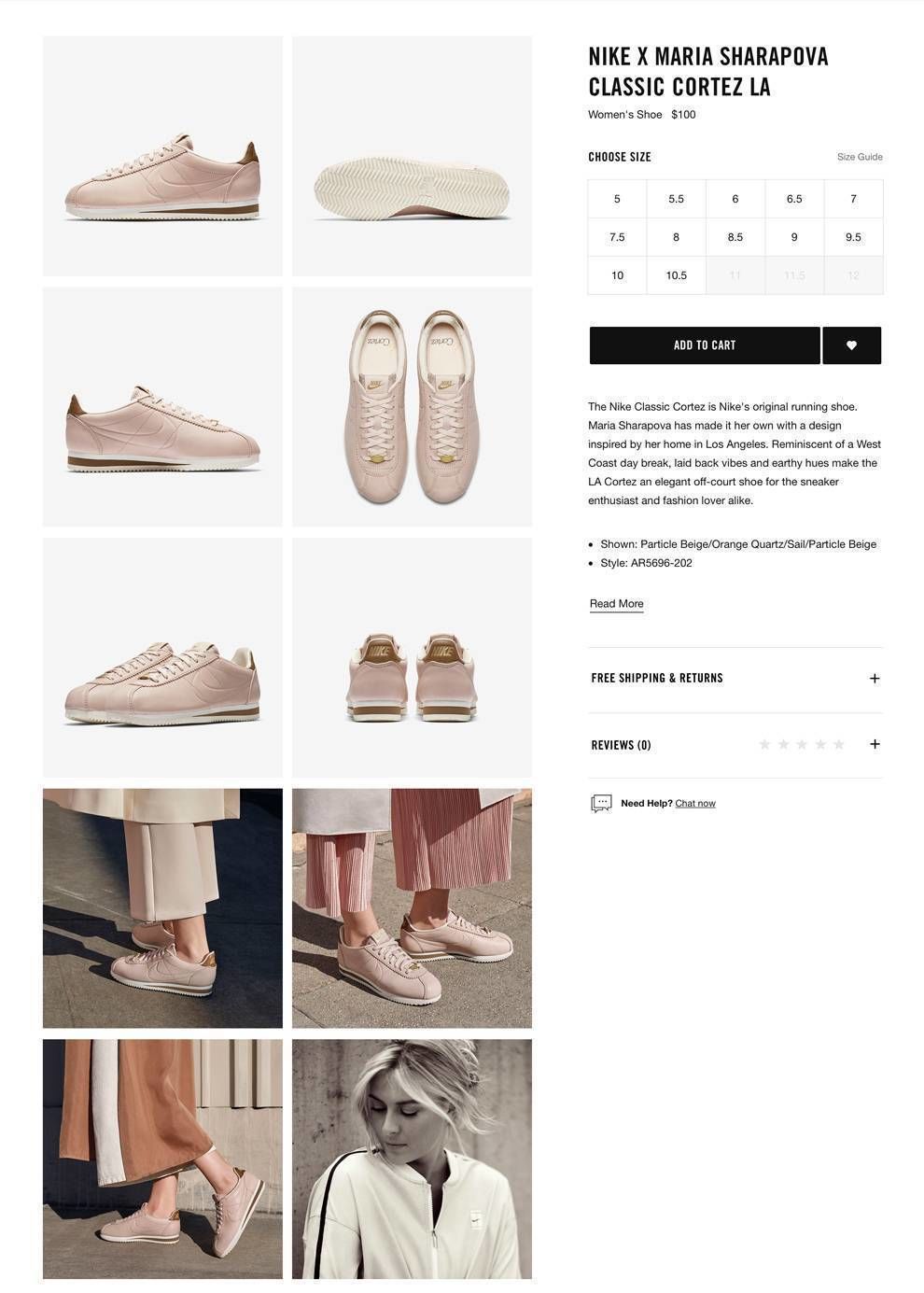
Nike Website's Product Detail Pages Show More Than 4 Images
When you drill down into an individual product page, you almost always get a grid with four or more images. This applies, for example, to the Maria Sharapova Classic Cortez LA Women’s Shoe page. This is great because the images take a 360-degree view. They show you views of the product from multiple angles, all at a glance. You do not need to visit another page to get access to these views of the product. Clicking on one of these images, however, will give you access to full-sized images of the product. These show you the same pictures in much greater detail, almost like holding the shoe in front of you.

Nike Shoe Size On The Product Description Page
Nike’s designers have included handy customization on the product listing page. This includes the right-hand sidebar that allows a user to select the right shoe size. You can see this on the Nike Lunar Control Vapor 2 page. The right sidebar includes other helpful options. These include:
- Add the item to your shopping cart.
- Save the item to your wish list.
- See the average review score for the product. When you click on the stars indicating review score, the reviews expand in the right sidebar. You can read product reviews side by side with the images that showcase the product.

Design Your Own Kyrie Irving Nike Shoe In 3 Easy Steps
Nike’s website functionality is notable for its sleek shoe design experience. As an example, you can see this on the page for the Kyrie Irving 4iD Basketball Shoe. On this page, a “click and select” interactive canvas let you select options and customize your shoe, including:
- Base - You can customize the color of the shoe’s main parts.
- The color of the Nike logo - Options include gold, silver, clover, bright crimson, and university red.
- Midsole - You can set a color for the midsole of the shoe.
- Heel Text - That’s the beauty of Nike’s approach. Everything is down to the details. Knowing you designed your own Nike this way will make your shoe quite irreplaceable.

The interactive shoe design experience is a real treat for Nike fans. You get to revisit the design choices that Kyrie Irving made when he worked on the Kyrie 4 Shoe with designer Benjamin Nethongkome. You can change anything at any time until the shoe looks just how you like it.
Nike Uses Design For Emotional Appeal
When you fire up Nike’s website on your phone or computer browser, what stands out is the brilliant use of color and emotion on the page. Nike’s website overall feels like a breath of fresh air. Let’s see how they convey this refreshing feeling through their e-commerce design choices.
A Place For Imagination
Even though Nike’s website has many notable images, it does not cram everything on you all at once. Rather, the designers have let the page breathe. They accomplish this through the use of significant whitespace as a core part of the design.
Using plenty of whitespace in this way creates a sense of freedom and effortless elegance.

A Taste Of The Outdoors, And How It’s Accomplished
Nike’s page uses a stunning combination of colors to create a taste of the outdoors. They do not use pictures necessarily of people running around on a track outdoors. Rather, the designers have played around with colors to give a sensation of being in nature.
Take a look at the earthy hues around the footwear images. The brown, white and grey resemble a typical outdoor landscape. Great designers know in-depth the principles of color psychology.
Nike has used colors on its products and website that give a refreshing taste of nature. This use of nature-like concepts in design uses the biophilia effect to please the eyes.

Biophilia is the human eye’s ingrained taste for imagery that resembles nature. Hospitals have been known to use this effect in designing hospital interiors to show images of natural landscapes. The result was that patients found these spaces more soothing and conducive to recuperation.

Air Jordan X Page Design: How To Present A Legendary Product
The Air Jordan XI page is not notable for sleek cool animations or brilliance of color. But this is a remarkably well-designed page for its purpose: A product sales page that focuses on the product.
These sales pages are often a challenge for the designer because you want to be creative, but you do not want to take away the focus from the product itself. After all, your customers buy the product, not the page. Still, a good designer should be able to craft a standout sales page. Let’s see how Nike achieves this balance here.
It opens with the legendary Michael Jordan statement at the top: “I’m back.” These famous words were said by Michael Jordan on returning to the sport of basketball following his self-imposed retirement.
Instantly, fans know this is the real deal, the historic Jordan they are here for. After all, this is the “Air Jordan” page.

From there the visitor is taken through a well-arranged tour of photos that take the viewer from far away right up to holding the product at arm's length.
As if that is not enough, the camera then zooms in, placing the Air Jordan X right in front of the viewer’s eyes. He or she can see the impressions of soft padding inside, the solid white exterior. Clearly, this is a sturdy, but overwhelmingly comfortable, sports shoe.
The all-white hue of the product blends perfectly with the off-white background, as well as the white color around the page.
Black text to describe the Air Jordan X makes it easy to read the product description.

Then, to seal the deal, the camera gives the viewer one last close-up at a high zoom level. This one is on the underside of the shoe.
That’d be the least important part of any other shoe. Here, instead, the camera shows the viewer the imprint on the shoe. It chronicles Jordan’s incredible accomplishments from 1985 all the way to 1995.
Rather than being unimportant, the choice of this image shows that this is a shoe with a difference. Even its underside is a repository of valued Michael Jordan achievements. When you wear it, you’ve got the complete package. You too can become Jordan, even if for a fleeting moment.
There’s nothing more to say at that point than to buy the product. This is a complete, well-designed product page. The chronological product walk-through, almost like you are seeing it physically in a store, could be something to emulate on product assignments.
Nike’s Website Design Sticks To The Brand
Nike has made its reputation as a leading sportswear company head and shoulders above the rest. While you can count on it to do things its own way, sometimes that way looks deceptively simple. It just gets the job done.
Nike’s website is proof of this.
The site is highly effective for its purpose: getting people to buy Nike’s footwear and other products. These are some of the techniques you can take away from the design:
- Use highly readable typography for product landing pages. Black on white is a great choice.
- Product close-ups are highly effective on a product page for a single product listing.
- E-commerce websites need not be hard to scroll through and filter. Design creatively to reduce the number of clicks it takes for a user to do things. Make sure to check out our article on best shoe brand designs.
Now that you know how Nike does website design, it’s time for you to go do the same. Don’t be afraid to just do it!


