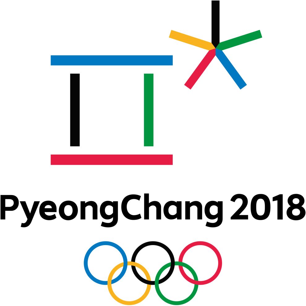
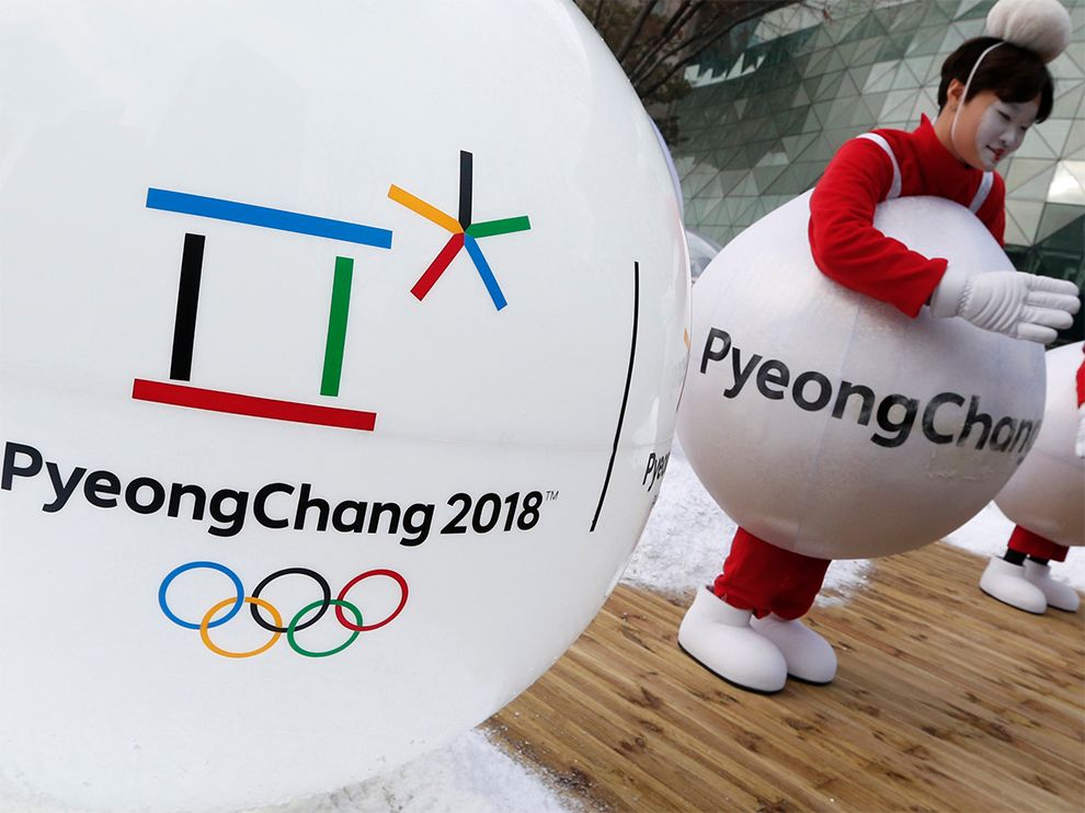
The 2018 Winter Olympics’ logo is a combination of the Olympic Games' classic logo and unique elements.
The top of the PyeongChang 2018 logo features symmetrical shapes made out of single lines, representative of the Korean alphabet.
This main symbol is a combination of the Korean characters which spell the 'p' sound (for Pyeong) and the 'ch' sound (of Chang). Below this design are the words PyeongChang 2018, in black, well-spaced lettering.
Centered underneath the text is the Olympics symbol, originally designed in 1912 by Baron Pierre de Coubertin, co-founder of the modern Olympic Games.
This symbol features five intertwined rings, which represent the five participating "continents": Africa, Asia, America, Australia and Europe. Each ring is in a different color: Blue, yellow, black, green and red.
The PyeongChang emblem at the top also uses five, colors -- which are traditional in Korean culture.
The five cardinal colors are found in many aspects of daily life and tradition in Korea, including in clothing, celebrations, martial arts, architecture, art and food.
The multicolored design is described by the organizers as "global icon born from the spirit of Korea." The first character in the emblem also represents a gathering place where the three elements of Cheon-Ji-in – heaven, earth, and human – are in harmony.
The second character symbolizes snow and ice, as well as the athletes’ stellar performances. P
yeongChang 2018’s new emblem symbolises a grand gathering of people from all around the world in celebration of Olympic winter sports, which is taking place in the harmonious land of PyeongChang – a square where the earth meets the sky, where athletes excel in snow or on ice, and where everyone will celebrate the world’s biggest winter festival in 2018.

This excellent logo design also uses space exceptionally, ensuring that the shapes and lines are spaced out accurately, and that attention does not detract from either of the elements.
The text in black also makes for a good design choice, since colors have been used in the designs at the top and on the bottom.
Combining elements of the Korean alphabet and oriental philosophy, this new brand will allow people to immediately connect with Korea. The logo is rooted in the heritage, of Korean culture and the Olympic Games itself.
At the same time, it is also modern and contemporary, particularly in its minimalist design. It gives a glimpse into the rich culture of the hosting country and celebrates the history of the Games.
The 2018 Winter Olympics logo design makes for a unique, memorable, and meaningful symbol to unite the participating countries together.
PyeongChang 2018 Winter Olympics is a minimal logo design in the Sports & Leisure industry.


