Shyp picks up products from people’s homes, professionally packs them, and selects the cost-effective carrier to ship the products to their destination.
Open the Shyp app. Snap a photo of the item to be picked up and shipped. Costs $5.
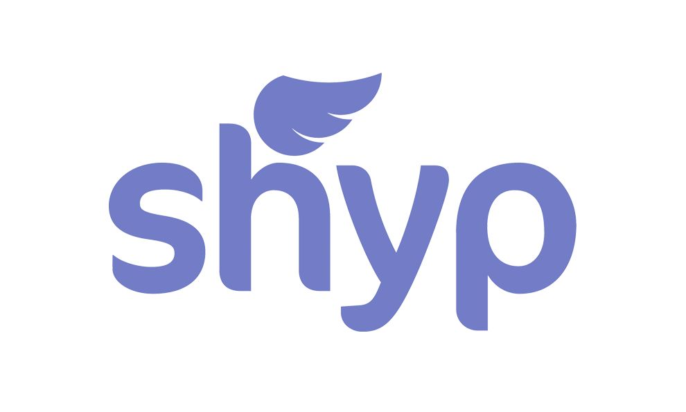
The blue logo was redesigned in 2015 to the modern and elegant wordmark we see above.
DesignStudio spearheaded the redesign campaign. Shyp’s vision is focused on simplicity, confidence, and no headaches.
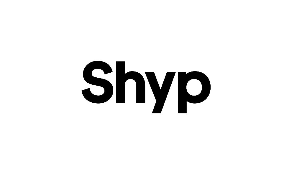
The logo design looks like a billion-dollar world changing powerhouse. It could be placed on twenty-foot diamond outlined custom glassed doors, and belong.
A symbol is no longer required to know who the company is or what they do. The new wordmark is bold and measured and to the point.
What does Shyp do? They ship. No headache for you. No more packaging or not having the right tape. No more worrying about extra fees or when the post office closes.
They get it done. Costs $5.
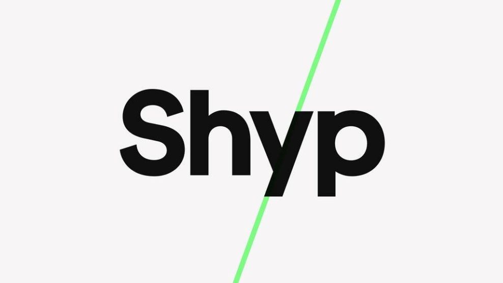
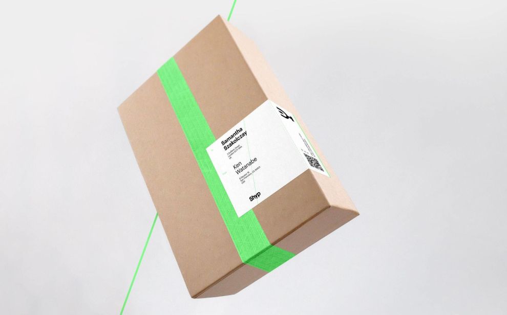
A green slash was added to the logo in certain settings. It symbolizes Shyp’s position as the middle man between sender and receiver. Wherever you are, they are meeting you half way.
The green used is #89FF8C. The font is a sans serif typeface. The green slash embraces the diagonal angle of the letter “y”, embodying the brands spirited energy and innovative path.
DesgnStudio wonderfully executed this brand and logo transformation. The previous logo was cartoonish and took away from the seriousness of Shyp’s mission. Shyp has converted all independent contractors to full-time W2 employees.
They care not only about their customers but their employees, too—they are recognizing them as people. They are changing the expectations and standards of shipping.
The logo reflects the simplicity and essence of Shyp’s mission of simplicity -- to take away all headaches of shipping while establishing the long-term vision of continuing to disrupt an industry plagued with problems.
The logo makes a bold announcement: We are the solution.
Shyp is a modern logo design in the Distribution industry.


