- Advertising
- Aerospace
- Agriculture
- Architecture
- Arts & Recreation
- Automotive
- Banking & Finance
- Content & News
- Distribution
- E-Commerce & Retail
- Education
- Engineering
- Entertainment
- Fashion & Beauty
- Food & Beverage
- Government
- Health & Wellness
- Hospitality
- Legal & Insurance
- Luxury
- Manufacturing
- Medical & Pharmacy
- Non-Profit
- Professional Services
- Real Estate
- Sports & Leisure
- Technology
- Travel

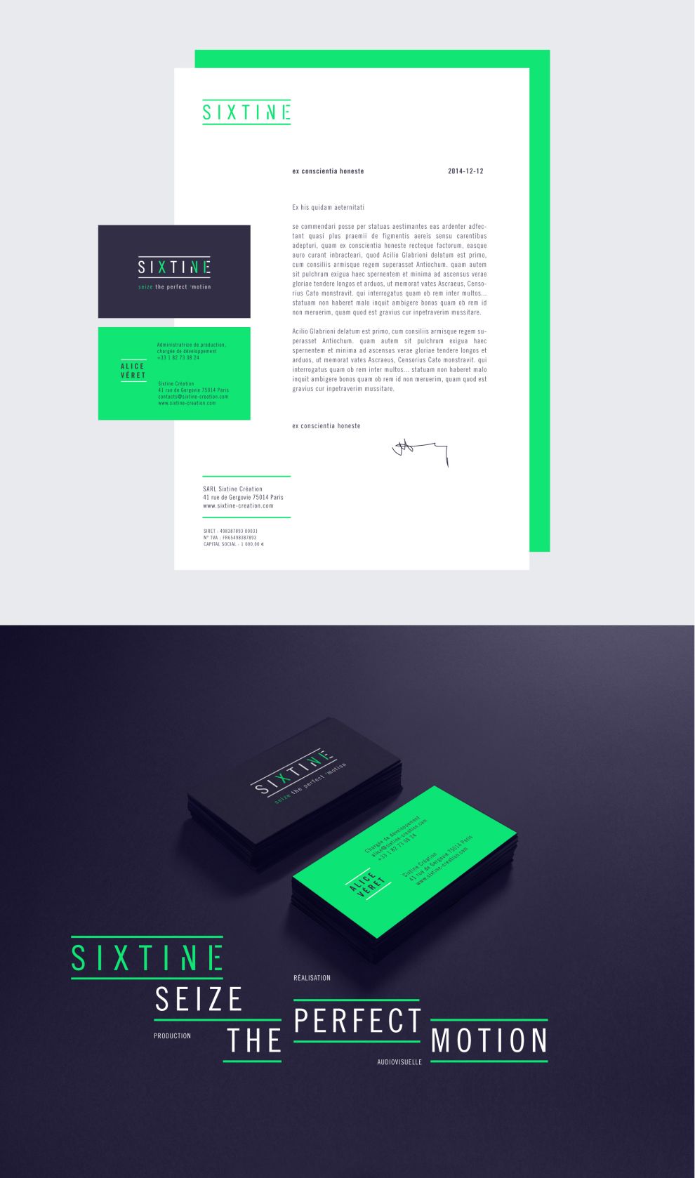
Sixtine is an audiovisual creation studio that films commercials, documentaries and video clips. Formerly ‘Sixtine creation’, Sixtine opted for a simpler name, full of elegance, history, and symbols.
Along with the simpler name came an update to the brand collateral. The color palette used for the updated branding consisted of dark navy, white, and a lime green with a fluorescent effect. The color scheme coupled with the font style ensures that their is an overriding sense of clarity throughout the print designs.
Dark navy carries with it the symbolism of importance, confidence, and power. In the case of Sixtine they’ve used it as an effective alternative to a neutral black, and it definitely helps accentuate the green shade.
The lime green inspires a sense of playfulness and youthfulness. It seems to create a feeling of anticipation, and helps to promote an aura of positivity.
The headings are capitalized throughout the designs with a narrow ‘Mono’ typeface being used. The letter spacing does a nice job of enhancing the impact of the headings, giving the letters some room to breathe.

The font used in the paragraphing is of a similar typeface - it’s well-spaced and easy to read, which is ideal for the required print materials.
Throughout the designs you’ll notice evidence of some smart additions and modifications to the plain text, such as the heading, where the roman numerals ‘X’ ‘V’ and ‘I’ are highlighted in green. XVI stands for ‘sixteen’, an alphanumeric play on the actual company name.
The fonts, colors and subtle design tweaks make this an impactful, clear, and exciting combination. As an audiovisual creative studio it’s important for the brand to reflect the quality of work you can expect to receive as a client, and vice versa. These print designs do exactly that.
Sixtine is a clean print design in the E-commerce & Retail and Fashion & Beauty industries.
- Industries:E-Commerce & Retail Fashion & Beauty
- Types:Business Cards Stationary


