
Sound UK’s Unique Design Emphasizes The Brand’s Own Offering
Sound UK is a music producer located in the UK. They’re made up of music lovers — dedicated to creating beautiful pieces of art. And here’s what these creatives have to say about their mission: “We produce extraordinary musical encounters. We want as many people as possible to experience and enjoy these. To make this happen, since 2001 we’ve sought out the most creative artists, realizing their most imaginative musical ideas for the enjoyment of audiences across the UK.”
As their website suggests, Sound UK wants to make a difference in the world of music. And these music producers are perfectly described by their slogan “extraordinary musical encounters.”
They provide a range of ways to get involved in the industry through talks, workshops programs and training — and the Sound UK logo represents their unique approach with style and finesse.
Type-only logos face an even greater challenge of becoming memorable since they rely less on design by nature. However, Sound UK executed this masterfully with their powerful, creative and captivating logo design.
This wordmark comes with a twist, however. There is a creativity and a playfulness infused into these words that grow as the letters continue. The design we’re talking about? A fantastical soundwave symbol that calls to the brand’s musical background.
This design features a unique soundwave distortion that moves from left to right, picking up power and becoming larger, as if it were traveling through space and becoming louder as it moves. Ultimately, this soundwave reshapes the word at the end of the logo while simultaneously integrating itself within the word.
Placing "UK" next to the word "Sound" ingrains the origin of the brand and intended recipients of the soundwave: The United Kingdom. The logo font is a modern sans serif with unique elements — particularly to the letter "K" — positioning Sound UK as a leader and a pioneer — thanks to this symbol, everyone who sees it knows that this brand is a forward-thinking brand within the music industry.
This logo design walks the fine line between simple and dynamic. It is both minimal in nature, and equally energetic and bombastic in personality. This logo stands out from others in the industry — in the world of music, and in the field of design.
How The Sound UK Brand Uses Their Logo Across All Mediums
There’s a finesse to this wordmark logo. And the subtle infusion of a playful element in the form of a growing sound wave really captures the essence of this brand in a modern, minimal and captivating way.
Wordmarks can oftentimes come off cold, stuffy and corporate. But here, there’s a balance that makes this logo easily transferable across mediums. It isn’t reserved for letterheads and marketing materials. This logo can stand on its own and show off in a powerful, robust and phenomenal way that stands as a testament to the influential work this brand is committed to.
The Sound UK logo is apparent across a wide variety of mediums. It sits on the brands’ desktop and mobile site, up in the corner and directing users across the page.
It sits on posters to add an edgy, modern vibe to the artsy pieces that dance across the materials. And it matches the fluid and geometric nature of many of the designs this brand creates overall, adding a cohesiveness that is refreshing and welcome.
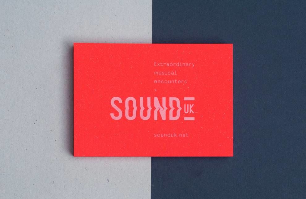
This logo also sits on other print materials like business cards. Here, it is extremely noticeable. It takes up the entire card, standing as the sole design element that draws attention and pulls people in. And the fact that this logo is simultaneously a symbol and a wordmark gives off an excellence and an authority that is almost tangible.
This logo is the perfect image to use to help build brand awareness. And here, it adds a sophistication and a forward-thinking mentality that is beneficial to the brand in its entirety. It can easily be used in a variety of situations and mediums — and that’s the perfect kind of logo design.

What Is Sound UK?
Sound UK is a fully-functioning music production company that works with artists across the UK. They are a comprehensive team of designers, producers and creatives that are passionate about connecting artists with the tools that will help them create powerful, auditory masterpieces.
According to the brand:
Sound UK is run by Directors Polly Eldridge and Maija Handover with Assistant Producer Chloe Arnett. We work alongside a crack team of freelancers and consultants across production, design, participation and fundraising. These include Tim Hand (production), Becky Morris Knight at Shipshape Marketing (digital marketing), Beth Fouracre(participation), John Gilsenan at IWant (design), Sarah Coop(fundraising) plus many more.
But this brand is more than just a production company. It’s a brand that cares about music and aims to ensure that everyone is able to experience music in a way that affects them on an emotional and visceral level.
For 17 years this altruistic brand, along with their charity of the same name, have gone out of their way to change the face of music in the UK and they’re not stopping any time soon.
We want to make it easier for more people to experience and learn about exciting new music and the people that create it. We do this through providing a range of ways to get involved in our work including talks, workshop programmes and training. We also create projects that call on local communities to help artists create new music in response to where they live. Together with artists and other partner organisations, we create a wide range of ways to experience new music; from concerts in major concert halls to villages, sound installations in museums to music performed on farms plus digital works for the online community worldwide. The music we present in these places embraces all musical genres, from jazz to sound art, electronic to contemporary classical and all points in between. Across everything we do we strive to enable artists and audiences to take risks – and enjoy them.
Sound UK has a heart. And their logo shows that subtle, impressive persona with prestige and honor.

The Benefits Of A Type-Only Logo
Type-only logos, otherwise known as wordmarks, are impressive, sleek and authoritative. They give off a modernity and a simplicity that perfectly captures a minimal essence that aligns brands as ones that are fresh, robust and credible.
Of course, logos that infuse some kind of symbol are also easy to remember and can be embodied in different ways across a variety of mediums. But the wordmark logo is simple and classic. It gives brands an edge that exudes leadership and integrity in the way a symbol simply can’t.
And for a brand that is extremely professional and all-encompassing — like Sound UK — going with a wordmark says a lot about the team of designers and producers that are working their hardest to make a difference.
Brands do run the risk of coming off boring and uninteresting through the use of a wordmark logo — but Sound UK planned ahead. Their logo isn’t just a simple, straightforward and clean wordmark. It’s a minimal design that incorporates subtle elements that help it stand out wherever it’s located.
The playful integrations into its typeface really take this wordmark to a whole new level — and it captures the best of both worlds. It stands strong and resolute like a wordmark should, but also infuses the modernity and style of a brand that is hip and current with the times.
Wordmark logos stand as trademarks that embody everything a brand has to offer, and this one does so immaculately.
How This Creative Logo Perfectly Captures The Musical Services Of Sound UK
This Sound UK logo is a perfect testament to the brand and its offering. It works with music, as it is a music producer. And this logo infuses a soundwave into its wordmark to take hold of that innate element and show it off to the world.
This logo is strong, sleek and robust. It does a lot in a short amount of time. It shows the brand’s credibility and authenticity but also shows its playful and creative side to really grab the attention of all potential audiences.
And it is so easily transferred from medium to medium that it really does a fantastic job at raising awareness and staying relevant in the UK music world.
There’s a simplicity to the wordmark nature of this logo. But there is also a fantastical and whimsical element that says a lot about the brand and the people that work there, but also about the work they do and the influence they have. Make sure to check out our article on best logo designs by UK agencies.
Create an eye-catching logo like this one with the help of these top logo design and branding studios!


