Spanjorskan’s Print Designs Breathe Life Into The Brand Identity With Style & Grace
Spanjorskan is a Swedish restaurant in Stockholm that pulls from a variety of Spanish influences in its cuisine, branding, and decor. It's known for its Spanish inspired roots, and the tone is a palpable one inside its doors and out.
The lively and loud ambience from a small tavern on a backstreet in Madrid. The scent from the rotisserie, whole baked turbot from the oven and shrimps on the grill. Coming to Spanjorskan is a little like going on a short trip to Spain. Here we’ve collected the essence of what makes us long for warmer latitudes.
This lively and spirited restaurant needed an equally fun and playful brand identity to match the essence of its roots. It needed an identity that was loud, in your face and unforgettable. The brand needed an identity to match the spirit within. But it also needed an identity that could strike the perfect balance.
The team at Spanjorskan decided they needed a refresh, and they turned to design studio Lobby Design to add that bit of drama and life that the brand was looking for.
And the design studio really pulled through, creating a range of brand and marketing materials that add a personality and flair to the brand and its presence.
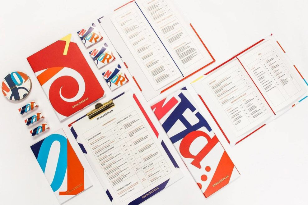
These menus, pamphlets and accompanying materials are full of life, energy, and greatness. With color, shape, and typography these stunning prints stand out from the crowd.
Bright colors, exciting swirls, and dynamic movement elevates this design to a level far beyond the usual menus you see at your local restaurant, and it sells.

These Spanjorskan Prints & Branding Materials Use Bright Colors and Flowing Shapes To Engage Visitors
Top-notch print designers have a keen eye for putting together meaningful colors and unconventional compositions to grab the viewer's attention. In this case, the combination of bright colors, fun shapes, and surprising typography is hard to ignore, impossible to miss, and demand your full attention once they catch your eye.
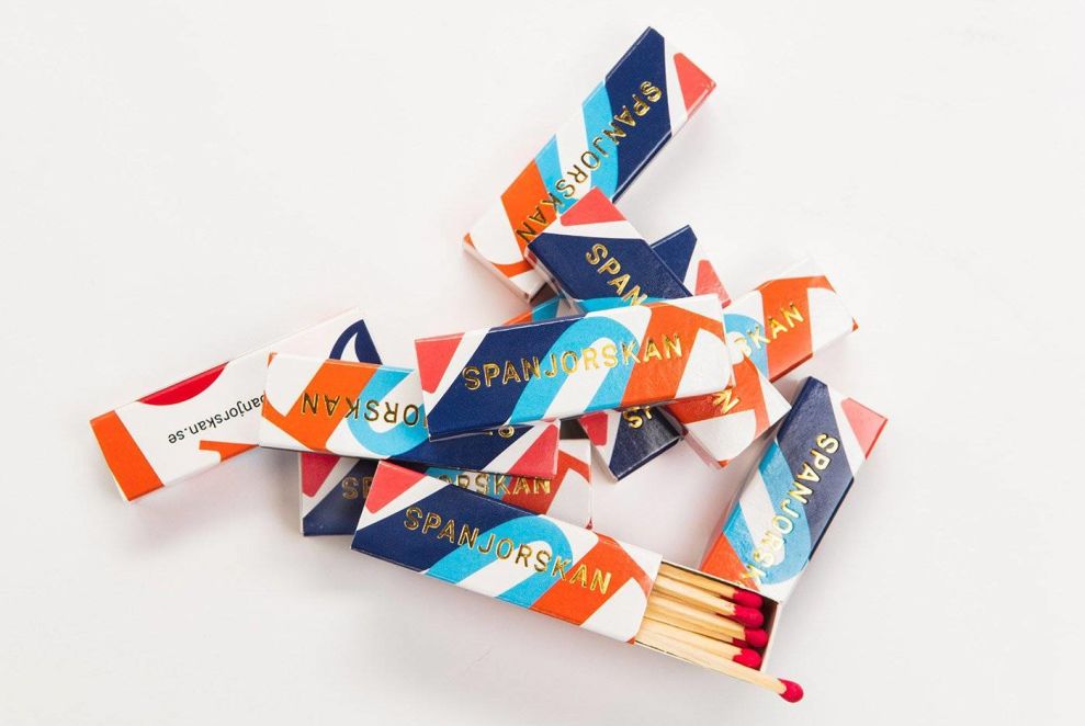
On menus, materials and business cards, the name of the brand is written out in multicolored letters that are written in fluid and funky ways. These shapes dance around the design. They are scattered and fresh and creative.
This adds a layer of movement to the design. The shapes that dance along these pages are dynamic and fresh. It's clean and bright and strong.
The shape of these letters changes, as does the color used to create them and the way they're written out -- varying between uppercase and lowercase all over.
The main colors used in this design include reds, oranges, pinks, and blues. They are layered over the design and make up the typography -- in both the brand name and on the menu.
But these colors also make up the background designs of a lot of these materials. They call to the brand's Spanish inspiration and influences.
There's an authenticity and a heritage to this design thanks to the lively colors and deep use of color.
A shiny, gold foil layers over these designs with the brand name in a more regal and sophisticated way. It's enthusiastic. It's strong. It's bold.
Swirls and twirls make up the design when the use of letters isn't involved. It's smooth and inviting. It's bold and daring.
These designs walk the fine line and strike the perfect balance of creative and sophisticated -- and that's because they're determined. They're prominent. They have a purpose and make a statement with intention.
These designs engage on a personal level, and they take this brand from just a simple restaurant to one with authority, honor, and heritage. With these designs in place, it's obvious that this restaurant cares about the food it makes and the clients they cater to.
Spanjorskan’s Swirling, Colorful Print Designs Make A Stunning Statement
These print designs are mesmerizing. They are bright, colorful and vivid. They are engaging, exciting and fun. Whether reading through the menu or snagging a playful token as you leave, the colors inspire and the shapes make you smile.
From the enthusiastic use of rich colors that are reminiscent of the lively Spanish spirit to the funky and fresh shapes and words created from the colorful shades, this print design concept shines. It is a testament to branding experts' ability to add a touch of playfulness to the design while staying true to the brand's core identity.
Who wouldn't want to get lost in the swirls and twirls while sitting down for a gorgeous and hearty meal made with heart and soul.
To match the beautiful dishes, exotic drinks and tantalizing mood of this restaurant as a whole, the design team at Lobby Design went with an out of the box design that's flirty, silly and nostalgic.
Calling back to its Spanish roots, this design truly stands the test of time, combining heritage and authenticity in a creative and excellent way.


