- Advertising
- Aerospace
- Agriculture
- Architecture
- Arts & Recreation
- Automotive
- Banking & Finance
- Content & News
- Distribution
- E-Commerce & Retail
- Education
- Engineering
- Entertainment
- Fashion & Beauty
- Food & Beverage
- Government
- Health & Wellness
- Hospitality
- Legal & Insurance
- Luxury
- Manufacturing
- Medical & Pharmacy
- Non-Profit
- Professional Services
- Real Estate
- Sports & Leisure
- Technology
- Travel

Spotify’s Music Streaming Logo Design Is Instantly Recognizable
Spotify is one of the most popular music streaming apps in the world. It was launched in 2006 as a digital music streaming service where users can stream millions of songs, discover new tracks, build a music collection, or create customized playlists.
As of this year, the company is valued at $16 billion — further proving its wild and exciting success as a music, podcast and video streaming company.
Spotify is an app that’s available worldwide, with functionality on a wide range of devices and operating systems. For further inspiration on app design and development, check out our curated list of top app development companies and what they have to offer. Spotify really has taken the world by storm in the decade since its conception.
In May of 2018, Spotify had about 170 million active users every month — that’s 170 million people listening to their favorite true crime podcasts, downloading the latest top 40 albums and watching new music videos.
Spotify has a lot to offer its growing audience, and in 2014, they knew they needed to give their logo a facelift to match the modern edge the company was beginning to foster. The result was an exciting and vibrant design that was as eye-catching as it was simple.

Spotify’s Iconic Emblem Emphasizes Simplicity, Cleanliness And Minimalism
Spotify’s logo has seen a few different variations over the years, but largely the overall concept of the design has remained the same. The latest edition, however, has a modern and chic edge to it that makes it stand out against competing music streaming services.
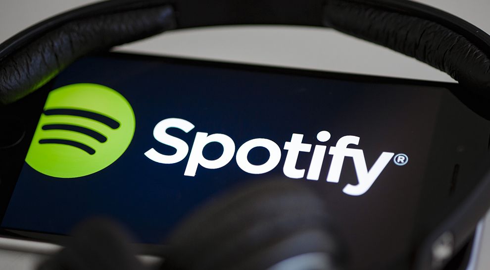
The Spotify logo is simple, clean and minimal. It consists of a green circle with three frequency waves inside which immediately give the viewer the association of sound and movement.
The green circle of the design is bright, exciting and clean. It’s a very clear and crisp shape that allows the illustration within to really stand out.
Overall, this bright, clean and simple design is a timeless display of creativity, determination and excitement.
Simplicity in logo design allows a brand to increase their marketing opportunities in a variety of different formats. This eliminates any chance of the brand symbol losing or warping its identity when placed in different mediums such as print and digital.
The logo comes in three colors: black, white, and green. Green reveals a positive and modern feel. Black is used to convey power or authority as well as elegance and the future. White is used as a contrasting tool, with green and black. This directs attention to the text and important messages.
In 2014, Spotify decided to change its logo and possess a new identity. The visual expression that followed was designed by Collins, one of the leading NYC branding agencies.
Collins designed multiple color schemes for Spotify's newly-designed logo.
Imagine the feeling of pure happiness. You’re playing your Spotify playlists with an unprecedented amount of songs. Then, as the night unfolds, your favorite song comes on. You are bursting with emotion.
Collins wanted to create a brand identity system that correlated visually with the bursting experience, saying:
Research showed 75% of Millennials value meaning over wealth. Historically, music has been the go to source for it. But as the Internet made music more abundant, that emotional connection decayed. No longer sitting in their room captivated by an album, most people use music as background noise while doing chores. Spotify wanted to restore that deeper, more meaningful connection – or as the strategy declared, “Make music personal, again.” When a song profoundly resonates with you, what happens? You cry. You cheer. You scream. You laugh. Or, as we put it, you burst with emotion. Our brand identity system aimed to be the visual corollary to this “bursting” experience.
And the results were phenomenal. This logo is responsive, enthusiastic and bold. There isn’t any chaos or confusion in this design, though it is unique and creative enough to stand on its own and make an astounding impact.
It’s so perfectly designed that it sits beautifully on all mediums and materials — from its app design to its website and beyond, this logo is modern, clean and fresh — giving a carefree and exuberant vibe to the brand as a whole.

Spotify’s Logo Establishes The Brand As A Modern Industry Leader
Top-rated logo design companies share one philosophy: Good logos are easy to remember. The best logos are fun and exciting and captivating. Timeless logos are all of the above!
They’re everywhere, all the time. The best logo designs refuse to be ignored, forgotten or lost in the crowd.
And it’s this repetition — this act of seeing the logo over and over again — that makes the logo familiar and iconic.
Spotify achieves this in a variety of ways — from its app design to its website and its advertisements that line subway walls. Spotify’s upgraded logo is bright, exciting and hard to ignore. The bright green dares you to dig deeper, and the overall cleanliness of the design adds a class and sophistication that aligns Spotify as a leader in the music streaming industry.
Spotify is a clean and crisp logo design that further pushes Spotify leagues ahead of the competition.
- Industries:Arts & Recreation Entertainment Technology
- Tags:Abstract Minimal


