First impressions last on the World Wide Web, especially for startup businesses aiming to solidify their name online. A good website design plays a crucial role not just in communicating their vision and values as brand owners but also in presenting their products and services.
To effectively convince potential customers to buy, startup companies don’t need to create flashy graphics or loud visuals. And while there is no correct template, the best way to go is to have a straightforward and user-friendly design. Enter the best web design companies!
Here are the 8 best startup website designs in 2023 that leave a lasting impression on your site visitors.
Table of Contents
1. More Millimeter by Say Hey

Standout Features:
- Sticky minimalist contact icons
- Dark-themed website design
- Widescreen video plays on a loop
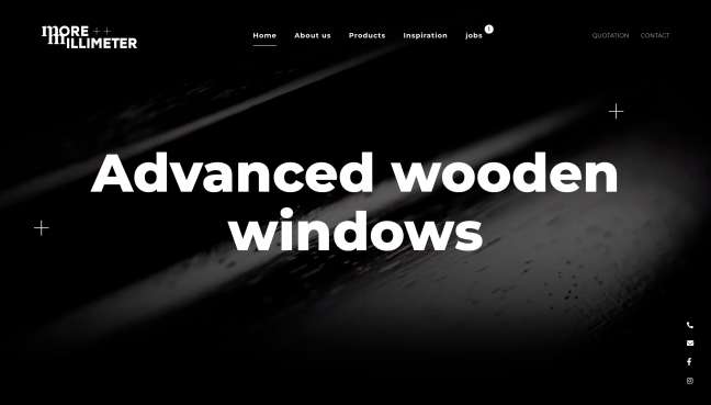
More Millimeter is a company based in Germany that designs, produces, and installs wooden doors and windows.
Its website design by Say Hey is as polished as its products.
Since it is imperative to showcase the quality of their products, the agency made sure to include high-resolution images and creative videos.
When you scroll down a little just below the header, you’ll find an appealing interactive product information section. This section talks about the client’s production methods, materials, and product quality.
Going dark-themed with this startup website design is an A+ choice.
The black background adds a beautiful contrast to the client’s assets and product displays. These images easily pop out because of the dark design.
On the header and middle section of the homepage, visitors can stop and watch videos showing the company’s production process. These on-loop widescreen videos play automatically when scrolled upon. The agency added a text overlay on the mid-section video as a finishing touch.
Another small but commendable detail the designers did with this website design is the sticky contact and social media icons at the lower right corner.
The minimalist icons for the client’s company phone number, email, Facebook and Instagram pages are displayed vertically. The icon colors change between black and white depending on the background.
2. ZeBrand

Standout Features:
- Mousemove parallax effect
- Colorful abstract shapes
- Attractive typefaces that blend well with the design
“Fun” is the word to describe this startup website design. From its colors and illustrations to the website transitions, ZeBrand really proved they deserve a spot as one of the best designs on this list.
ZeBrand is a brand-building platform that specializes in storytelling and design. Their website design successfully displays their creativity and originality to potential clients.
Right off the bat, site visitors are greeted with a huge hero text that says “Build, grow, and manage your brand” almost filling the entire screen. This chunk of text follows the user’s mouse movement – moving left, right, upward, and downward depending on where the cursor goes.
The website design for this startup company is also decorated with colorful abstract shapes in vibrant colors of red, green, blue, pink, purple, and mustard. These shapes float in the grayish-white background.
But the cuteness doesn’t stop there. The rest of the website is adorned with clouds, stars, and colorful fonts, too.
The designers incorporated soft, rounded typefaces to blend with the light and fun website design. Unlike other websites, the agency is very keen on showing how vibrant the brand is. They’re not afraid to use different styles and colors in texts. Plus, they are more experimental in presenting various design elements such as images and icons.
Overall, ZeBrand’s website is an eye-catching and unique take on startup website designs.
3. Attio by Ana Moreno

Standout Features:
- Customer testimonials in marquee animation
- Longer scroll experience on the homepage
- Monochromatic approach
The Attio website design by Ana Moreno is simple, sleek, and neat.
The agency leaned on the monochromatic approach with the design. Black, white, and gray shades dominate the website, with occasional pops of color on the inner pages.
What sets this apart from other startup websites is the slim horizontal call-to-action (CTA) that almost stretches through the screen size. This displays Attio’s latest announcement with a “Read More” button that leads to the whole article.
Just below the hero copy is a preview of the dashboard in dark mode which turns to light mode upon scrolling.
The agency added customer testimonials and media features in a Twitter-like layout with marquee animation. This is another unique element that’s especially beneficial for startup companies like Attio. Each block is linked to either a tweet, published writeup, or client review.
All in all, the client’s website design is comprehensive and informative. The agency managed to squeeze in all the details about the product without overwhelming the visitors.
This Client Relationship Management (CRM) platform is presented in detail under the “How it Works” section on the homepage. It’s divided into three different parts: Sync, Build and Collaborate.
Signup CTAs are creatively scattered on the pages too. With a distinct blue color, site visitors surely won’t miss it!
4. Mysa Skincare by Shape

Standout Features:
- Clean and minimalist design
- High-resolution images
- Embedded Instagram grid
Mysa Skincare radiates in this website design by Shape.
The design leaves no room for guessing because it’s clear and concise. Right from the get-go, visitors know what kind of products are sold, starting with the split header design in teal. On the left is the copy that says, “The only skincare products you’re ever going to need.” It is parallel to a creative product shot of their Hand Wash product.
This header alternates two versions: one in teal and another in off-white. The second version features the Lip Oil with the copy, “Enriched with amazing natural ingredients,” plus a “View Products” CTA button.
Since this startup website is an eCommerce platform, product images and lifestyle shots populate the site.
There’s a product section on the homepage that displays some of the client’s items, prices, and brief introduction copy. Four products are showcased horizontally and browsed by dragging your mouse from left to right. This is signaled by a circular cursor with the word “DRAG” in it.
To introduce natural oil-based skincare products to the market, the agency capitalized on high-resolution images, informative copy, and testimonials.
Before reaching the footer section, there’s a horizontal grid of images sourced from the client’s Instagram account. These photos add more human elements and candidness to the website. Even with just a few images displayed, it’s already enough to balance the overly curated product shots on the site.
5. Proptech Platform by Lazarev Agency

Standout Features:
- Streamlined and clear process
- Great web layout for user experience
- Adaptive design
Lazarev Agency brought solutions to the table in this project.
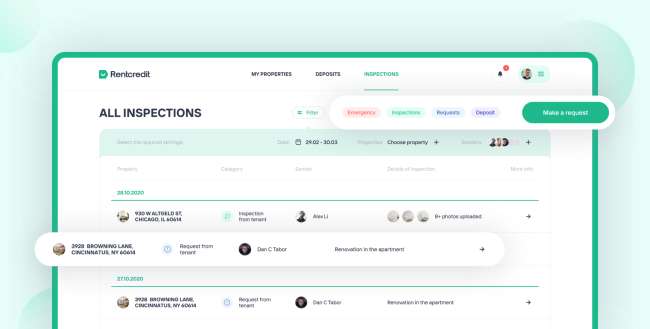
Specializing in designing, creating, and maintaining startup products, Lazarev developed this Proptech Platform for RentCredit with flying colors.
The app navigation is this design's edge.
Although the homepage is packed with information, everything is easily accessible from thereon. It’s intuitive enough to let users know exactly where to go and which functions to click.
The agency followed the minimalist approach in using graphics. Combined with a simple color palette, the overall design looks easy on the eyes and doesn't overwhelm its viewers.
Ultimately, the adaptive design pays attention to the product features. The agency made it a point to highlight its relevance and value.
The app design effectively simplifies the process of renting, inspecting real estate, and payment, while making sure that the app looks professional.
6. Resbite by Creamos

Standout Features:
- Cartoon animations decorate the whole website
- Pastel colors
- Interactive content sections
Creamos carried out a minimalist design that flaunts cartoon animations across the website. The pastel colors scattered throughout the site, especially on some section blocks, make everything look light and inviting.
A lot of whitespaces on the design provide just enough breathing room for all the content and animation present on the website.
Having plenty of whitespaces isn't necessarily a bad thing, especially on this design, since the agency did well in balancing everything. It helped improve user experience and urged visitors to focus on the most important details.
Additionally, the animations and short video clips covering Resbite's mission are also a nice touch to their content.
As for the typography, the agency incorporated only one type of font with variations in sizes and colors.
Another feature worth mentioning is the interactive content section. Scrolling through the site, you will encounter a content block with right and left arrows that allow you to read more. This move is an excellent way to keep visitors engaged.
The design might look simple at first glance, but the animation makes it come alive. This design approach didn't sacrifice usability in favor of visuals.
Overall, we expect this cutesy approach to remain timely over the years. Trends come and go, but Creamos did a wonderful job of ensuring Resbite stays relevant over time.
7. Zoey by Klein Media

Standout Features:
- Paint brush-style accents
- Colorful geometric patterns
- Simple menu navigation
Zoey is a company that focuses on creating an empathic digital environment. And Klein Media stepped up to bring this vision into an artistically appealing website design.
The agency combined colorful geometric patterns with paint-brush style accents and high-quality team photos to bring out the fun yet professional side of the brand.
Visitors are greeted with bright and warm colors of blue, yellow, and orange. Scrolling down gives an instant sense of ease since UI/UX design is taken as the number one priority here.
Paint-brush style backgrounds in blocks of content also serve as visual aids that provide a dash of color as it informs. These paintbrush strokes are also distributed in other parts of the page as design accents, lessening whitespace.
The three-button menu navigation is clear and direct, making it easier for visitors to learn about the brand and contact them easily.
That said, the effective design of Zoey fulfills its intended function. Particular messages are conveyed well while engaging the visitor altogether. Consistency, colors, images, and tasteful typography, wrapped in a simple package contribute to the effective website design.
Klein Media successfully builds trust and guides visitors through the standout features mentioned.
8. Just Bottle by Attila Vaszka

Standout Features:
- Seamless transition
- Embedded videos on inner pages
- Magazine-style layout
Just Bottle develops high-quality and environmentally friendly products. The company’s founders, Sam and Millie, are dedicated to reducing single-use plastic items on the market. From the brand name itself, they aim to create “just” and morally right bottles for use.
And their website design presents this vision perfectly.
Attila Vaszka, the creative mind behind this design, is a multidisciplinary designer focused on website design and visual development. The freelance designer shares the company’s passion for making a greener world.
For eCommerce websites like Just Bottle, they created a product-centric layout while still giving the visitors a front-row seat to the brand’s cause. Browsing through the inner pages of this of of the best startup website designs feels like reading a magazine. They included high-resolution and wide shots of nature, especially the ocean, along with brief content.
The headers are the scene-stealers in this design. Attila added unique image headers per page coupled with a one-liner tagline that instantly draws the audience in. When switching from one page to another, you will notice a seamless transition on these headers. The images are designed to smoothly pan to the left, while the overlaid texts slide in.
The shop page looks refreshing, too. The items are well-spaced from each other, while the product information sits legibly below each image. In the footer section, several payment options are displayed for easier transactions.


