- Home
- Best Designs
- Best Website Designs
- Taji Maji
- 404
- About Page
- Black and White
- Blog
- Check Out Page
- Clean / Minimal
- Colorful
- Corporate
- Footer
- Form
- Fullscreen
- Horizontal Layout
- Illustrated
- Images / Gallery
- Landing Page
- Masthead
- Menu
- Microinteractions
- Motion Effects
- Parallax Effects
- Pop Ups
- Portfolio
- Pro-loaders
- Product Listing Page
- Services Page
- Slider / Module
- Sound / Music
- Storytelling
- Typography
- Unusual Layout
- Use of Infographics
- Advertising
- Aerospace
- Agriculture
- Architecture
- Arts & Recreation
- Automotive
- Banking & Finance
- Content & News
- Distribution
- E-Commerce & Retail
- Education
- Engineering
- Entertainment
- Fashion & Beauty
- Food & Beverage
- Government
- Health & Wellness
- Hospitality
- Legal & Insurance
- Luxury
- Manufacturing
- Medical & Pharmacy
- Non-Profit
- Professional Services
- Real Estate
- Sports & Leisure
- Technology
- Travel

Japanese flower and crepe shop Taji Maji presents a web design that uses colorful imagery to entice their users. Their unique approach to enlightening simplicity and their frequent use of subtle effects both enhance the UX interface, drawing each user into their beautiful products.
The design is a single-page site, which allows users to explore without having to click through too many pages. The initial image is placed against a white background to draw attention to the beautiful artwork. It uses a vertical menu on either side of the painting that is noticeable without crowding the rest of the content or becoming overbearing. On the right is the restaurant menu and shop information, and on the left side of the image is the artist’s credits.
Users can scroll a bit to see two arrow buttons on the bottom left corner. The arrows allow users to browse through the artwork, which changes and turns in a way that mimics the pages of a book. The three-dimensional effects on the page give a unique approach to sharing a lot of information at once.
As the users experiment with the side scroll gallery, they’ll end up browsing through the restaurant’s menu. When different menu items are presented, the artwork also changes. This enhances the user experience by allowing viewers to learn about each of Taji Maji’s menu items. Check out our article on the best restaurant menu designs here.
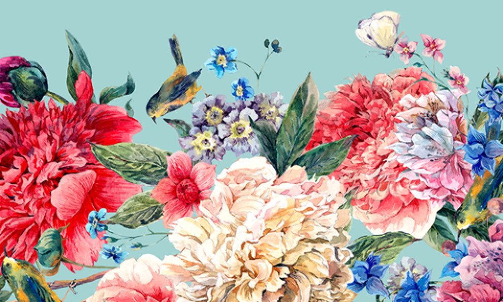
As the users move through Taji Maji’s menu, traditionally painted flowers become the central focus on each page. Intertwined with each flower is the first letter of the menu item. It is a bold combination that creates an interesting first impression for users. The location of the flower art moves between the right and the left side depending on what page the users are on. This choice creates diversity while the users are viewing the menu.
Each menu page relies on multiple sized fonts to create variations on the page being viewed. Bold letter and even Japanese traditional writing play a big role in these differences.
When users click on the menu button, a modal window will open. The full-screen site menu is placed against a blue backdrop. The background features a faded image of the artwork on the home page, and although enticing, it doesn’t distract from the quality of the entire page. Users can click on a menu item, which will guide them to the item’s description on the home page.
The “About” section of the website contributes to the UX interface by offering minimal content and getting straight to the point. The large, bold typeface works well with the background image, and it draws the user’s attention to the content on the page. Incorporated into the “About” section, the website includes a minimally detailed map of where the restaurant is located.
Taji Maji’s website combines its industry with artistry. Its original design and use of subtle, yet beautiful, artwork allow users to experience the company’s culture while also capturing the attention of potential customers.
Taji Maji is an innovative website design in the Arts & Recreation industry.


