The English Bus Website Takes Guided Tour To A Whole New Level
The English Bus is a family-run business that provides guided tours in the UK and Europe. This dynamic team of travel-hungry individuals has been ranked number one on Tripadvisor for five years in a row, providing comprehensive and exciting tour experiences to tourists and locals alike.
This small family business gives its customers an authentic and intimate tour experience, never taking on more than 16 guests per tour. They are dedicated to providing tourists with the best experience possible and only provide the most authentic and trustworthy information about these destinations possible.
Their current rating on Tripadvisors is five stars, with reviews touting their passion, dedication and exuberance. This family eats, sleeps and breaths travel and UK history, and they make sure visitors feel it.
This group of fun-loving, travel-hungry heroes needed a website design that matches this enthusiasm and carefree nature. They needed a website design that was exciting, captivating and engaging.
They wanted to convey, in as few words as possible, the power of their tours and their excellence as leaders in the UK tour industry. As a result, they created a website design that was fun, dynamic and hard to ignore.
I’m obviously not in the right space financial to book a trip overseas, but after looking through this site, I have to admit it’s hard to resist.

The English Bus Website Design Uses Video And Imagery To Captivate
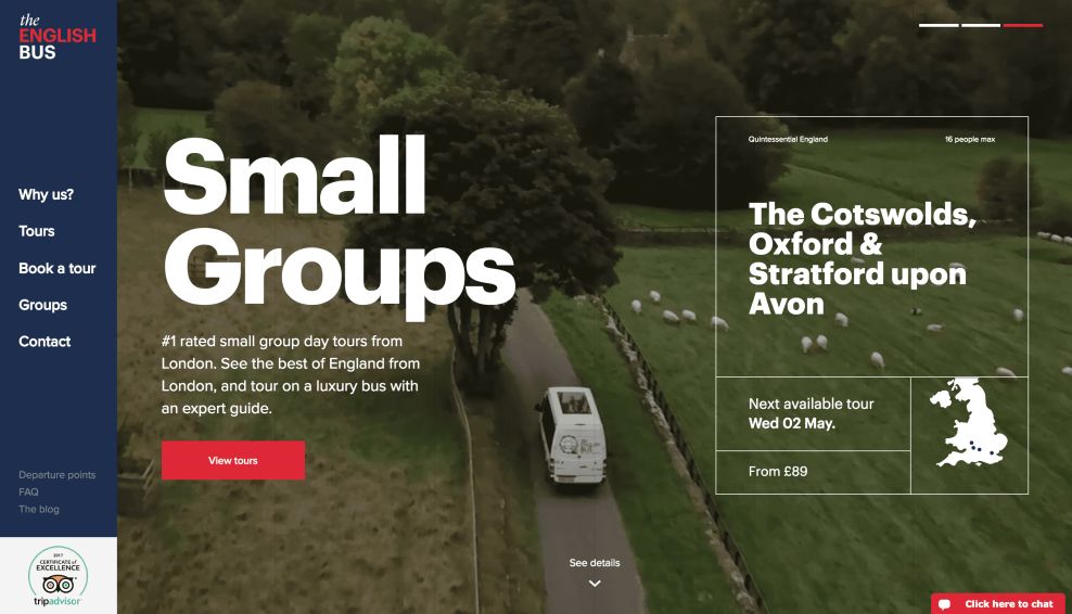
When you enter this site, you’re greeted with a stunning and effective video that plays, taking you on a journey through one of their many tours. It’s enlightening and insightful and engaging.
And it doesn’t stop there.
There are a range of videos that slide along the screen, giving you a glimpse into what this brand is, where their passion comes from and what their tours are like. They urge you to take the jump and join them.
These video are professional, fun and focused. They give you a sneak peek and compel you to join in.
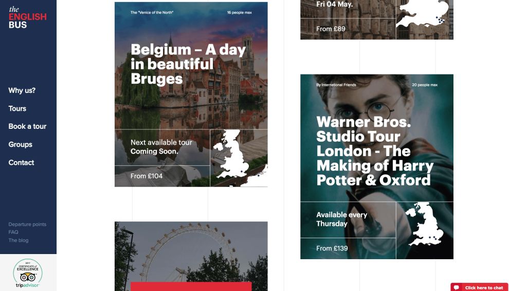
Similarly, the photographs on the website are engaging and impactful. These images slide in and give you insights into all of the tours you could possible want to join in on. They display this tour guide brand and all the destinations they have to offer.
These images add a personality and a personal, intimate touch to the website. And so does the color scheme, which is made up of whites, blues and red — much like the flag of the United Kingdom. This is fitting, since that’s where the company is based and that’s where most of their tours begin and end.
These photos, videos and colors add another layer to the design and make it extremely approachable and fun. These design elements change how you think about guided tours, and make you ready to book your next one.
The English Bus’s Site Plays With Motion And Animation To Keep Users Scrolling
The animations and movement of the webpage elements add a fun and dynamic layer to this design that takes you on a journey and keeps you involved until the very end.
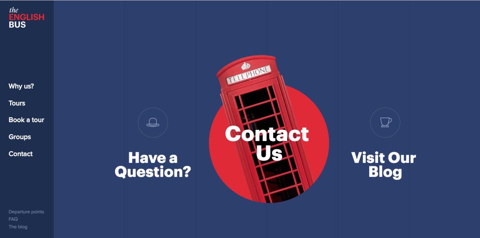
Images slide in, pop up and fold along the screen. This movement catches your eye and draw your attention to different aspects of the site — from the videos that play to the destinations they offer, and even to certain landing pages like the contact page and the brand blog.
This movement adds a playful edge to the website and the brand as a whole. It’s engaging and gun. Users are guided through the cities they’re urged to visit and the journey provides all the necessary info they could possibly require.
Typography And CTAs Grab Attention In The English Bus Site Design
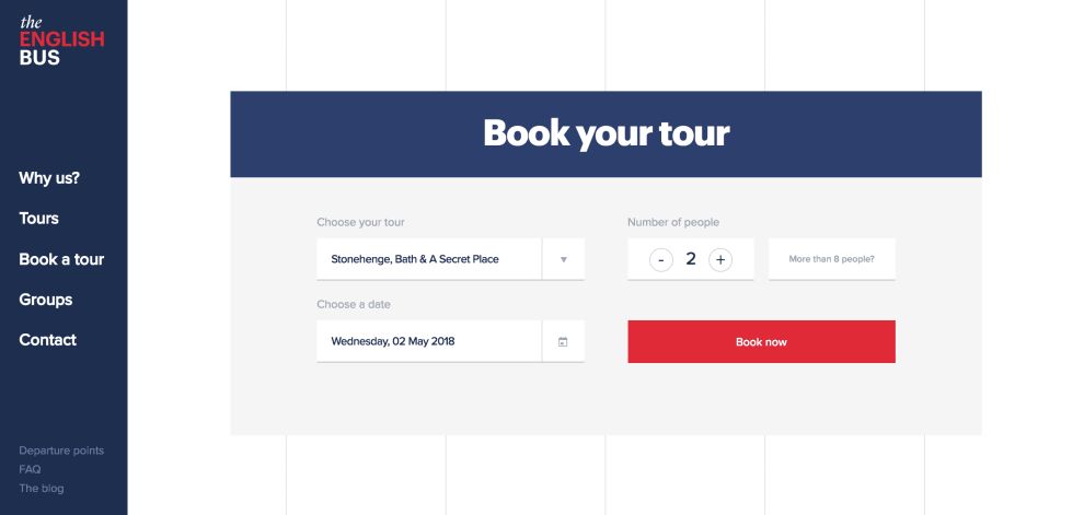
CTAs are also very clear and apparent thanks to bold typography and impactful images.
The text is clear, concise and punctuated. Images are crisp and calls to action are intuitive and clear to see.
A chatbox is even available to give user more information and answer any questions and concerns they might have.
There is a clear purpose to the text and CTAs that you see. They give people limited options, keeping the decisions to the minimum and the concerns to a minimum as well. There is no question or anxiety when it comes to where the tours begin or end, how to book or where to look to learn more.
The English Bus Digital Site Makes Taking Your Next UK Getaway Even Easier
The English Bus website makes travel even more fun than it already is. Tours can be boring and lifeless — I myself have never been a fan of guided tours, but this design and the dynamic elements included within have certainly changed my mind.
From the captivating videos that automatically play at the top of the screen, to the sliding effects that throw more engaging videos and images your way, you can really see what it would be like to take one these tours.
This plus the movement included keep you intimately engaged. Images pop up, slide in and appear out of nowhere. Animations dance around and pop up once you hover over icons. This adds to the fun factor, giving guided tours a facelift.
The red, blue and white color scheme matches the flag of the UK, and perfectly ties in this brand and its roots.
This is a family-run business, after all, and this design captures that without looking unprofessional or outdated.
The CTAs are clear, and the journey is seamless along this single-page design. There’s no question that you’ll want to book your own tour by the time you’ve finished scrolling.
This modern and playful website design turns guided tours on their heads, and you’ll be lucky if you leave the site without booking a trip for your next vacation getaway.


