
The rustic look of these coffee bags makes The Fresh Market’s artisan coffee feel more wholesome and “real” than the glossy bags of other coffee bean roasters. Still, the design has a modern feel to it, and it certainly captures the eye.
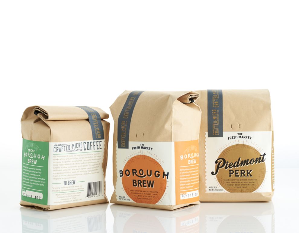
Each label features a similar design with the only differentiator between the subvarieties being color and typography. This gives the brand a feel of consistency across all packaging types, while still making it easy for customers to choose the coffee they love.
A bright, colorful circle that almost looks like a stylized sun emblazons the label. It’s a great choice because so many people choose coffee to wake them up each morning. The typography is playful and fun. There is also a unique, white drop shadow that makes the font feel like it has some depth, almost as if it is hovering above the colorful circle.

An artisan coffee should feel as though it has a bit of a vintage vibe to it. The Fresh Market’s artisan coffee packaging certainly accomplishes just that. The brown bag, clean design, and unique typography make this coffee container stand out, while also staying true to an artisan, wholesome feeling.
The Fresh Market Artisan Coffee is a top packaging design in the Food & Beverage industry.


