TripAdvisor's App Design Takes The Stress Out Of Mobile Travel Booking
TripAdvisor is a popular travel booking site that allows users to book hotels, flights and entire trips based on customer reviews and customized travel guides.
The brand prides itself on accumulating in-depth information about destinations, hotels and restaurants so users can create a travel experience that's right for them.
From interactive travel forums to user-generated content, TripAdvisor takes its users and their opinions seriously.
Headquartered in Needham, Massachusettes, this travel company was founded in 2000. In these 18 years, the brand has amassed more than 315 million members and 500 million reviews -- for restaurants, hotels, services and more.
TripAdvisor now stands as the premier travel site, with its own approval and rating process that elevates the businesses and hotels it reviews.
Top destinations get the TripAdvisor seal of approval, proving that this brand is a leader in the travel industry.
The company has learned a lot over the years. But its biggest strength is its ability to give users the experience they're looking for with ease and satisfaction.
The TripAdvisor user experience is simple, intuitive and smart. And their mobile app design follows the same streamlined navigation and engaging interface.
The TripAdvisor Mobile App Is Organized And Clean
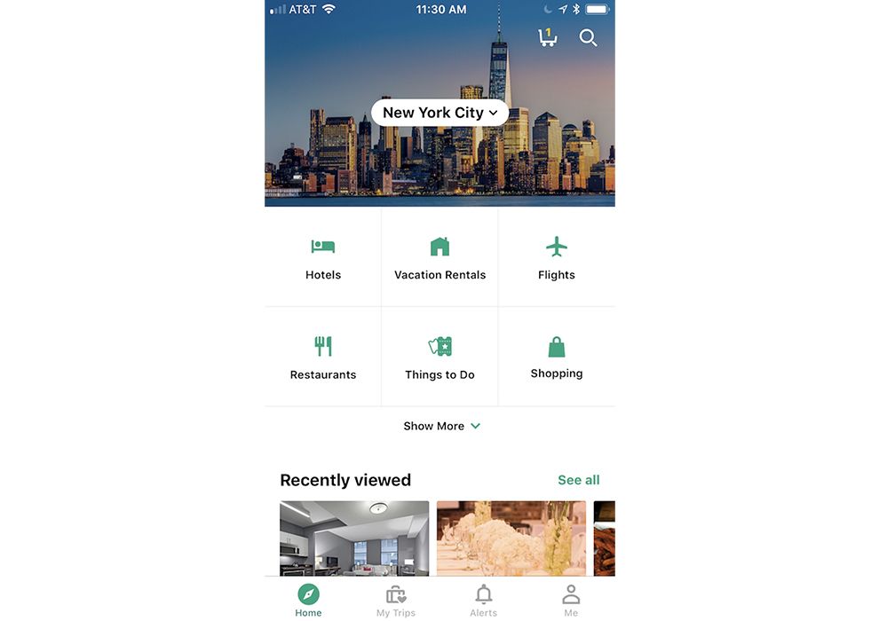
Crisp, bright and focused -- the TripAdvisor app has mastered the art of orientation and layout in app design.
With clear, bold illustrations that guide users to different landing pages, a focus on cityscapes and destination photography and a menu bar that is always visible, users have no problem jumping from page to page to get the information they need.
This app lays out in content in a clear and creative way. There's a grid where users can choose what exactly they want to book -- whether its a hotel, a flight or a restaurant. There's a simple drop-down option where users can make the destination decision. And beneath, there are a multitude of rows that break down popular restaurants, hotels, attractions and activities.
This, combined with a simple navigation menu at the bottom of the screen, fit with cute illustrations, further emphasizes TripAdvisor's dedication to creating a streamlined UX that puts users at ease while simultaneously allowing them to choose from a wide variety of different travel booking options.
This layout is clean, clear and crisp. There is plenty of white space that adds a pleasing and open vibe to the app, and plenty of imagery to add depth and purpose.

TripAdvisor's App Makes Use Of Stunning Photography And Creative Imagery To Ease Navigation Chaos
To aid in the beautify of this app's layout and organization, the team also included a variety of images and photographs that add a personality and an attention-grabbing nature to this already stunning mobile design.
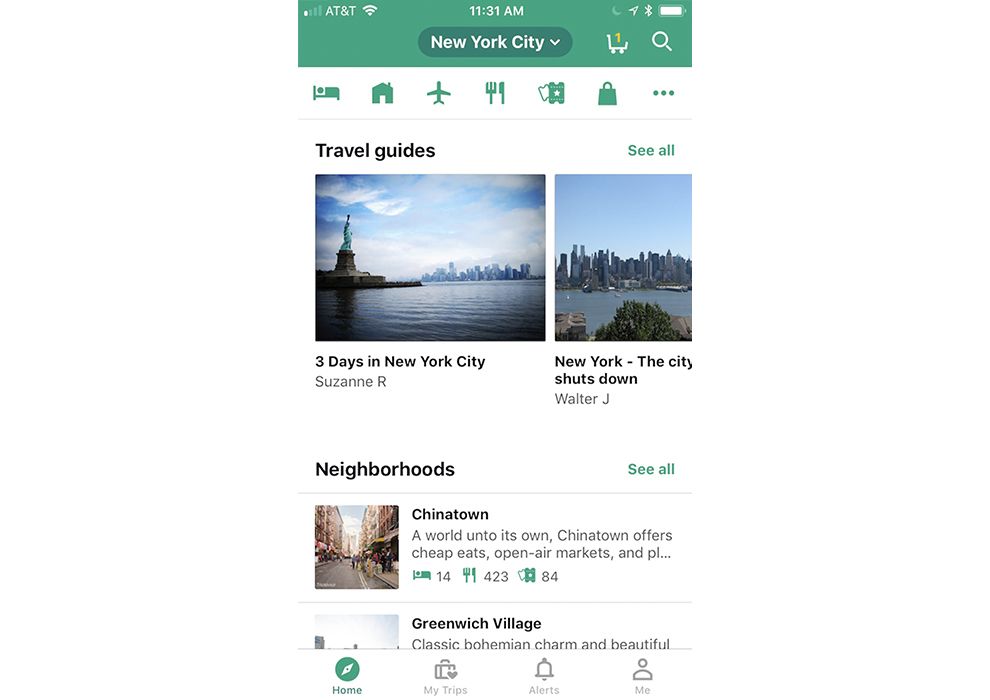
This app makes use of bright and bold icons at the top of the screen and the bottom to create a navigation system that puts the user in control. They can decide to book trips by hotel, flight or food choice -- keeping track of their choices just as easily.
Users also can check up on their trips, set alerts and check into their account from this menu bar.
And the best part? This bar is always visible for users to see and access.
Similarly, imagery plays a major role throughout the app design. In other sections, photographs take center stage, giving users a glimpse into the destination attractions they can choose from.
There are restaurant shots, cityscapes, user pictures and more littered along this design that give it a very personal and customized feel.
There's no denying these images standout and add a friendliness to the overall design that helps users navigate throughout the app.
The TripAdvisor Mobile Platform Is Intuitive, Engaging And Comprehensive
From it's exciting use of color, to its emphasis on whitespace, the layout of the TripAdvisor app is clean, engaging and exciting.
The overall organization is simple and streamlined. The app makes use of clean space, simple typography and powerful copy to provide users with the information they need right where they need it.
Similarly, the use of photography and imagery is extremely strong and resolute. Sections are broken down in a clean and clear way, with large images and a grid-like structure that takes users from point A to point B with ease.
The illustrations that line the menu bar also add a friendliness to this design. They add an intuitive and engaging aspect that helps users navigate throughout the site -- from the restaurants they're interested in to the flights they are interested in booking and more.
With bright green colors, cute and interactive illustrations, a streamlined layout and bold photography, the TripAdvisor app leads users throughout its user-friendly design in a way that eliminates stress and maximizes satisfaction.
This app strikes a pleasing balance -- it's comprehensive, content-focused and full of vital information, but it's also clean, simple and minimal in a way that makes absorbing all of this information quick and easy.


