
The Uber Logo, A Tech Story
Uber is a unicorn startup that’s synonymous with the tech boom of the last 10 years. There’s only a tiny handful of companies that are as celebrated for shaking up the technology industry.
Uber has achieved a whopping $61 billion in valuation. Let’s take a look at how this great company does logo design.
Uber Logo: A Brief History
For a startup working on ride-sharing, design would seem to be a distant consideration. Uber, however, sees things differently. The company places great importance on design and prides itself on their logo.
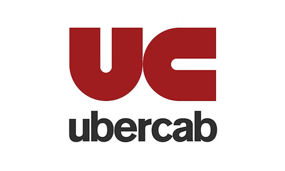
The UberCab Logo
Uber started out as UberCab. The company’s logo at this time was a red magnet facing two different directions (above). The magnet signified the ability of users to summon a private ride at will. In addition, the UberCab logo also appeared like the initials “UC,” for UberCab.
That first logo, circa 2010, also featured a black lowercase sans-serif font. The company’s brand name sat atop the initials. Not long after, the company’s logo changed, eliminating “Cab” from the text. This started the trend towards a shorter, simpler logo.
Uber Logo - The 2012 Version
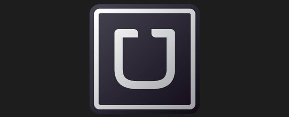
Uber would change its logo again, this time in 2012. The new logo shifted radically from the red magnet to a sleek version of the letter “U.” The change was popular with riders and would last until 2016.
The 2012 logo had elegant, prominent typography. With just a single letter, Uber was able to capture a couple of important things:
- The company name - “U” is the first letter in “Uber”. This made it easy to identify the logo with the company.
- The company’s motto - “U” also stands for “you”. The new Uber, distinct from UberCab, was emphasizing its motto: “Everyone’s private driver.” The focus here was on “everyone.”
Hints of luxury in this logo helped establish Uber as a luxury riding brand. Black is a great background color for this purpose. It’s deep, and the lack of brightness is soothing in an authoritative way. Paired with silver lettering, the combination created a distinct image of luxury.
Dissecting The Modern Uber Logo
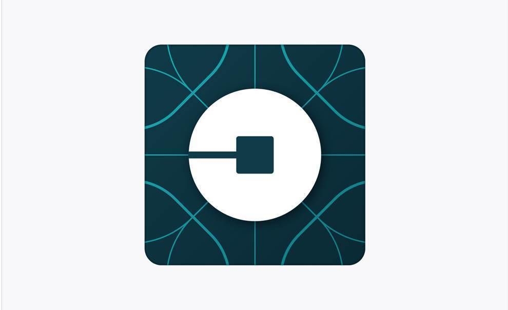
The latest Uber logo design, created in 2016, features a white circle against a dark, square background. It’s as radical a change as the previous logo, maybe more so. Since it totally drops the name or initials of the company, these were the changes that surprised people the most.
Uber Logo's Bits And Atoms
Whereas the previous logo associated easily with the company’s name, the new one is more abstract. The 2016 Uber logo completely dispensed with text.
The company ditched the iconic “U” lettering for an ultra-modern and sleek new image.
This new logo is regularly referred to as the “bits and atoms” logo. It shows a bit highlighted in white against the background of an atom. Blue lines crisscross in the background. There’s an element of motion in the combination. It’s an eye-catching design, even if it is not terribly complicated.
The block is symmetrical, with a lightly-etched axis splitting the whole into four quarters. It conveys a scientific precision that casts the company in a positive light. The fleeting imagery of bits and atoms is aspirational and creates an impression of still more great tech to come.
What The Uber Logo Design Says About The Company
Most CEOs would trust design to a branding consultant or some other authority in the market. At Uber, however, this was not the case. This new Uber logo design was created in-house, at the behest of former CEO Travis Kalanick. Kalanick personally worked with Shalin Amin, head of Uber’s design team, on the logo.
The team decided the new Uber logo had to showcase what they saw as the most important characteristics of Uber the company:
- grounded
- populist
- inspiring
- highly evolved
- elevated
The Uber logo that emerged captures these features well, especially the “populist” one. Atoms and bits are popular images of progress in Silicon Valley. It’s almost as if Uber was bidding to become the poster child of scientific progress.
The logo’s focus on bits and atoms seems unusual for a ride-sharing company until you consider where Uber is headed.
In its press release at the time, Uber said:
“Uber started out as everyone’s private driver. Today we aspire to make transportation as reliable as running water, everywhere and for everyone.”
As it becomes more of a global company than ever before in its history, Uber is adapting to local cultures. Its app, therefore feature different color palettes in certain countries. Former CEO Travis Kalanick, involved in the choice of design colors, had this to say:
"In Mexico, we were inspired by Mexican pink and the patterns in the local tiles; in Ireland, from the Georgian architecture and the lush greens; and in Nigeria, from the ankara, which came up again and again because of its bright colors and beautiful geometric patterns."
Uber Logo And Drivers: How They Go Together
Uber also provides a strong service to its drivers with their own app. This is consistent with its strategy for the future. It allows drivers to specific ride details, navigate with ease and even contact Uber representatives with questions.
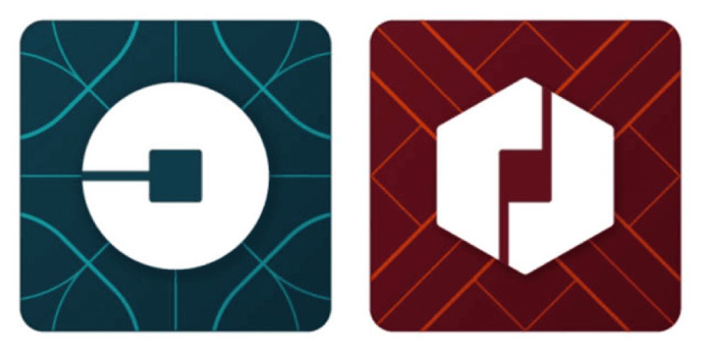
Thus, the new logo for Uber’s “Driver" app (above right) takes a similarly high-tech approach.
The driver's logo features two white, interlocking halves of a hexagon. The red-brown background has lines reminiscent of electronic circuit diagrams. Users have come to associate such imagery with the fast-paced tech culture of Silicon Valley.
With this logo, Uber signals that it’s a company that will continue to be on the cutting edge. The bold white shape in center stage compliments this image as well. Uber and drivers are the two halves that will bring more innovation to many customers around the world.

The Uber Logo Updates Again
Although the bits and atoms still influence the modern Uber logo, they have since gotten rid of the green and red hues, rooting their design in solid black and white. According to the design team, this allows the logo to be more flexible with new pictures and various colors for partnerships and events, while still remaining clean and accessible.

Uber's Logo Design Might Change In The Future
The Uber logo has gone through multiple evolutions since its start. That trend is sure to continue in the future. As Uber moves to play a bigger role in the broader economy, we can expect another radical change in logo design some years from now.
What’s next? Maybe a new logo showing how self-driving cars will play a role in the movement of people? Needless to say, this is one company with a passion for design, and one that will be worth watching.


