
Verizon Communications is holding company that offers wireless products and services to over 146 million subscribers. Verizon is the largest wireless telecom provider in the United States and is ranked no. 14 on the Fortune 500 list.
Can you hear me now? Good!
The company was created in 2000 as a result of a merger that unified Bell Atlantic and GTE. The outcome was a company that adopted its name as a portmanteau of veritas and horizon.
In 2015, Verizon bought AOL in a stunning $4.4 billion purchase. They needed to revamp their visual identity to coincide with future brand acquisitions.
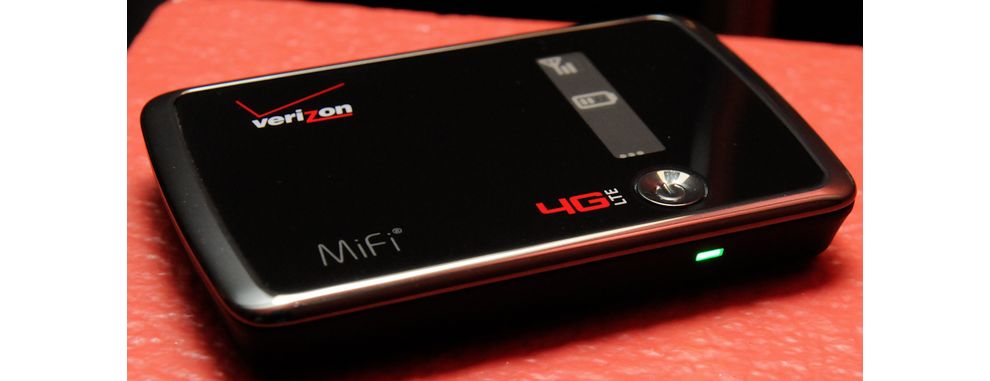
Design firm Pentagram led the project. The complexity of the original logo presented a challenge. It contained a modified italic typeface and a styled “z” — two colors. At times, the v was above the name, or next to it—it was tremendously difficult to reproduce in different media settings.
The new logo had to represent the drastic changein the way we’ve communicated over the last 15 years. Verizon has changed a lot as well.

Pentagram wanted to cherish Verizon’s core values of simplicity, reliability and dedication to its 146 million subscribers. To accomplish this task, Pentagram chose the Neue Haas Grotesk typeface, which was fine-tuned by Christian Schwartz of Commercial Type.
The red color is accented in a more luminous and neat hue. And the “v” is now a check mark. The checkmark is universally viewed as a symbol for the accomplishment of tasks. They nailed it. The checkmark acts as a sign-off and endorsement of the Verizon name. Verizon gets things done.
Verizon now has a logo that demonstrates their retention of modernity, simplicity, and reliability whilst they continue to thrust forward into new frontiers and new industries.
Mission accomplished: Check.
Verizon is a simple logo design in the technology industry.


