
Webflow is an increasingly popular tool that makes creating professional-looking custom websites easier for designers. Gone are the days when coding skills were required to design a stunning website.
Web-based programs allow Webflow website designers to worry less about the technical stuff and work more towards bringing their creative ideas to life (Find out how website builders benefit your blog)!
Designer or not, you can maximize Webflow’s visual canvas, easy-to-use tools, and customizable features. Use it to create and launch your online presence: may it be a landing page for your product, a portfolio for your work, or an entire website for your business.
Created by some of the best web designers in the industry these 8 best Webflow websites possess all the qualities of a modern website: out-of-the-box layouts, unique interactions, and responsive designs!
Table of Contents
1. SPCE Group by Attila Vaszka

Standout Features:
- Comprehensive homepage content
- Animated website elements
- Clean and fluid site layout
SPCE is an integrated real estate software that offers a seamless property management experience. From maximizing customer experience to boosting profitability, the tool has it all!
Their website is surprisingly clean, cohesive, and convenient for a platform loaded with many features and functionalities. All thanks to Attila Vaskza’s excellent design skills!
The homepage features a spread of everything users need to know about SPCE. The first sections provide a macro view of the platform and how it can help real estate professionals streamline their workflow and reach their goals.
The video slider is particularly helpful, especially for visual learners!
Site visitors can take a quick tour of the platform through feature walkthroughs, dashboard snapshots, and bite-sized information. There’s also a dedicated section for their cloud-based ecosystem, #TheGrid, where users can learn about the platform by interacting with the feature sliders, menu buttons, and so on.
Plus, the designer leveraged animation to bring visual elements to life – a great way to modernize the website and engage the viewers!
2. Gramado Summit 2023 by Duck Design Studio

Standout Features:
- Interactive content blocks
- Big and bold typography
- Straightforward messaging
As the biggest brainstorming event in Latin America, Gramado Summit 2023 deserves no less than a well-crafted website that entices participants to join in. With this Webflow website design by Duck Design Studio, the networking event will surely attract an army of content warriors.
The site layout is modern, sleek, and straightforward yet creative and interactive!
The hero banner displays the essential details, including the title, dates, and location. Right off the bat, users can instantly learn about the event without exploring other pages. A large “buy my ticket” CTA button engages the site visitor from the get-go! Learn more about designing CTA buttons here.
Also, displaying the text in a big and bold sans serif font grabs the attention and sends the message loud and clear. This bold typography is applied to the rest of the sections, making the content easier to read and understand.
Interactive content blocks also do wonders for the website in terms of aesthetics and functionality. The pop-up image and video blocks, text description containers, and animated site crawlers add an extra flavor to the site’s modern character.
3. HundredPixels
Standout Features:
- Dark-to-light themed UI
- Animated icons and cursors
- Large typography with clean layouts
HundredPixels is a Copenhagen-based digital product designer specializing in Webflow, among others. What better way to showcase that expertise than a beautifully-designed Webflow website?
Upon entry, site visitors can immediately learn about the designer’s specialization through a short and sweet bio description on the banner written in a large and wide typeface. The typography leaves no room for confusion!
The site layout is dressed in a pitch-black interface that transitions into a light theme as you scroll down.
The monochromatic color story makes for a clean and streamlined look – a modern site! And for a pop of color, the designer added a shade of vibrant purple, which complements the layout very well.
The designer also integrated animation to bring site elements to life. The animated image blocks, icons, cursors, and crawlers created a fun and edgy character for the site.
Clean layout + clear and easy-to-read content + dynamic visuals. That’s the recipe for a stunning Webflow website design!
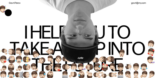
4. Gavril Perov
Standout Features:
- Comprehensive website animation
- Greyscale theme with vibrant touches
- Magazine-style content layout
If you’re looking for ideas to make your portfolio webpage stand out, you can take inspiration from Gavril Perov’s Webflow-designed website.
It uses big and bold messaging, unconventional layouts, and heavy animation – a sure-fire design combo to attract potential clients!
The site banner features a sizeable inverted image of the designer that overlays the critical brand statement and value proposition. They also added a bunch of Animojis in different expressions, instantly giving the impression that the expert is fun, approachable, and easy to work with.
Then, the animation show begins from there. It starts with the cursor, which drags a snake-like figure when you move it around the website – not distracting, but definitely entertaining! Additionally, the image blocks move like a vortex, and the menu lines dangle like little strings when you hover over them.
Finally, the magazine-style presentation of images and text descriptions adds a modern and artistic touch to the site layout. Check out some of the best magazine website designs.
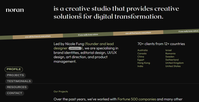
5. Noran Design
Standout Features:
- Single-page website layout
- Simple and intuitive design
- Dark theme with earthy colors
Noran Design’s website gives visitors an easy browsing experience with a modern and chic interface.
The site uses a single-page layout to convey everything about the design agency: its area of specialization, company background, clientele, and so on!
With this design, users don’t have to jump from one page to another to learn more about the agency. The banner alone already displays all the essentials: who Noran is, what they do, and their clients and locations.
The animated crawler that bears the brand statement is also a great touch! It reads, “if one really loves nature, one will find beauty anywhere.”
This brand character is appropriately incorporated into the design using earthy, muted colors like green, beige, and brown. They surprised us by marrying these colors with a dark theme, a style choice we rarely see in web design!
While the website only uses a single page, users won’t have difficulty scrolling through a long webpage. Because of additional navigation buttons, it’s easier for site visitors to jump to a specific section.
6. West Stringfellow by Karpi Studio

Standout Features:
- Responsive design
- Dynamic website animations and transitions
- Bold typography with bullet descriptions
Business websites usually use a more straightforward and industrial layout to convey their professional identity. Well, West Stringfellow is a cut above the rest. As a leader who helps businesses grow through innovation, his website shows exactly how innovative he is.
All thanks to Karpi Studio’s proven Webflow design expertise!
Instead of the usual banner with a navigation menu, the website’s header section features an outrageous image of West Stringfellow with space-themed sticker illustrations. A singular menu button opens up a full navigation page containing the site’s sections.
Creative animations elevate the site’s layout and add life to the website’s visual elements, from the sidebar crawler filled with engaging slogans to the arc-style CTA buttons.
Visual transitions also create movement and interaction between various site elements, making the browsing experience even more satisfying.
The bold typography made all the content blocks scannable and digestible. Plus, the bullet descriptions offer a more effortless reading experience!
7. PrettyDamnQuick by studio&more

Standout Features:
- Parallax scrolling
- Badge-style illustrations
- Animated text and content blocks
One of the best webflow websites is PrettyDamnQuick, a modern logistics brand that means business. Its brand messaging is clear and straightforward, yet still very playful, approachable, and fun – something studio&more beautifully translated through this Webflow-designed website.
The secret? Website animation!
Entering the site is like stepping into a world where logistics is “made damn simple.” The banner features a miniature illustration of a city where shipments move fast and smoothly, clearly representing how efficient PrettyDamnQuick truly is.
But that’s not all. Scrolling further down, site visitors can have a grand time interacting with the animated titles, menus, sections, and more! They used a parallax scrolling technique to make the visuals more dynamic and the overall user experience more immersive.
Badge-style icons, 2D illustrations, and framed text blocks also add a modern touch to the site’s layout. Not only do they look good, but they also break the monotony in texts and enhance the site content’s readability.
Lastly, the elements are dressed in bright and vibrant colors, making the website even more visually striking!
8. Bazil

Standout Features:
- Parallax scrolling design
- Simple homepage with comprehensive content
- Multiple navigation options
Paris-based web designer and photographer Bazil did a fantastic job creating this portfolio website with Webflow, and here’s why.
The site opens with a straightforward homepage containing just the key elements. A professional portrait, the field of expertise, and the navigation menu with a contact button.
That’s it! No further scrolling – just a simple single page that houses everything potential clients and collaborators need to explore more about Bazil’s work.
The main navigation is divided into two sections: the artist’s web design and photography background. Several navigation modules are set in place to make it easier for site visitors to learn more. There are CTA buttons, clickable text, and menu options that all lead to the same pages.
The portfolio page is where the actual interactive scrolling begins. It contains comprehensive information about the artist’s projects, neatly organized in sliders, content blocks, and magazine-style layouts.
The website also features parallax scrolling, so visitors can interact with the content as they scroll further into the website.


