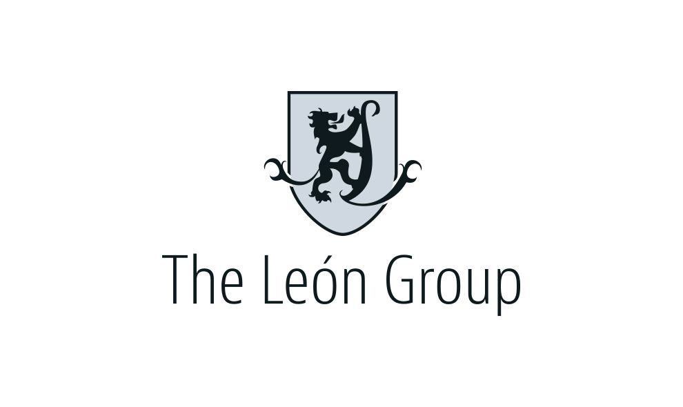
The Leon Group logo exhales tradition and heritage while maintaining modern flare and a contemporary message, which is exactly what this company is all about. Based on the family crest of the owners -- the Leon family -- this logo showcases a stylistic monogram of the letter L held by a lion (leon), surrounded by a shield. This evokes feelings of trust, care, and safety, making the bold statement that the company is durable and inviting, and giving peace of mind to clients. The work with The Leon Group is to be in good hands.

This symbol is paired up with a tall, slim, modern font that represents the group's business goals -- always moving forward, innovating, and implementing the latest technologies and techniques. The logo contains both dark blue and sky blue, which continues to communicate that sense of trust and state-of-the-art solution.
In several circumstances, this logo can be found in silver, which adds an air of high-end luxury to a different audience (one of which is in the Hamptons, New York). The Leon Group's logo pleases the company's audience and makes a strong statement.
Leon Group is a classic logo design in the real estate industry.


