
Mindwork is a New York-based therapy collective. The logo designer for Mindwork had a difficult task; they had to create something interesting, while still respecting the seriousness of the work that Mindwork does. The result is a clean, simple logo that clearly conveys Mindwork’s goal.
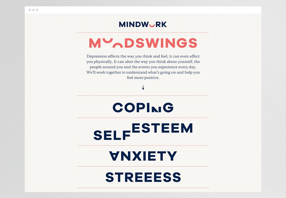
The typeface is a bold, black, sans serif font. There is nothing wildly creative about this; it’s simple, serious, and it stands out. The “O” in mindwork is the only stylized part of the logo. It has been cut in half and highlighted in red. The idea is to have it look like a smile—a simple but powerful statement about the work that Mindwork does for their patients.
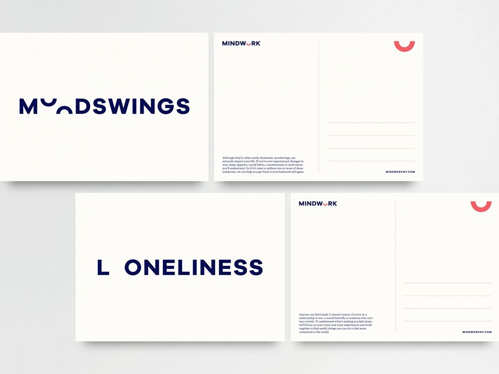
Their bold, simple design translates well to a variety of applications, including business cards. The black typeface with red accents jumps off the white background. Viewers can see that the “smile” used for the “O” can be displayed on its own as an alternate logo. After seeing it sandwiched between bold text, it’s interesting to see the smile stand on its own and keep the same brand identity for Mindwork.
Therapy is obviously serious business. Mindwork had to be careful not to choose a logo that would make light of the serious mental health issues that some of their patients deal with. Still, they didn’t want a logo that’s too serious or too dark, as it could convey that they aren’t good at their job. The result is a simple but effective logo that you can recognize anywhere.
Mindwork is a bold logo design in the professional services industry.


