Best Design Categories
Best Technology Logo Designs of 2024
View the Top Technology Logo Designs Below
Industries
- Advertising
- Aerospace
- Agriculture
- Architecture
- Arts & Recreation
- Automotive
- Banking & Finance
- Content & News
- Distribution
- E-Commerce & Retail
- Education
- Engineering
- Entertainment
- Fashion & Beauty
- Food & Beverage
- Government
- Health & Wellness
- Hospitality
- Legal & Insurance
- Luxury
- Manufacturing
- Medical & Pharmacy
- Non-Profit
- Professional Services
- Real Estate
- Sports & Leisure
- Technology
- Travel
- Witness the skillful balance of cutting-edge design with recognizable, accessible imagery in this collection of technology logos
- Learn how logo designs foster strong brand recognition while maintaining the distinct characteristics of the tech industry
- Get inspired by the best technology logo designs showcasing innovation and a blend of simplicity and complexity
Best Logo Designs 2023 - 2024


 MediumMedium's logo features a simple black-and-white design. It combines a modern 'M' monogram with lowercase letters for a sleek, contemporary look.3,112Visit Site
 YoutubeYouTube's logo redesign emphasizes a red play button icon, shifting focus from "Tube" to a modernized, clean, and flexible design across different screen sizes.3,125Visit Site
 Magic LeapA playful and mysterious logo design makes Magic Leap an organization to watch.3,520Visit Site
 ShypShyp's logo is a bold, elegant wordmark with a green slash, reflecting the brand's efficient, customer-focused approach to shipping.2,363
 Function EngineeringDark, bold and mysterious, the Function Engineering logo design looks like it was forged from the earth itself.3,016Visit Site
 SnapchatSimple, wordless and strong — Snapchat’s logo design is a powerful image that even non-Snapchat users recognize.18,182Visit Site

 SendGridWhen someone first looks at the logo, the blue squares pop out. Within the squares are two arrows which symbolize communication. The overlapping represents engagement. Dark blue squares on the outside of the logo are messages each party is sending.2,404Visit Site
 IBM Blue MixThree multicolored hexagons in blue, green, and black with an inner white circle and 3D pyramid combine to conjure the logo symbol.1,800Visit Site
 CedrusThe logo was created by Inkbot Design. Two stand out features include a gorgeous #3156F5 blue and the unique typeface. The custom logotype exhibits rounded lines and a cutting-edge feel for a company that sells products in over 70 countries.2,820Visit Site
 Radiate IncThe Radiate Inc. logo contains a connectivity symbol, all capital letters, large font spacing, and a green font color2,578Visit Site
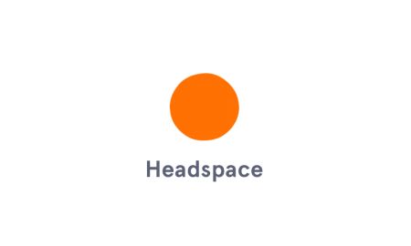 HeadspaceThe Headspace logo is an orange dot, symbolizing the feeling of being centered and calm, completely on brand with the identity of the company.12,514Visit Site
 AirbnbAirbnb is a great logo design in the eCommerce and retail, hospitality, and travel industries.10,622Visit Site
 LyftLyft has an iconic logo design that mixes vivid colors with an instantly recognizable company wordmark.14,934Visit Site
 Stripe Logo DesignThe Stripe logo is a wordmark. While accomplished logo design companies seldom use purple for commercial services, this specific hue captures the brand's essence, clearly indicating Stripe’s forward-thinking product development.11,421Visit Site
 ZiplineThis logo is clever, relevant, and symmetrical. The red represents the vaccines, medicine, and blood that its fleet of Zips delivers across Rwanda.5,934Visit Site
 Blue ApronLogo designed by Frank CollectiveThe italicized nature of the BJS logo emphasizes the modern and dynamic feel of the company itself.5,392Visit Site
 IntelThe swirl is smooth and sleek and blue. The use of blue in this logo communicates trustworthiness — a trait that must be taken seriously, for the computer chip that powers hundreds of millions of devices.7,930Visit Site
 General ElectricTwo simple letters flow together inside a broader swirly blue mark that bends in at each navigational direction as if they are on a compass.13,663Visit Site
 ExxonMobilSimplicity is beauty. We can see it here in three crucial design elements: the crossing x’s, the red color, and the tagline “Energy lives here.”8,365Visit Site
 CiscoTheiconic symbol incorporates storytelling, as the bridge represents the company’s roots in the bay area.8,141Visit Site


