
When creating a bottle label for Friends of Friends Wine, the designers at Co-Partnership were faced with a big challenge: to make the brand stand out next to other premium wines. If you stroll through your local wine cellar, the options tend to follow a traditional label design. Friends of Friends took that classic label design and added their own flair.

In the super premium wine market, it’s hard to find a wine that tastes bad. Using their brand image, Friends of Friends Wine had seem distinct among other incredible-tasting wines. The result is a colorful design that uses the tried and true wine label as a canvas.
Bright, colorful characters mingle on the label. The contrast is very stark, and the typography is in-line with what you would find on other premium wines. A script font spells out the brand name, and their logo is situated between Latin words. That’s where the traditional wine label ends, and the Friends of Friends brand takes over. Colorful characters are scattered about the label, almost as if a cartoon party has accidentally invaded a wine label printing press. They add a much-needed touch of fun and personality.
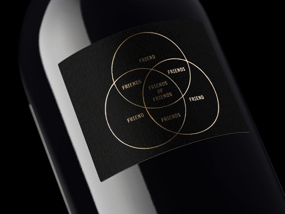
On the back side is an alternate version of the logo. It’s black and gold to further accentuate the premium quality of Friends of Friends Wine.
For those that take their wine seriously and want their bottle to reflect that, there are a hundred brands with a classic, premium wine appearance. Friends of Friends Wine is trying to attract those that take their wine seriously, but don’t take themselves too seriously. The combination of tradition and fun definitely makes this products stand out among its competitors.
Friends of Friends Wine is an illustrated packaging design in the Food & Beverage industry.


