
Hardy’s Packaging Design Promotes The Brand In A Clean And Stunning Way
Hardy is a Portuguese seafood brand that infuses German influences into its smoked salmon and seafood products. And it’s a brand with a strong heritage and a family legacy that can hit its consumers on a personal level.
According to the brand itself:
Hardy is an experience. A product that binds together history, adventure, tradition, locality, fusion and innovation. Whether grown in the cold Norwegian sea or on the shores of the wild Scottish coast, what matters is quality. Our Salmon grows under careful respect for its kind and for the environment. The best waters combined with healthy food ensure a safe and valuable product which is the keystone for our philosophy. It is of upmost importance that we know our fish.
The man behind the Hardy brand was Eberhardt Horst Dams, known as Hardy by his friends and family. He was a seafood connoisseur and was known for the impeccable recipes he would pass along and teach to his family. And one family member kept a record of these masterful concoctions, so he decided to create an entire company to bring these creations back to life. And with that heart and soul in mind, Hardy’s was born.
It’s a brand dedicated to using natural ingredients and only using the best in its products. It’s a seafood company that wants to inspire and excite through food — and it wants to infuse all of the elements its family heritage can offer.
But with good food, comes good design. Hopefully, at least. So Hardy turned to design studio This Is Pacifica to create a packaging and overall brand identity that captured the history, heritage and wonder this brand wanted to promote.
This Is Pacifica had this to say about the Hardy brand — a brand with a strong history and an impactful message:
Hardy is an experience. A product that binds together history, adventure, tradition, locality, fusion and innovation. Hardy is a heritage of time, with a contemporary flavour: smoked salmon according to a German smoke formula and Portuguese knowledge. The signature communicates the legacy, tradition and mastery that the product reveals.
The resulting packaging captures this essence, it captures this persona and creates with it a dynamic and innovative brand identity that elevates these products tenfold. From its boxes to its print materials, this design soars above the result, solidifying the Hardy name as a leader and an authentic producer of fine fish products.
All it takes is one look and you’re sold.

The Hardy Packaging Utilizes Traditional Materials To Elevate Product Authenticity
Hardy is a brand known for its seafood. It packages sustainable, unmodified and all-natural seafood products. And it’s a brand known for its trustworthiness and authenticity. To emulate that, the creatives at This Is Pacific decided to go with a design that put these initiatives first, creating a one-of-a-kind packaging that looks nothing like traditional seafood product packaging.
These products come wrapped in unique, branded materials that elevate the products and promote them as elegant, trustworthy items.
The fish is wrapped in delicate, natural and illustrated paper with the company branding drawn all over it. This shows an attention to detail and an authority in the industry — this brand can take the time to package its products with grace and sophistication, so they must put that same passion and ambition into their products and how they gather them.
Similarly, these products are encased in a solid, geometric and sturdy brown box. It looks trustworthy, reliable and strong. It’s not thrown around haphazardly. It’s not dirty. It’s unique and powerful and organic.
And this shape and structure are equally enticing, with cutouts on the surface that heighten the design and further promote the brand and its consistent, cohesive branding.
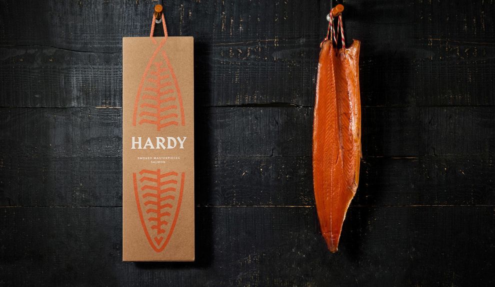
There’s also another element to these designs seen in the packaging, and in its accompanying print materials. There is coral-looking twine that works as a handle or as a tag on the top of the design. It holds the packaging up and puts it on display. It also makes these boxes easy to carry, which is a plus for many consumers.
And this twine certainly adds another layer to the design. It looks similar to the lines fishermen would use while out at sea. This makes it even more apparent that this brand and these products are aquatic in nature.
And this was intentional according to the agency:
The packaging was treated as an extension of the brand, natural and appealing. The packaging is entirely made of raw micro-corrugated cardboard with UV color printing. With a minimalist and assertive look, the packaging represents the salmon and the handle reproduces the logo loop. Two different packages have been created.The shape, materials and strucutre of this design were all intricately picked with a purpose. In one form or another, they represent the brand and promote its goals and identiy. And it does so in such a seamless and sophisticated way that the message gets delivered practically subconsciously. You don’t know whey you’re drawn to these products or this brand, but you are. And that’s the point.
Overall this clean, simple and stellar packaging brings the brand and its identity full circle. Soft, subtle and organic elements help to align this brand as a leader in its industry and tell consumers that these are products that they can trust — these are the products they need and they shouldn’t bother going anywhere else to look for them.

Hardy’s Packaging Uses Clever Illustration To Excite And Entice Consumers To Make A Purchase
But the creativity behind this packaging isn’t just in the materials used — it’s also in the color and illustrations that jump from the paper surface.
According to the agency behind these masterful designs, the Hardy packaging is a result of two powerful design considerations:
Hardy's graphic identity results from two main ideas: the use and manipulation of a strong typography that evokes a Germanic aesthetic, rigid and sharp as a cutting knife and the symbol that reproduces the Hardy process, the salmon fillet, with its texture and repetition of pattern, and a drawstring tie that binds it to the smoker. The visual representation of the fish is adapted to other fishes in the Hardy portfolio, such as the slender and longer Eel, the Mackerel (small and group) and the extension to future new products. The chromatic palette was defined with great care: the salmon orange and a deep blue exist in balance and in alternation.
As you can see, the typography and the imagery stand out — big time. The image of a fish is playfully incorporated, with cutouts that add texture and fluidity to the design. And the coral coloring drives the aquatic nature home even further.
The blue in the branding and typography matches with the clean bright white used, adding to that nautical feel and instilling a creative and exciting edge. These words are bold, brash and strong. They stand out and grab attention, but bring with them an air of whimsy that reels you in (pun intended).
The mixture of color and illustration is beautiful when set against the clean, organic background. It lets consumers know immediately what kind of brand their dealing with, and instills within them a trust in the brand as a whole.
The Hardy company does seafood — it does it well, it does it sustainably and it does it because it loves it. You can feel that through these illustrations and typography choice because they are so direct, honest and straightforward.
Hardy’s Boxes & Tags Bring Simplicity And Creativity To Seafood Packaging
Seafood packaging is generic for the most part. It comes with a few, select attributes and doesn’t do much in the way of inspiration or creativity. If this packaging has any identity at all, it comes in soft and subtle ways.
But the Hardy packaging is far from ordinary, as is the brand behind it. No, these designs inspire, engage and excite. They foster feelings of authenticity and trustworthiness — and they sure make you hungry.
It starts with the materials used — a brown, structured box with a twine-like handle. This calls back to the natural, organic nature of the product themselves. It also gives a nod to its nautical nature — the twine representing the ropes used out at sea.
Similarly, the cutouts in the shape further promote a seafood vibe in a playful and engaging way.
And the illustrations on these design stand out too. The outline of a salmon — in a modern, minimalistic and silly way — make up the design. Cutouts on the box add texture, while physical color fills in the rest of the blanks. This fish imagery is simple but compelling and further reminds you what you’re dealing with.
Typography is bold and white, taking on a whimsical and fun font to grab attention and entice. The colors used also harken back to the ocean, with blues and corals adding depth and context.
This design is fun and superior — bringing a touch of creativity to seafood packaging that’s never been seen before.


