
Ofelia makes water tasty and nutritious through a powder full of minerals and natural flavors, and its packaging strongly represents its goal. The logo is a clean sans serif typeface with a “splash” element that represents water. This logo was also designed with the idea that the “O” could be used as a standalone element (while still retaining that splash element).

Bold colors add to the vibrancy of this design. Meanwhile, colorful illustrations and 3D typefaces reflect the mood and edginess of each flavor, which entices consumers to try them all.
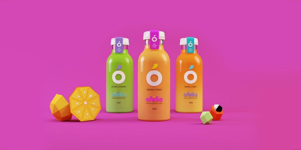
The packaging design of the pre-made drinks is simple yet effective. The brand name is prominent, and contains the main logo as well as the “o” mark. However, it would be nice to see some of the illustrations that are featured on the powdered mix incorporated into the bottle design as well. Nonetheless, these water additives and pre-made drinks are bright, fun, and different.
Ofelia is a colorful packaging design in the E-commerce & Retail and Food & Beverage industries.


