How does a luxury chocolate brand separate itself from the mass-produced options sitting on store shelves? After all, they are all wrapped up in a casing. You can’t taste, see, or smell the chocolate. The answer to setting yourself above the rest before the first taste is: packaging.

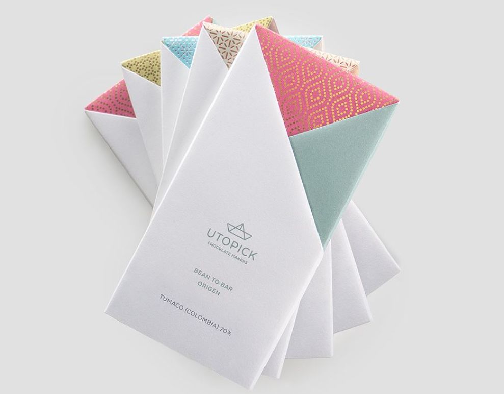
Simply by giving Utopick Chocolates a quick glance reveals that this is not some ordinary chocolate bar. The handcrafted treat is wrapped in a hand-folded paper wrapper. This is not some cheap foil. Colorful paper pokes out from behind a minimalist, white wrapper, giving each variety a unique look that’s still consistent with the brand.

Each crease in the packaging says that the ultimate care and attention has gone into their product. If a company is willing to put this much work into their packaging, then their chocolate must surely be just as amazing, right?

An added attention was put into the typeface and logo colors. They match the accent colors on the packaging. Otherwise, the white portion of the label is very minimalist and luxurious. If iPhones came in wrappers, this is how they would look.
When Utopick wanted to sell chocolate bars, they entered a very saturated market. There are a huge range of candy bar brands. However, there are very few that have this kind of attention to detail emphasized in their packaging. Hungry yet?
Utopick Chocolates is a minimalist packaging design in the Food & Beverage industry.


