
The famous proverb says we shouldn’t “judge the book by its cover.”
The same rules apply to music. Professional graphic designers specializing in creating music-focused visuals double as artists. A well-designed album cover can help the music pique the listeners' interest through its visuals. But sometimes, the design is so alluring that we get the urge to determine what these stunning visuals are supposed to depict.
And it’s all the better when the visuals perfectly fit in with the music, conveying a multimedia journey that can awaken your feelings and move you deeply. Not sure what we’re talking about? Hopefully, this article will help.
Here are some of the best album cover designs that masterfully establish the connection between what you see and what you hear:
Table of Contents
1. Broadcast The Secret Verse by Design and i

Standout Features:
- Style Combination
- Cloudy, stormy weather
- Mountain ridge
Broadcast The Secret Verse is the latest album of the UK-based artist Chris Cleverley. Chris is known for his ambient Dream-Folk that transcends the known limits of acoustic-led music in the 21st century. The cover for his latest release was designed by Design and i, imaginatively combining cool colors (using color psychology) with the soothing watercolor art style, providing a sense of “calmness in an open storm.”
The cover combines the watercolor art style depicting the cloudy, rainy sky that takes up most of the space with acrylic-like art used to portray small, faceless figures on a ridge. The blurry sky depiction tells a tale of life’s significant uncertainties, vastly greater than the size of the people on the ridge, that appears clear and detailed.
This cover design is reminiscent of a different, modern perspective of the famous Romantic painting “Wanderer above the Sea of Fog.” The setting is similar, but the roles of nature and people are reversed, commenting on the contemporary views of life. Check out the article on the best singles’ cover designs.
2. GRAVEMIND "Conduit" by Soft Surrogate

Standout Features:
- Epic glyphs
- An obelisk-like geometrical figure
- A lake in the mountains
Gravemind is a metal band based in Australia. The cover for their debut album, Conduit, was designed by Soft Surrogate, encapsulating the essence of the band’s ideas with a combination of powerful visuals endowed with mystical messaging.
The cover depicts a lake among two mountain peaks with a burning orange, a translucent obelisk-like figure hovering above the water. It’s unclear whether the cuboid figure is ascending to or descending from the water, but its inevitable motion is shown through the clouds dispersing beneath it.
The mountains and the water are dark and mysterious, much like the burning-orange centered figure. We get a peek of the sunshine, with the sun partially covered by the top left corner of the cuboid.
The mysterious visuals are enhanced with epic vertical and horizontal glyphs accompanying the typography, rounding off the strange energy of the design.
3. Brave Arrows - The Plagues by Charles Scott Creative

Standout Features:
- The negative film effect
- Morse-code patterns
- Antique art
Brave Arrows is the solo project of Michael Socrates, the guitarist of If Trees Could Talk, Artificial Astronauts, and many other bands. His latest work, The Plagues EP, is a collection of predominantly late-night basement jams. Charles Scott Creative designed the original cover for this project.
This cover design merges three visual devices to form incredible artwork, with three women in antique garments with their hands pointing up. The monochrome negative design places a thin black circle around their joint hands, indicating a dark ritualistic maneuver.
The entire right side of the panel is covered with a pattern of black dots that also reappears on the left woman's dress. These dots are accompanied by dot-and-dash glyphs above the left and right women's heads. The glyphs are frequently associated with the Morse code, so it appears that the women are trying to communicate with someone or something (find out how you can leverage bold-lettered logos to communicate with your audience).
4. Squid - Near The Westway (2021) by Lanning Sally
-content.jpg)
Standout Features:
- Abstract
- Clean
- Subtle white lines
Squid is a 5-man collective from Brighton, the UK. This Post-Punk band released an RSD (Record Store Day) exclusive EP called Near The Westway in 2021, and Lanning Sally designed the cover for this project.
The design encompasses three main elements: the green grass on the bottom, the black intersection, and the ‘cut-out’ circular sky panel. The cloudy sky meets its reflection in the center of the grass, with the visuals reflecting themselves.
While the top section surrounding the clouds is pitch-black, the space between the clouds is laced with subtle white diagonal lines. This digital abstract painting suits the sound of the record marvelously, just like the music, and then its intricate details show themselves over time.
5. Second Guessing - Tijd Verdringt LP by RAINY DAY
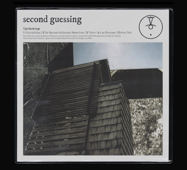
Standout Features:
- Brutalist architectural theme
- Bleak colors
- Grief and recovery symbolism
Second Guessing is a 4-man screamo/post-hardcore band from Utrecht, The Netherlands, active since 2013. Their second EP, Tijd Verdringt, tackles the themes of losing a loved one and other instances of mental decay and recovery.
The cover for the record was designed by RAINY DAY, an agency that encapsulated these themes and the band’s hard sound through visuals of Dutch architecture. It masterfully portrays the (re)building of one’s mental stability after a rough patch.
The brutalist artwork goes hand in hand with the intense sound found in the record. The colors are bleak and dulled down, referencing the loss of joy and the bright worldview the person used to have before entering this state of mind.
This cover design encapsulates all the different phases of one’s mental and emotional journey through despair, perfectly complementing the tone of the audio.
Our design experts recognize the most innovative and creative designs from across the globe. Visit Design Awards to see the:
- Best Logo Designs
- Best Website Designs
- Best Video Designs
- Best Print Designs
- Best Packaging Designs
- Best App Designs
Our team also ranks agencies worldwide to help you find a qualified agency partner. Visit our Agency Directory for the top Logo Design Companies, as well as:
- Top Web Design Agencies
- Top Video Production Companies
- Top Print Design Companies
- Top Packaging Design Companies
- Top Mobile App Development Companies


