
With increased technological development, travel is easier than ever before. People are connecting across the globe in ways history could never have anticipated, and Australian airliner Qantas is helping to make it happen. By accessing a glossy, corporate site, users can discover dozens of travel options that will take them to worldwide destinations.
Vibrant photos cycle through a slideshow in the background, while easy booking tabs for flights, hotels, and transportation fill the forefront of each page. Drop-down tabs on the home page direct users to numerous other site locations where they can find global vacation spots, tourism advice, entertainment and restaurant ideas, business travel information, and so much more. Search bars respond to user interaction, and the interface maintains a clean design for customizing travel plans.
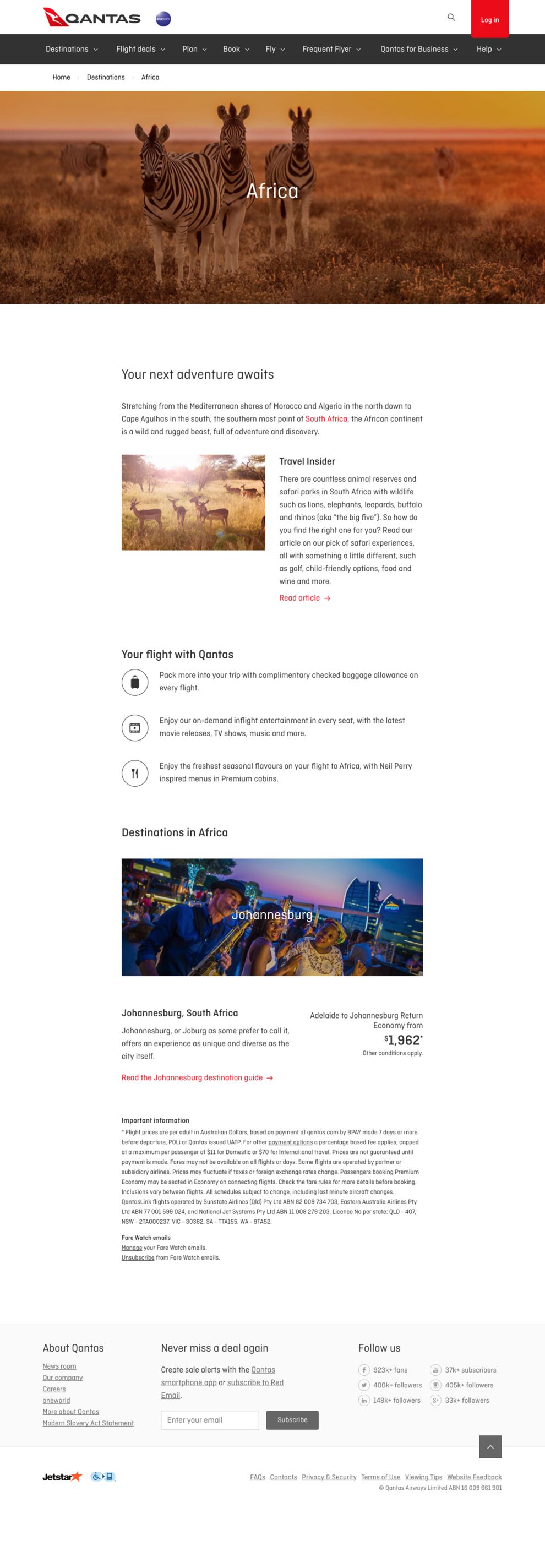
As users select various destinations that interest them, they can scroll through pages of options that detail flight and location information. Sleek digital articles are linked in the site pages, each suggesting travel ideas for users that hope to explore everywhere from the urban to the exotic. To avoid filling each page with too much text, this design also uses icons as bullet points for informative sections of the site. This approach connects users from diverse tech capabilities and ensures that anyone can enjoy all the information provided. The world is at the fingertips of Qantas’ users!

With so many exciting options for users, ranging from luxury travelers to thrifty spenders, the site could easily become overwhelming with too much information. But, designers of the Qantas website kept the options as accessible and professional as the travel experience. A stark white background fills in many of the pages across the site, and it uses simple square and rectangle text boxes to maintain consistency across each page. Whether looking for getaway cruises or sales on flight deals, users will know what to expect from the interface layout.
Bright, ambiguous red shapes break up the symmetry in the UX and provide a splash of color and creativity. These highlighted areas strategically bring attention to site features like cheap flights or links to last-minute deals. Scrolling provides users with more options for accessing travel blogs and airline member emails. The entire UX is easy to navigate, and it leaves users with the headspace to enjoy planning their upcoming adventures.
Qantas is a clean website design in the Sports & Leisure and Travel industries.


