
Last year, the global eCommerce market was forecast to reach $5.7 trillion. And this figure will keep growing, portraying the endless potential of the global retail market. With such a big cake on the table, the question arises: How do you get a piece for your brand?
There has never been a better time to enhance your presence online. But how can you increase the likelihood that you will be successful with your online consumers?
While the aspects are not predetermined, there are optimal requirements to reap the benefits of your eCommerce website design. These include working with specialized web designers to make your web design user-friendly by utilizing the best UX practices, ensuring you’ve added mobile-friendly features, extensive but not tedious product information, and much more.
But these are all words with a relatively vague meaning, so it’s best to look at some successful examples. Here are some of the best eCommerce website designs to inspire you to improve your own:
Table of Contents
1. Le Petit Olivier by Sutunam

Standout Features:
- A natural and soothing design
- A carousel-preview
- Well-balanced elements in product-placement
Le Petit Olivier is an all-natural eCommerce brand delivering cosmetic products for men and women for the last 25 years. Their website design was created by Sutunam, which provided a platform that reflects the brand’s values while maintaining simplicity and ease of access.
The balanced, pastel colors complement a well-paired font style, resulting in a soothing web design that’s pleasant to every nature-lover. You’re greeted with a carousel-product preview of the various ongoing promotions and brand and product-related news.
The product placement is excellent as it blends state-of-the-arc photography with a short description of the item. The top menu is simple, consisting of only the hamburger menu for thorough exploring and the search option right next to it.
2. Bloem & Moi by Encyphers

Standout Features:
- A cool welcoming quiz feature
- Highly legible typography
- A unique “shop by feature” option
Bloem et Moi produces and provides exclusive hemp-based tea blends for people seeking self-care and reasserting presence in every moment, helping them lead better. Encyphers designed the brand’s minimalistic and straightforward website, omitting all the unnecessary elements that might deflect the browser’s attention.
The website greets you with a picture of the organic product in a transparent jar and the ingredients scattered around it. The hero text next to the product invites you to improve your life with several self-care taglines.
The header encompasses the logo on the left and a menu guiding you to your destination next to it. Above it is a thick black line inviting you to take the brand’s self-care quiz to help you find the right product.
The typography is easy to read, with wide character spacing in the headlines. The website offers a unique “shop by feature” option, letting you pick one of the four intriguing categories.
3. Mister by MakkPress Technologies

Standout Features:
- Highly customizable products
- Minimalistic page layout
- Animated discount bar
Mister is a men’s designed jewelry eCommerce brand. MakkPress Technologies envisioned the brand’s web design as straightforward, helping customers reach the product in seconds.
This web design is built on a minimalistic page layout. The dropdown menu is on top and becomes a fixed navbar that follows you as you scroll. Above it, you can see a great animated discount bar that keeps you in the loop on all the ongoing promotions.
Before showcasing the featured products, the website lets you know that Mister has officially licensed products from several entertainment companies. Then you are presented with a catalog of the top-selling merchandise, with each product encompassing a different perspective as you hover over it.
Finally, the website encourages you to customize and make your own products. With each attribute changed the visuals adapt to your choices, letting you (re)view your item on the spot.
4. BOHECO by Kloc Technologies

Standout Features:
- A strong sense of community
- Cool illustrated elements
- A free doctor consultation
Bombay Hemp Company, or BOHECO, is a company with a plan to reimagine the future of Indian agriculture with the help of hemp and cannabis. The website design, built by Kloc Technologies, helps the brand explore and showcase the kaleidoscopic use of cannabis in agriculture.
The website design blends customized product placement and cool illustrated elements with testimonials, awards, and recognition sections. The fixed navbar helps you map out your exploration, and a blog section shows that BOHECO aims to spread awareness rather than only sell its products.
Another cool feature that emphasizes this strong sense of a learning community is the invitation to get a free consultation with a doctor to reassure you’re okay with starting your cannabis journey with the brand (Check out how these travel agencies built their website designs around the user journey).
5. Impresa Motta by Ottobix

Standout Features:
- Respectful and serious
- Photography-based categorization
- Well-branded
Impresa Motta is a funeral home that has been providing services for the residents of Milan, Italy, since 1945. Such a long tradition demands an elegant website design that emphasizes necessity rather than glamour. Ottobix successfully developed a solution that encapsulates the brand’s image.
The design is calming and decluttered, but primarily, it feels respectful and formal. The professionalism can be seen from the start, with the menu differentiating two options, one for an immediate need and one for planning ahead.
The scrolling experience blends familiar scenes in the unfortunate event depicted through high-end photography and the soothing, peaceful, and legible content blocks that help the user navigate through the website.
This web design is very well branded, as it subtly showcases the tradition and the decade-old professionalism of the brand at every step while still maintaining the focus on the customer and their needs.
6. Leather Crown by Mary Philip

Standout Features:
- A newspaper layout
- A mixture of traditional art and modern products
- The personal, handwritten typeface in the product description
Leather Crown is an Italian-based eCommerce website that sells customized sneakers for men and women. Like their products, the brand’s web design is not afraid to experiment with creativity in presenting the sneakers and the brand itself. This web design is the work of Mary Phillip.
The website is "placed" inside an old newspaper layout. Most visuals are monochrome, but if you hover over them, they become colored and, in a sense, gain new life.
Apart from the products, the visuals contain historical art pieces with tiny modern additions (like a camera around the Statue of Liberty’s neck). This blend of old and new brings a contemporary art experience, helping you envision yourself “renewed” with the brand’s sneakers. (Check out more art and illustration website designs)
The product description takes advantage of the hand-written typography, giving it that “messy” atmosphere of a sketch for a new idea. The website design sends a message to the brave and the experimental, those who want to get creative with footwear.
7. Breeo | Headless eCommerce by Bodhi
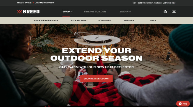
Standout Features:
- "Grillustrations"
- Stunning, high-res visuals
- Expansive purchase customization
Being a true innovator of firepit technology since 2011, Breeo aimed to expand its flame online and bring you the ultimate campfire experience in just a few clicks.
Besides your typical, proven design tactics such as a sticky menu bar and striking, on-brand color scheme, Bodhi elevated the user journey by inspiring potential buyers to play with and design their very own, custom fireplace - fire pit builder!
Essentially, the website embodies Breeo's mission - making sure everybody gets the perfect fire pit for their backyard. Visitors are encouraged to experiment and preview different materials, sizes and accessories, customizing until they've created their ideal "leisure pit."
Our design experts recognize the most innovative and creative designs from across the globe. Visit Design Awards to see the:
- Best Logo Designs
- Best Website Designs
- Best Video Designs
- Best Print Designs
- Best Packaging Designs
- Best App Designs
Our team also ranks agencies worldwide to help you find a qualified agency partner. Visit our Agency Directory for the top Logo Design Companies, as well as:
- Top Web Design Agencies
- Top Video Production Companies
- Top Print Design Companies
- Top Packaging Design Companies
- Top Mobile App Development Companies


