
A high-quality website does wonders for any business: it improves their brand recognition, increases trust with consumers, drives conversions and helps companies reach particular objectives.
In this article, we list the best website designs inspiration for 2023 (courtesy of some of the best web developers on the market) that excel in visual appeal and engagement without sacrificing substance and function.
Table of Contents
- More Awesome
- Leading Edge Manufacturing By Vibrandt Media
- Dynamic Wave Consulting By Design With Artisan
- Diemersfontein By Seventh Season
- AL Aesthetics By Creative Ideaz
- Darling Brew By Jumpin’ The Gun
- A&G Residential By JK Premier Marketing
- Bonasila
- Royce Chocolate By Arctic Grey
- Unique Blinds By Explore Agency
- The Doral Yard By The Copper Portico
- Chameleon Fitness Apparel By Creative Webs 2U
- Tomi Palonen
- Komala Vilas By Blue Hive Asia
- The Content Cliq By The Social Cliq
- Ryken By Kaizen Five
- Boulevard Marketing
- CoachPulse
- X Firm
- Maña Industries
1. More Awesome

Standout features:
- An off-beat background video
- Horizontal navigation menu
- A very simple typeface
More Awesome is a Dutch marketing and communications agency for B2B technology companies. They provide content marketing and brand strategy services to their clients.
Their website design inspiration follows the principles of a storyline-driven conversion funnel, which is a description especially applicable to its homepage. It opens with a simple value proposition and tagline (“Grow your business”) while the video background of a dog adds a bit of zaniness and a friendly tone to the brand’s voice.
As the user scrolls, the tagline/UVP changes to something new, accompanied by a few lines of messaging in a very legible font. The background changes at the section with social proof, past clients and portfolio.
The main menu navigation is located on the left-hand side of the screen. A column-layout navigation contains a hamburger menu with “Services,” “Work,” “Team” and “Blog” link items. Icons to the agency’s Twitter and Instagram pages are located at the bottom.
2. Leading Edge Manufacturing By Vibrandt Media

Standout features:
- A well-defined color palette
- Clean, industrial layout
- Sliding menu navigation
Leading Edge Manufacturing is a company providing services in design and drafting, machining, fabrication, coating and other aspects of the fabrication industry. Their website is a courtesy of Vibrandt Media creative agency.
This website design is decidedly industrial in its aesthetics, befitting the company’s market and niche. Grid graphics, images of tech equipment, precise column/rows layout and graphite gray colors all contribute to this appeal.
Above the fold is a carousel slider with five different images pointing out the five different industries this enterprise serves.
A sliding menu appears from the right while prominent, rounded CTAs entice visitors to request a quote. The homepage’s funnel itself is divided into three sections: “Our Process,” “Why Choose Us?” and “Testimonials.”
3. Dynamic Wave Consulting By Design With Artisan
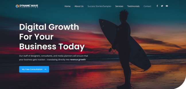
Standout features:
- Vibrant imagery above the fold
- Economic use of white space
- Generous use of CTAs
Dynamic Wave Consulting is a digital agency that specializes in design, consulting and media planning to drive their clients’ digital growth.
Their website, developed and designed by Design With Artisan, opens with a very colorful and vibrant photo of a surfer, as a play on the company’s name. A modern sans serif typeface in white contrasts the vivid colors quite clearly and the blue CTA button takes the visitor to the Free Consultation page.
Once the user begins scrolling, a colorful image is replaced with plenty of white space and a very user-centric messaging and overall UX.
Splashes of blue and orange break away from the white space. Blocks with the agency’s UVPs and services are all accompanied by a prominent CTA and an in-depth paragraph focused on the benefits of these services.
The navigation is a standard horizontal main menu at the top of the page and it disappears when the user scrolls.
4. Diemersfontein By Seventh Season

Standout features:
- Well-incorporated product pages
- Complex and thorough home page
- A wine-related color palette
Diemersfontein is a wine and country estate in South Africa that organizes wine tasting, weddings, conferences and various other types of events.
Seventh Season, a web design studio that showcased its expertise on this website, went for a very complex and detailed design, incorporating earthy colors associated with winemaking: greens, olives, browns and burgundies.
The two-level menu incorporates the contact info and main points of interest, as well as the Buy Online CTA and a cart icon.
A looping video of the estate’s countryside is in the site’s background above the fold, incorporating a few of the brand’s taglines. Scrolling down reveals an uneven layout comprised of the estate’s history and its people, harvest info, flagship wines and “Plan Your Visit” form.
When it comes to the highlight of the website, each wine’s product page is minimalist and focused on the description of the beverage and its bottle’s hi-res image.
5. AL Aesthetics By Creative Ideaz

Standout features:
- A sliding menu from the top of the page
- Plenty of CTAs
- Interactive approach to photos
AL Aesthetics is a facial aesthetics clinic by Dr. Ash Labib. Creative Ideaz agency has designed a website for his private practice that emphasizes the doctor’s experience, expertise and success with his previous clients.
This particular website design follows the best practices of using a black and white palette, letting the photographs of the clinic and patient’s facial alterations do all the talk when it comes to color and splendor. The homepage is enhanced with videos showcasing the clinic’s methods to instill confidence in prospects.
The website’s content covers the clinic’s treatment range, founder’s years of experience and strategically placed calls-to-action that invite visitors to book a free consultation.
The main menu navigation slides in from the top when a user clicks on a hamburger menu icon. The menu and the mentioned CTA are sticky and always merely a click away from the user.
6. Darling Brew By Jumpin’ The Gun
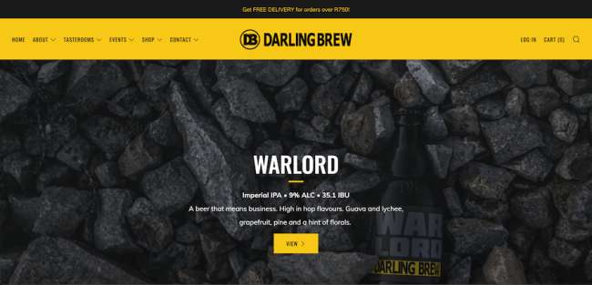
Standout features:
- Distraction-free product pages
- On-brand colors
- A playful and jovial UI
Darling Brew is a South African craft brew whose website is a brainchild of Jumpin’ the Gun creative website design agency from Western Cape, SA.
Sporting the brand colors – black and yellow – the website consists of a variety of content: from the company’s achievement of being the first carbon-neutral brewery in the country to top beer choices and merchandise.
The fun and playful layout corresponds to the brewery’s target audience’s behavior and interests. The sticky main menu consists of the user journey points, user login options and shopping cart.
The CTAs are rectangular yellow buttons that are quite prominent despite blending in with the surroundings of the same color.
The beer product pages feature vibrant images of craft beer bottles, an extensive set of information about each brew and a distraction-free environment so that the user can focus on buying the beer as quickly and easily as possible.
7. A&G Residential By JK Premier Marketing

Standout features:
- Well-organized navigation
- Descriptive messaging
- CTAs at strategic points of the user journey
A&G Residential is a home building company in North Carolina. Their website is courtesy of JK Premier Marketing — a website, social media and graphic design agency.
As it is content-heavy, A&G Residential website design relies on plenty of white color but not a lot of white space, as images, photos, home diagrams and messaging take up plenty of space to communicate the company’s complex offering.
Rectangular CTAs lend a bit of clarity to the user journey and move the visitor down the funnel towards conversion points with a clear and concise copy. A CTA with a phone number is located at the main menu’s top right corner so the prospects can make a quick phone call via Skype or a similar service.
The two-level main menu offers just enough navigational depth to provide plenty of options to the visitor but not overwhelm them with too much to choose from. The organizational hierarchy follows the logic of a user journey, resulting in a fast and intuitive user experience. Explore some of the best design agency website designs on DesignRush.
8. Bonasila

Standout features:
- A streamlined main menu
- High-quality images of planters
- An interesting mix of fonts
Bonasila is a producer and seller of a collection of Fiber Reinforced Plastic planters. Their website is an interesting combination of fonts, photos, custom illustrations and messaging that explains each product collection in great detail.
Thick, bold fonts in white dominate the opening screen with a photo of a sumptuous interior adorned with Bonasila planters. Once the user begins their journey by scrolling, a combination of large fonts, big, hi-res planter images and sans-serif fonts unfolds a lengthy homepage funnel.
Images of colorful planters coupled with occasional blocks of green break the minimalism of a white background and light brown font. The main menu is sticky and conveniently limited to only three options, in order to streamline and simplify the user journey.
9. Royce Chocolate By Arctic Grey

Standout features:
- Exquisite photography
- Concise messaging
- Minimalist product pages
Royce Chocolate is a Hokkaido-based fine chocolate boutique and online store whose website, developed by Arctic Grey, is every bit as enticing and mouthwatering as you’d expect from a website selling top-class confections.
Above the fold, the website sets the tone for the visitor’s entire user experience with professionally-shot photography of chocolate truffles. The main menu’s transparent background turns white once the user begins scrolling.
The multi-column layout below the fold features more hi-res images of different chocolates and remarkably to-the-point messaging consisting of only a few words to feature collections and vital info for the consumer.
The navigation’s Shop section has a mega menu layout. Going to any chocolate category page reveals a four-column layout for particular items and clicking on one leads to a photographic page where visitors convert with a bold Add to Cart button.
10. Unique Blinds By Explore Agency
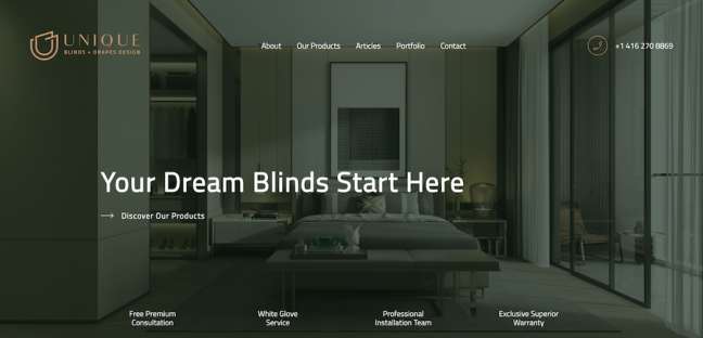
Standout features:
- A classy color palette
- Simple CTA forms
- Informative content
Unique Blinds is a producer and seller of window drapes and blinds from Toronto whose website, designed by Explore Agency, is a display of professional, corporate-minded aesthetics with a very streamlined color palette.
A dark green filter envelops the opening photograph of an interior above the fold. Fonts in white and copper accents are the only other hues, contributing to a very classy and elegant overall feel.
Although the main menu appears only once the user scrolls back up, the website navigation and its user journey are quite streamlined and fully optimized to educate the visitor on the benefits of using Unique Blinds’s products.
The homepage itself consists of informative messaging bits on the design process, the entire collection of drapes in the brand’s offering, testimonials and articles. To top it all off, there is a very simple form for scheduling a free consultation as an effective means of driving prospects down the funnel.
11. The Doral Yard By The Copper Portico

Standout features:
- A very simple homepage
- Effective use of images and videos
- Fast and easy UX
The Doral Yard is a restaurant in Doral, Florida that provides a combination of food and live music experience in an embracing, inclusive environment. Their website, designed and developed by The Copper Portico, embraces the best practices of a vibrant, community-driven digital presentation.
Landing on the homepage, the visitor is greeted by a full-screen background video displaying the establishment's amenities in a vivacious, "good vibes" atmosphere. Scrolling down reveals the four-square grid that offers a sneak peek into the restaurant's food and drinks options, live music, operating hours, parking, as well as job vacancies. A social media stream at the bottom concludes the content of this focused and concise homepage.
The sticky main menu provides further guidance and moves the visitors down the funnel towards the reservations option. It covers all the essentials of the restaurant's menu as well as available events. Also, you can check out some of the best restaurant menu designs here.
With very few graphic elements and visual aids, the website lets hi-res images and professionally-shot videos do all the talking. This understated and hidden simplicity of the website also makes it very fast-loading, ensuring a good UX on all devices.
12. Chameleon Fitness Apparel By Creative Webs 2U

Standout features:
- A combination of vertical and horizontal scrolling
- Very large product images on Shop pages
- Simple shopping process
Chameleon Fitness is a brand of fitness apparel whose website is a work of Creative Webs 2U agency. The website starts off with a bang, with a highly appealing homepage containing several full-screen videos in the background.
Gradient blue and green colors, featured in the brand's logo, make their appearance on the webpage's main CTA. The messaging uses various sizes of sans serif fonts that stand out quite crisply against the multicolored background - as does the main navigation.
But the definite standout feature of this homepage is the fact that it is scrolled horizontally. Several different backgrounds and messaging discuss different aspects of the website's Shop, keeping the user always above the fold and not missing out on anything of note.
The Shop pages itself use a combo of horizontal and vertical scrolling. The products are displayed quite boldly and prominently on the product pages that follow the best practices of eCommerce design by not distracting and quite simplifying the shopping process.
13. Tomi Palonen

Standoutfeatures:
- A striking color palette
- Excellent, to-the-point user journey
- Great showcase of the designer's talents
Tomi Palonen is a Finnish graphic designer, photographer, illustrator and writer. He is also the sole developer and designer of his own portfolio website.
A visually striking homepage opens with a professional photo of Palinen against a dark background with his native land's forests, huge font in red for his name and blue, sans-serif typeface for his credentials. The main menu follows the same color scheme.
The homepage's storyline follows the natural progression of a prospect who needs to be informed and educated on the services Palonen offers. His works, tools he uses, biography and more all end with a final conversion point in the form of a contact form.
The menu navigation elaborates further on each of these points, for anyone interested to delve deeper into his work.
14. Komala Vilas By Blue Hive Asia

Standout features:
- Sticky navigation menu
- Motion effect elements
- Plenty of negative space
Komala Vilas is an authentic Indian vegetarian restaurant. Their website, courtesy of Blue Hive Asia, communicates the rich history and tradition of this culinary establishment while keeping its feet firmly grounded in the present and the best practices of today.
A distinctive, light yellow, dark red, dark green palette sets the tone for the homepage which is very easy on the eye, starts off with exploring the restaurant's past and offerings and concludes with sumptuous images of food and the brand's Instagram feed.
Slight motion graphics and animated elements provide the curious factor to the website which also features a very convenient, sticky navigation bar for the browsing pleasure of the user.
CTAs use solid visual tricks to stand out against the rest of the content. The images have enough of breathing space to truly pop off the screen and grab the imagination of the visitor.
15. The Content Cliq By The Social Cliq

Standout features:
- A blend of retro and modern visuals
- "Loud" colors and large fonts
- Effective lead-capturing form
The Content Cliq is an agency connecting brands with TikTok content creators in order to raise their profile and reach the new demographics of this popular social media platform. Their website is created by The Social Cliq.
Much alike TikTok itself, this website design is an amalgam of retro leanings and decidedly forward-looking, visuals-centric approach. Bright, neon colors (purple, teal, lime green) all formulate an unexpected palette. Huge videos, big letterings - it's all deliberately loud, as it introduces potential clients with a whole new world of content.
The messaging section features plenty of white space, the creators showcase uses a very basic but effective mosaic gallery style and the current portfolio is a series of embedded TikTok videos.
Right at the bottom of the page is the lead capturing form, using the same stylistic approach like the rest of the page for greater consistency.
16. Ryken By Kaizen Five

Standout features:
- A design aligned with the target audience
- High-quality imagery
- Restrained color palette
Ryken is a men's skincare brand whose website by Kaizen Five agency is a color-restrained, crystal-clear display of their products in masculine surroundings, as dictated by the brand's target audience.
Clean design, black and white elements aided with crisp photography and a 100% contemporary sans-serif typeface are the driving elements of this website. Plenty of content, communicating the importance of skincare for men and breaking the stigma around it, play a role in this web design which is meant to educate and empower as well as impress.
All-over background images above the fold, a menu bar that blends with the image, rounded black CTAs and a well-written brand mission are the defining elements of a very elaborate homepage.
The eCommerce part of website displays hi-res images of products - creams, moistruisers, serums etc. - stand out in stark contrast against the white background, while detailed product description provide enough for an informed purchase.
17. Boulevard Marketing

Standout features:
- One-page user journey
- Excellent messaging throughout
- Popping visual elements
The website of a digital agency Boulevard Marketing is a perfect example of how important it is to have an amazing website if you're in the business of growing brands and improving their overall business metrics.
With a distinctive personality and a certain "coolness" factor, this website design communicates class, quality and professionalism. Modern, straight lines, asymmetric content clusters, animated transitions, bright colors - it is all there and it all works towards a single goal: converting prospects.
Inventive 3D effects on certain elements, well-presented UVPs, case studies and deliverable numbers all make up an extremely varied homepage that delivers the agency's purpose and method.
Only two items at the top menu navigation, Resources and a red CTA Book a call demonstrate the sharpness of focus on what's good for the customer.
18. CoachPulse
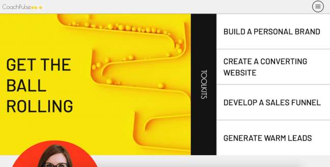
Standout features:
- Full-screen menu
- Uniquely shaped CTAs
- Vibrant color palette
Another digital agency on this list whose website is the best possible window into their capabilities and quality of services, CoachPulse sports a design that is as fun and playful as it is informative and tightly strung.
A lively swash of yellow and an animated image along with the company's four main services greet the visitor before proceeding to educate about the founder and her credentials.
What follows is an exercise in modern design, very reminiscent of the paintings of Mondrian, with brightly colored squares mixing with white background and diagonal lines as the website elaborates further on the set of services. Yellow, squared calls-to-action appear at every section, with a corresponding copy.
The main menu is a hamburger icon at the top right that, when clicked, opens across the entire screen, to a stunning and visually consistent effect.
19. X Firm
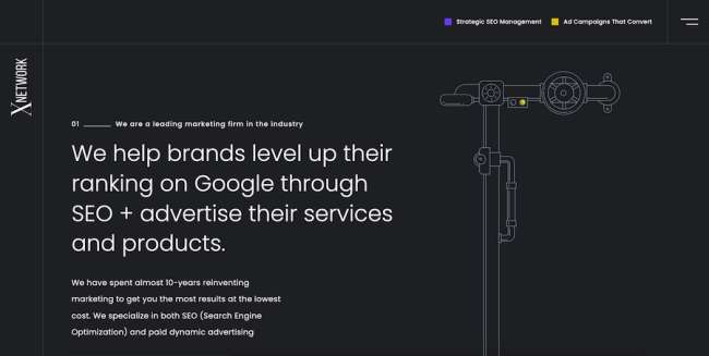
Standout features:
- Custom illustrations and background elements
- Two accent colors against a dark background
- Full-screen menu
Orlando and Curacao-based marketing agency X Firm opts for a darker palette for their website design, lovingly interlaced with splashes of purple and yellow. Dark grey background and white fonts give enough contrast to lend legibility to the website.
The main menu is located in the top right corner and opens across the entire screen, revealing a half-half design with microanimated images on the left and link points of interest to the right.
The homepage itself begins with a main value proposition and explanation of what the agency does above the fold. Scrolling down, animated yellow line squiggles along with the user moving, passing by the messaging that explains the companies methodology, company culture and more content bits adorned with cool loading effects on the images.
The bottom of the page, after the testimonials section, is reserved for a simple yet striking call to action inviting the prospects to get in touch. A technical drawing of a mechanism's diagram is a nice touch and very original use of a visual.
20. Maña Industries

Standout features:
- Colorful custom illustrations
- Visually appealing website
- Basic but legible fonts
The website design for Maña Industries, a marketing and advertising company from Buenos Aires, Argentina, is a colorful affair with proprietary illustrations gracing the opening screen above the fold. A subtle, low-key branding on the top left corner and the main menu to the right adorn white fonts.
The central CTA button invites visitors to explore more, taking them to the landing page for a highlighted case study with huge images of their work occupying the entire screen. This large-scale photo approach is prevalent on a decidedly visually heavy homepage, with images in various sizes and shapes loading onto the page.
With very little messaging — apart from a large-font copy near the top of the homepage — the website uses visual evidence of its expertise to communicate its value propositions. The website's main page ends with a footer section containing location and contact info, among other things.
The Portfolio page displays the company's track record with a large image and a brief CTA leading to each client's page. The user can skim through them by clicking on the section at the bottom right of the screen.
Our design experts recognize the most innovative and creative designs from across the globe. Visit Design Awards to see the:
- Best Logo Designs
- Best Website Designs
- Best Video Designs
- Best Print Designs
- Best Packaging Designs
- Best App Designs
Our team also ranks agencies worldwide to help you find a qualified agency partner. Visit our Agency Directory for the top Logo Design Companies, as well as:
- Top Web Design Agencies
- Top Video Production Companies
- Top Print Design Companies
- Top Packaging Design Companies
- Top Mobile App Development Companies


