Did you know that stationery design dates back to the 1860s? It's true -- and in fact, we have Abraham Lincoln to thank for the first letterhead. During his reelection campaign, he printed the illustration of his portrait in the top left corner of his letters, and that’s how it all began.
The bloom of business stationery design and professional letterheads continued into the 1900s -- even Nikola Tesla had his own design that featured his most important inventions at the time.
From invitations to business cards, stationery is a part of our lives nearly every day. But have you ever really thought much about those thank you letters you write out, the cards you get in your package shipments, the wedding invitations you receive or those business letters you mail out?
Probably not, but these 15 best business stationery designs for 2023 will make you wonder...
Table of Contents
- The 15 Best Business Stationery Designs That Bring Branding Full Circle
- Why Is Stationery Design So Important?
- The Many Different Types Of Business Stationery Design
- How Stationery Design Affects Branding
- The Top Business Stationery Design Tips
- Business Stationery Is Important Because It's Another Extension Of Your Brand
The 15 Best Business Stationery Designs That Bring Branding Full Circle
1. Francesco Petrarca Liberal Arts School Stationery
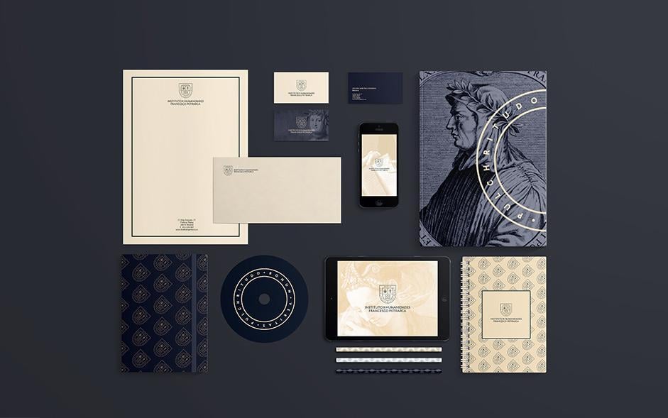
The Nueve studio captured the essence of a liberal arts school for adults, perfectly conveying their mission and vision. This color palette gives off a rich, classy feeling at first, but when you delve deeper into the color scheme and gradients, you realize that the overall design manages to be both very modern and aged at the same time. The school crest as a logo even has Latin word, "Bonum, Veritas, Pulchritudo," which means "Goodness, Truth and Beauty."
The goldish-yellow color on Francesco Petrarca’s Liberal Arts School prints has a subtle gradient that gives off a feeling of rustic papyrus. Items used for communication in this stationery are designed using a minimalistic approach, befitting of an educational institution. The school’s crest is perched on top of the letterhead, and contact information is sitting on the lower end, which is an unusual place when it comes to design standards, but it's very intuitive.
Elements like notepads, pens and notebooks use repetitive designs, creating a seamless pattern. The crest’s sleek design with light lines and typography works well with black and yellow contrasting colors.
The presentation folder and business cards have a scaled Petrarca portrait which breaks the repetitiveness throughout the rest of the stationery design. The presentation folder also has a portion of the school’s credo enlarged so that we can see the word "Beauty" (Pulchritudo) on top.
2. Spectra Lighting Catalog
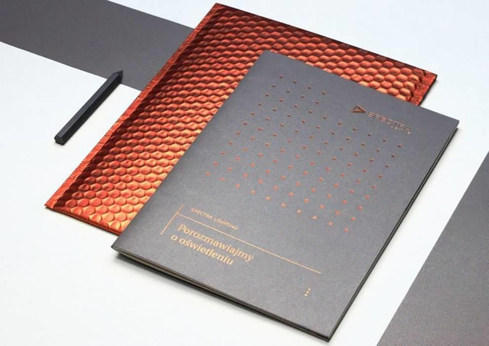
Spectra Lighting is an architectural lighting agency and their stationery design definitely lives up to the name and expectations of a lighting company. Everything about this design is built around the idea of light and impact.
Ots achieved through metallic and copper tones, thick premium quality paper, embossed lettering and a presentation file pattern. The overall feel that this stationery design emanates can be explained as very modern and simplistic.
The presentation file captures your attention with almost over-the-top shine, but it fits in splendidly with the catalog. The dotted pattern of shiny copper accents provide a unique symmetry at first glance, and the matte black background simply invites you to feel the paper material in your hand. The catalog literally begs you to pick it up.
However, once you open it, you'll be greeted with minimalistic icons with sleek and light, almost weightless lines, and bolded dark copper font.
Just like the lightning services Spectra provides, this design aims to pull you in with modern accents and pizazz, keeping you engaged with simplicity.
3. Adam & Eve Law Firm Branding
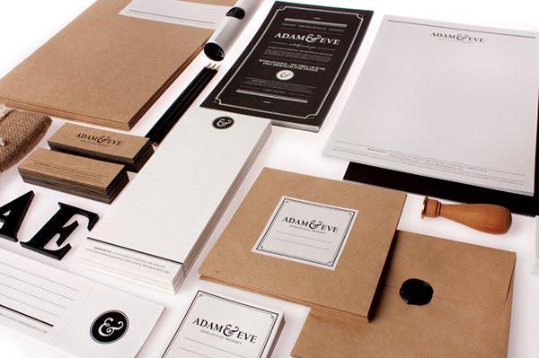
Adam & Eve is an intellectual property law firm that stands out from the rest of its competitors through their splendid stationery design. Law firms usually go for the classy and expensive feel, but their stationaries usually end up looking bland and dry, which isn’t the case with Adam & Eve’s refreshing approach.
Playing with the elements of a biblical story in contrast to the lawyers’ names in the firm produces a well-balanced stationery that captivates with minimalism and elegance, but still challenges conventional principles.
The logo of the firm is its main strength – the ampersand. The “and” sign brings out an important symbol of unity throughout the design. The ampersand is soft and round, written in cursive and with a bold typography.
Even the eco-friendly materials used in this stationery say a lot about Adam & Eve, and their mission to go back to the beginning, the very roots of existence and nature. They are cleverly emphasizing traditional values with ancient scrolls delivered in modern mailing tubes.
The presentation folders have a distinctly rustic feel, complemented with simple and unobtrusive labels in the middle. Wooden signet and wax stamps add on to the overall experience. Whoever receives Adam & Eve’s letterheads in the mail is in for a treat.
4. Gong Vo
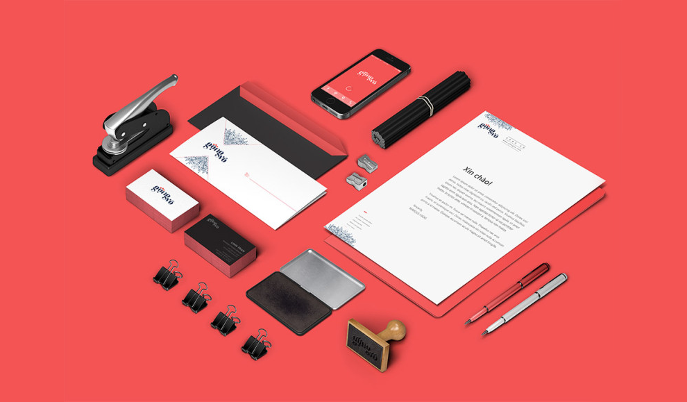
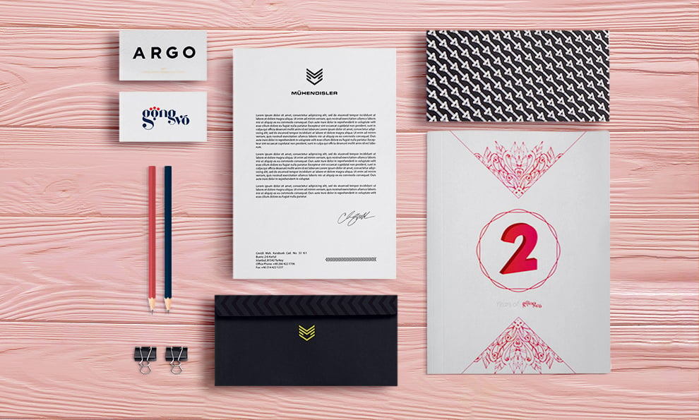
The idea behind Gong Vo’s stationery design is pure brilliance that hits you only when you delve deeper into its meaning. Gong Vo is a notebook company whose logo is inspired by Drosera, the insect-eating plant.
The typeface is very rounded like Drosera’s hanging stems, and the first letter “O” has 3 red dots that sit atop of it like a crunchy meal ready to be snacked upon.
At first glance, you might not see the connection between the notebook company and an insect-eating plant, but the pure brilliance resides in the way people capture notes, ideas and knowledge with just a pen, their hunting tool, and the big, hungry notebook. The elastic band provides certainty that everything will be kept safely inside.
The color palette is rich and relies on the hues of red, navy blue and white space. The two patterns of blue doodles are also inspired by the Drosera plant and fit nicely with the negative space. It even looks like they form arrows pointing to the logo in the center. The whole picture is very symmetric and pleasing to the eye.
This entire stationery design has a well-balanced feel with the repetitive logo and doodles across the business cards, letterhead and brochures making the entire design a cohesive one. Using matte black and gold embossed hues breaks up the composition nicely, adding a more elegant touch to the written communication.
5. Function Engineering
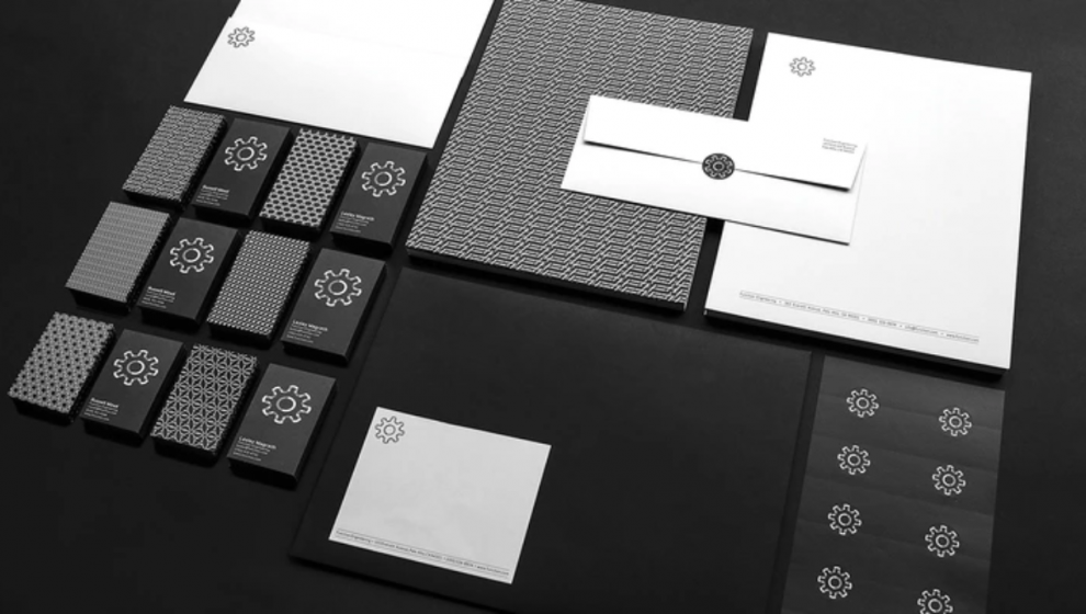
Function Engineering is a company that specializes in product development, mechanical design and engineering of industrial equipment, including robotics. They're famous for their linkage and hinge systems, and when you take that into consideration, creating seamless, interlinking patterns seems like a simple logical solution.
They are a serious company that deals with functionality and precision – and those are the exact values embedded in this stationery design. A monochromatic color scheme reinforces their principles and no-play attitude.
Even the brand’s name reflects that – it’s simple and to the point. It’s also more cost-efficient to print monochromatic letterheads in the office, they don’t require professional printing services.
The logo, at a first glance, is a simple gear, signifying that all pieces of the puzzle have to fit in perfectly like cogwheels and perform a certain function. But when you look closer, you can see that the gear consists of smaller geometric elements linked together.
6. Argo
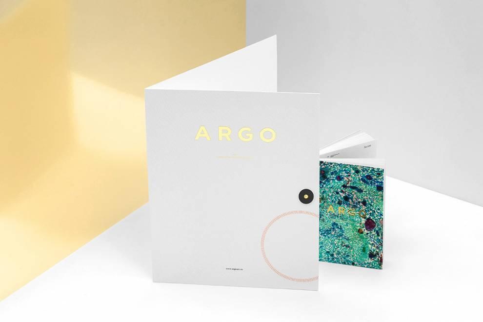
When you have an art investigation and history consulting agency, where the main objective is finding new art pieces, your stationery has to be adventurous, bold and colorful. Argo strikes that fine line between abstract and minimal and light and colorful.
The bright, golden shades in Argo’s logo give importance to the worth that Argo brings to the table, evoking a feeling of artistic value and class. If the shade was any yellower, the true brand vision and values would be lost – Argo is not about the sheer luxury and expensiveness, it’s about quality.
The main emblem on the design stems from a compass, and since they are on a mission of finding new art in the world, the symbolic image aligns perfectly with the brand’s mission. Massive and bolded typeface in Argo’s logo shows the pride they take from their own work, while their uniqueness is reflected in stationery design through the usage of their own vivid art pieces. Compared to its conservative competitors, Argo stands out with a well-balanced flair.
The downside of such vivid and bold colors and intricate artwork can be seen in the cost of professional printing services. But it is surely worth it.
7. Mühendisler
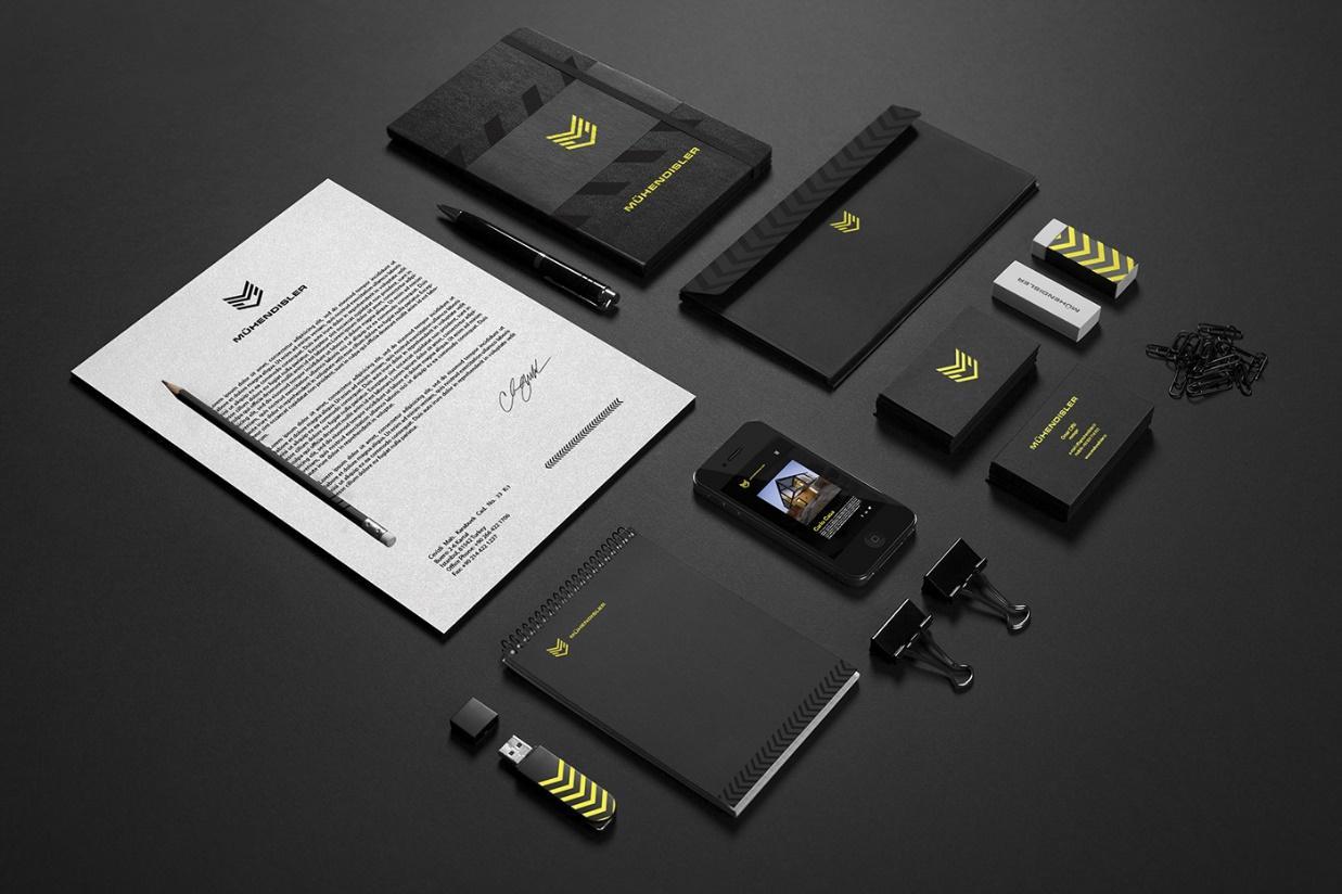
Caution! Construction in progress.
Mühendisler is an old and respected construction company that's been on the market for more than 100 years. But they were in need of a strong rebranding initiative to emphasize that they aren’t living in the past and that they’re more than able to bring modern solutions to the table.
When dealing with the construction industry and heavy machinery, customers want strength, longevity and a sense of security. Mühendisler’s stationery design rounds up those adjectives nicely, impressing them into each stationery piece. One glance at these sets lets you feel the robust nature of this brand.
Mühendisler’s main forte and primary stationery design theme is its logo. A combination of construction blocks in 3D, they form a massive letter “M”, and the colors used matched with the symbol of security tape all point to intricately devised imagery -- interesting for a construction company.
The vastness of black negative space just emphasizes the contrasting brilliance of the bold logo. It cannot go unnoticed.
Clearly conforming to the strict color palette of matte black and almost fluorescent yellow (the colors linked to the construction workers) adds overall unity. However, Mühendisler manages to break this cycle with different shades of black on its envelopes and notepads. They even look like tire marks.
The quality and thickness of paper also indicate that Mühendisler is oriented toward high-end materials that will protect what’s inside, whether we're talking about office stationery design or the buildings they construct.
8. Pitaia
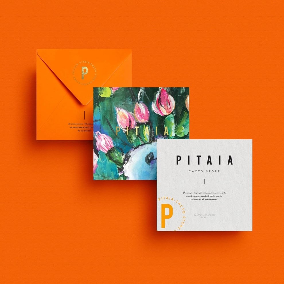
Pitaia is a Mexican shop that sells authentic, hand-crafted pots, sculptures and other clay decors. It’s a brand with a strong tie to its Mexican routes, so their stationery emulates that in every way possible.
This stationery makes use of the natural elements of the area — cactus plants, flowers and other organic, natural imagery in a watercolor format to promote an effervescence and happiness.
Beautiful menus, gorgeous cards and exciting letter templates make up this stationery, and it is truly mesmerizing to see this cleanliness and modernity matched with such a creative and cool style.
This stationery is bright and attention-grabbing, using oranges, pinks, purples and more to breathe life into the brand and let all those who interact with it know that it cares about where it came from and keeps it at the forefront of its positioning at all steps of the way.
9. Landmark Abstract Agency

This professional agency focuses on real estate ventures, and to grab onto that sophistication and regal enterprise, Spotlight Design rolled out a print campaign that included clean, minimal and corporate stationery designs to show their edge and prominence in the industry.
The key elements of these envelopes, letterheads, pins and business cards are the color used — a bold, luxurious navy blue and sophisticated silver — and the creative and edgy logo design that stands out and sits as the focal point of these designs.
The logo is made up of an overlapping L and double-A symbol. The L sits in the middle, the middle line of the A made up of the bottom of the L. And then the double As overlap creating a giant, multidimensional A design. It’s cool and fun and oozes sophistication.
And the other integral part — the colors — add a trustworthiness and a soothing quality that shows the viewer that this brand means business.
These are stunning and stylish stationery designs that other corporate entities can learn from in their cool, modern and minimal nature.
10. Jade Hotel
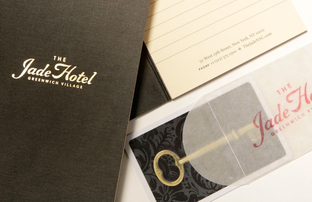
The Jade Hotel is a boutique establishment with a vintage vibe. And that’s evident inside and out — from the hotel’s architecture and interior design to these stunning and robust print designs.
This hotel embodies all things NYC, situated in Greenwich Village and holding onto the history and resilience of the Big Apple. But to increase brand awareness and further bring its identity full circle, it rolled out print designs in the form of business cards, key holders, stationery pads and more to really punctuate it’s old-school, regal vibes.
According to the agency behind the prints — Mucca:
A boutique hotel in the heart of NYC’s Greenwich Village, the Jade Hotel embraces the romance of the city’s history, when traveling was an adventure and phones were rotary. We partnered with Gemini Hospitality Group to develop a branding strategy that leverages the increasing value placed on local and authentic travel experiences. The end result is a brand identity that evokes the charm of a bygone era in every aspect of the guest experience—from the facade signage and interior wayfinding, to room keys and door hangers, as well as a robust hospitality website.
These prints are full of charm, enchanting designs and creativity to give the hotel a persona that captures the world of 1920’s New York that immediately hits home with visitors.
11. Semet Interactive Branding
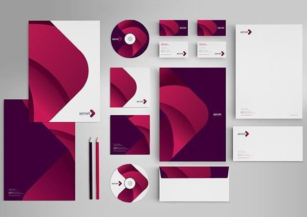
Semet Interactive has a great stationery design that shows us how a scaled logo can be repetitively used as an inspiration for the entire collection’s main theme, but still be different enough on each piece.
Layers play an important part in this stationery design and provide the overall feel of interactivity, which perfectly corresponds with the brand name – Semet Interactive.
The color scheme is very bold and eye-catching. The logo is layered and rounded with very soft lines, but the interesting thing here is how the designer played with the color palette.
Brash pink, purple and red hues embedded in such rounded, flowery design would typically feel light and soft, but in this composition, it looks breathtakingly powerful. Combined with white negative space, this simple logo stands out like a bold beacon.
The same thing can be said for the bold and curvy, elongated typeface that complements the logo’s geometric shape. Together, they create the beautiful form of an arrow, which is a strong symbol for the brand, signifying its willingness to take you from the beginning to the end result.
Considering that this company provides digital marketing services to its customers, it’s important that the stationery branding also contributes to their mission and vision – positive end-results.
The letterhead design is simple and without borders, which makes it printer-friendly. The contact information can be seen at the end of the letterhead, which seems to be the latest trend. It’s not where you’re used to seeing it, but it somehow makes sense to have the contact details at the end of your letter, not the beginning. The envelope plays well with colors and layers without overusing the brand’s logo.
12. Wedding Invitation Stationery
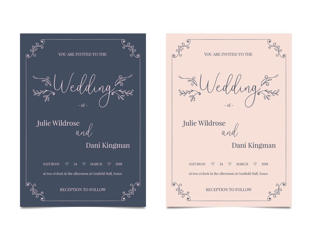
Stationery doesn't have to be solely used for business purposes – wedding stationaries are a perfect example of that. This subtype of stationaries can prove to be a great inspiration if you're looking for a clean, elegant and classic design for a corporate brand.
Just switch the wedding details with company information and you can end up with a regal and dignified design. Imagine this stationery for a restaurant, a wholefood company or an organic cosmetic line. It would fit in rather nicely.
Creative businesses can be displayed nicely with soft lines and even some metallic embossing. Don’t be afraid to search for print design inspiration elsewhere, the beaten path isn’t always the right one. Sometimes it pays to think outside the box.
13. Julian Loft Stationery Design
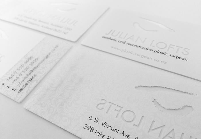
Julian Loft is a famous plastic surgeon who views his practice as a place that fulfills dreams, and his customers are his work of art. Due to the overall artistic feel (unconventional for a plastic surgeon), this stationery design and letterhead set the tone for the clients' expectations.
The logo is a story all its own. Continuing with the artistic theme, this logo is a depiction of an eye, touched by the artist’s brush. The lines aren’t clear, it’s rather a beautiful smudged and imperfect representation of a work in progress.
Since Julian Loft’s cosmetic surgery is dealing with something very physical and touchable, it made perfect sense to use optical tricks like engraving and embossing certain elements.
The attention to detail in the stationery design is vital to the type of business, and also reflects the brand’s own mission – dedication to creating near perfection. If you look closely you will see a subtle hint of pattern on the business cards that looks like a wallpaper. The thick and full material is nice to the touch and plays with clients’ sensory input.
The true beauty and the crowning jewel of this stationery is Julian’s letterhead. Purposefully chosen as an example, this letterhead is here to show you how the reverse side doesn’t have to be empty. It can rather compliment the overall design. In this case, it’s adding elegance with a seamless pattern of flowery design.
Julian Loft has a simple color palette that isn’t flashy or metallic, which would, in this case, be very tacky. It consists of classy brown and gray hues, uniformed across the entire stationery.
14. Brass Union
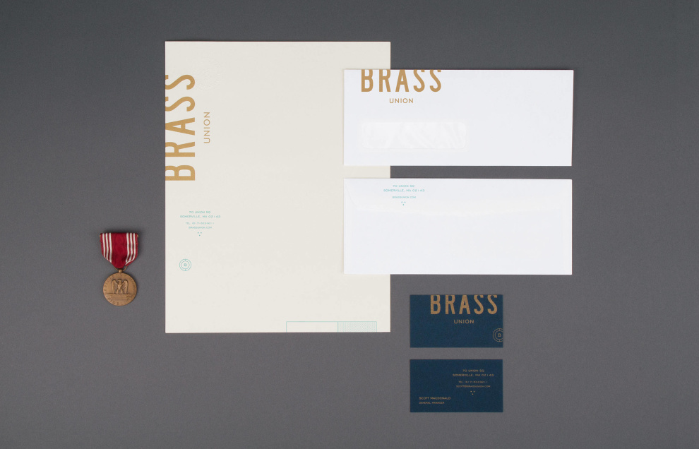
Brass Union’s stunning stationery adds a regal and sophisticated vibe to the brand as a whole — taking on the persona of a jailhouse, these prints bring the restaurant’s history to life.
Made up of rich and luxurious colors like blue, cream and gold, these business cards, letters and envelopes truly stand out in a clean, modern and edgy way. That, plus the infusion of signage, embossed elements and stamped symbols further promotes the brand’s jail-like persona.
In this instance, stationery is used to promote a brand and its identity in a playful, yet striking and serious way. And it works to beautifully capture a restaurant that’s dedicated to creating authentic and captivating experiences.
15. Reservoir Capital
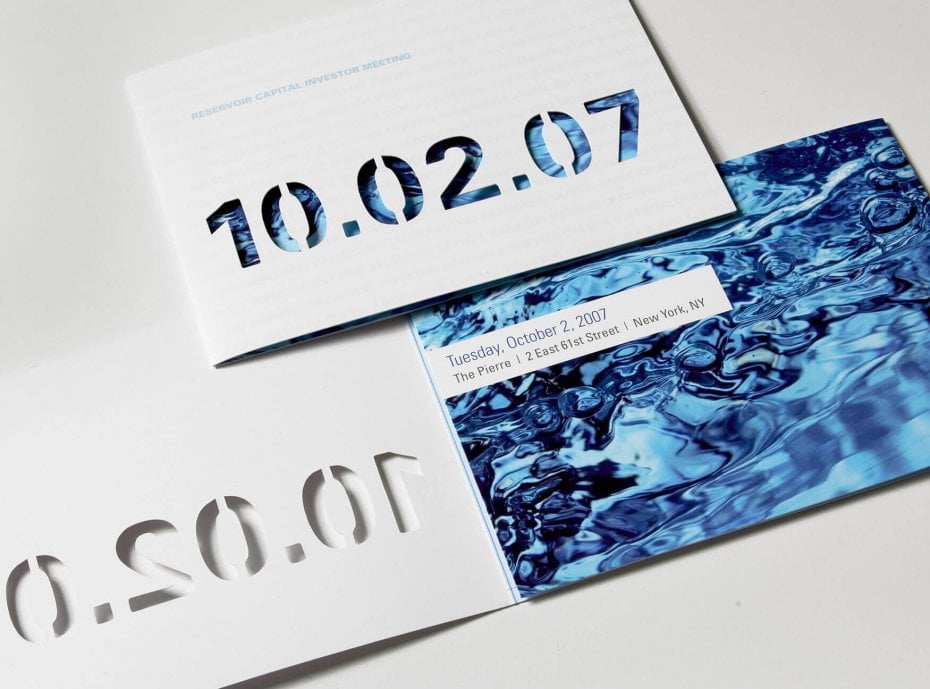
Reservoir Capital had an upcoming, annual meeting with the CEO and executive team, and to promote the event in a proud, corporate and stunning way, the brand turned to design studio GreyBox Creative to come up with an invitation that walked a fine line between creative and corporate.
According to the agency:
The invitation for an upcoming investor meeting needed to be different and creative, yet nothing over the top. The client had always used water imagery throughout their branding. With the image of the water chosen, we liked the texture and movement it evoked. We custom die cut out the date on the front of the invite to show the water through. The repeating name of the event was printed in a clear matte varnish on the front for a subtle effect. The invitation folds twice and contains the details of the event.
With the use of clever cutouts, water imagery and almost holographic text to make up the background of these prints, these invitations steal the show. They are creatively orientated and encourage interaction immediately. They stand out in their ability to add a playful touch to a solid, professional brand. And they do so seamlessly.
Read on to learn more about business stationery design and why it is a crucial aspect of your branding.
Why Is Stationery Design So Important?
It's the first piece of content other businesses and consumers will interact with.
You might be asking, why is stationery design so important? Well, you know what they say about first impressions – you never get a second chance to make a good one. Well, the same goes for stationery designs. A good stationery design sets the tone from the start, especially if it’s used for B2B marketing.
When executed properly, letterheads, envelopes, folders, USBs, CD covers, invoices and business cards can boost your brand and corporate identity.
Be prepared – your business print designs will be judged by their cover.

The Many Different Types Of Business Stationery Design
Good stationery design is aesthetically pleasing, but only truly great ones reflect a brand’s core values, mission, and vision. Design can bring those to life through small glimpses of symbolic meanings that unobtrusively shine through.
Stationery design will consist of everything the designer and the brand agree upon, so there isn’t a definitive list of best practices. But there are standard designs and print sizes when it comes to business prints:
- 1 US Letterhead - 8.5” x 11”
- 1 Non-US Letterhead – 210 x 297 mm
- #10 US envelope – 9.5” x 4.125”
- #9 US envelope – 8.875” x 3.875”
- 1 Business card – 3.5” x 2”
- 1 Presentation folder – 9” x 12”
Other professional print designs include branded pens, CD covers, email signatures, invoices, stamps, notepads, stickers, planners, brochures, flash drives, signets, CD covers, 'Thank You' notes, greeting cards, mobile phone screensavers, masks and anything in between.
But today, we're talking about prints.
To inspire you in all of your print design needs, we gathered 15 stationery designs to fuel your creativity -- complete with a guide to creating the perfect stationery and types of designs you can pursue.
When thinking about different types of stationery design, several approaches give good results. We have minimalistic, elegant, modern, rustic, classic and abstract. If we're talking about the types of color, we can have effective stationery designs in monochromatic schemes or an entire array of colors.
And these 15 designs run the gamut, providing you with a large variety of styles to choose from.
How Stationery Design Affects Branding
Stationery design is oftentimes the first piece of tangible content consumers and fellow businesses will be interacting with. And a bad design certainly paints a picture of a company that lacks ambition, passion and authority.
It may be the modern age, where almost everything is online. But that doesn't mean a physical presence isn't necessary, and the easiest way to incorporate a physical identity into your overall branding is through print designs like letters, business cards and more.
These give your business a professional edge and show your talent right off the bat.
And not only that but these designs hold an integral part of a brand's identity within them -- starting with their logo. A logo design is impactful and can determine the direction of your brand. And therefore you need a good one.
Logo design and branding go hand in hand. And you need to be willing to do everything in your power to ensure it's seamless and serene.
But that's just one example of the design elements embedded within print designs that help to capture an entire brand identity. Your branding is made up of consumer opinions -- how they perceive you and what you do. You can't outwardly tell them who you are, you have to show them.
With stationery design, you establish a brand foundation that lasts years into the future.
The Top Business Stationery Design Tips
Choosing the right direction depends on the brand values you wish to portray. For example, abstract and colorful stationaries work well for creative businesses, stern and monochromatic for corporate entities.
Bold colors are great in contrast with negative spaces. When we're talking about marketing and B2B, brash colors are good if you want your letter to be noticed in the growing pile of mail.
If we're talking about different printing techniques that can be used to bring your brand mission and vision to life, then some of the choices you can play with include embossing, engraving, spot UV for accentuating shiny gradients and foil ink and foil blocking for metallic texture.
If you want to create a consistent branding feel, play with the design like Echelon did and omit repetitiveness on purpose to create the bigger picture. Here, every stationery element fits together like a puzzle piece.
As we have seen in some examples above, you can use a logo as a decoration, scale it up, or make a seamless pattern out of it. You can brand every item in your stationery with a logo, or just use parts of it. Some brands like to use a large watermark logo on their letterheads to increase brand recognition.
There is no limit to what you can do. The possibilities are endless.
Business Stationery Is Important Because It's Another Extension Of Your Brand
A good piece of advice before starting with the design is to really get the sense of the brand and emotions connected to it. Delve deep into your brand’s origin story. Here, a detailed client brief and your personal research skills play a vital role. Make sure to check out our article on logo design brief.
Don't forget to take the heart and soul of your brand into consideration -- this should be the base for all of your designs.
Be sure to ask the client how the stationery elements will be printed. If they’re using the black and white office printer, then there is no reason to deliver a colorful letterhead. Also, office printers can sometimes cut out parts of letterhead design if they are close to the edge. All this isn’t an issue if the client is going to use professional printing services.
Learn these technical terms - bleed area, trim & safety lines. Bleed area is the outermost edge of the design that should be kept empty since trimming process isn’t always 100 percent precise. The safe zone is intended for logos and text and everything that you wouldn’t want to be folded or trimmed. Imagine sending a letterhead with trimmed out contact information?
These are all some of the more technical aspects of print design that you will learn as you grow either as a brand or as a designer. But they are important to keep in mind when creating these print designs. Stationery matters and they have the potential to impact how your brand is perceived.
Use these guidelines and examples as inspiration for your next stationery design -- you never know who's watching.


