There’s been a lot of talk about minimalism in UI and the power it has to engage user attention. So, should you follow the web design trends and strip your website of all the unnecessary elements?
As it turns out, you should.
One study showed that visual complexity can affect a user’s perception of a website within 50 milliseconds of exposure, making it more difficult for them to navigate and interact with the site’s elements.
But, don’t mistake minimalism for simplicity. A minimal website can be a complex ecosystem, but its interface is clean, clear and concise. The color scheme is simple, the layout makes it easy to explore the site, and everything is designed with user experience in mind.
Minimalist web design isn’t only about making your website or app look pretty. It’s about helping the user navigate through your platforms as efficiently as possible. It’s the perfect match of form and function.
“Less is more.”
Rest assured, we've all heard this exact sentence more times than we can count when modern design is the topic of conversation. And as it turns out, minimalism actually is the way to go. But, we should all keep in mind that even though it seems easy to create and manage a minimalistic approach to design and UI in general, the road to get there is bumpy and often tricky.
Now, you may have thought, “creating a minimalistic UI is easy... you just delete everything you don't need."
But boy, would you be wrong! Try imagining it like this: You have a product and/or a service and you want to get the maximum amount of information to your (potential) clients. But, there's a catch. You absolutely cannot use any type of complex communication.
Doesn't sound that easy anymore, does it?
Table of Contents

These 10 Stunning Examples Of Minimalist Design Set Modern Trends
1. Twitter
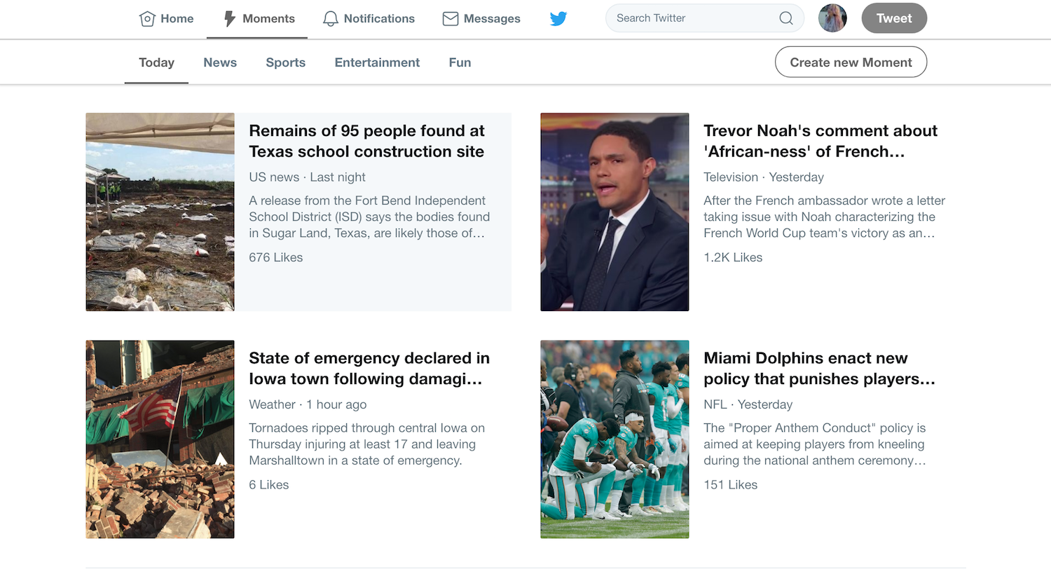
Right off the bat, we have the infamous bird of Twitter. We can’t help but mention this clever symbol because of its simplicity and sleekness.
When this social network became widely-used, the design was simple, but kind of clunky. The logo had the word “Twitter” in it, and the bird logo was pretty much obsolete back then. Soon after, things began to change. The UI became simpler and simpler. And let`s not forget the 140 characters (now double that size) restriction to get your message across.
The entire design was trying to be simple and minimal but it was just missing the mark. This system smelled of the “be efficient and do it fast” kind of minimalism. But with recent updates, this design really does embody creative minimalism.
Now, there are more things we can learn from this service. For example, the decision to remake the "favorite" icon from a star to a heart is a great example of useful simplification. Being that the user needs to spend less time figuring the site out as possible, the heart icon change was ideal. The slight change to a more recognized symbol enabled users to browse more efficiently.
Additionally, the sleek listing of tweets from friends and brands matched with clever images and a clean interface makes for a design that pulls you along with elegance and sophistication.
This interface is innately intuitive and was built with consumers in mind, and the infusion of minimalistic elements like white space in its home section, and the beautiful organization of headlines in its discover section brings the whole, minimal design full circle.

2. The Global Oil Map (By GSM London)
Now, to a slightly more business-related topic — a somewhat strange example of a UI, related to the imports and exports of raw oil. This website is rather unique and provides a nice learning example of exceptional minimalism.
When you land on the website, you’re greeted with flowing oil and a short text message. In addition to those options, there’s the explore button. The first impression you get from this front page is seriousness, with a push for modernity. But next comes the really important part.
After clicking the explore button, you’re not welcomed by lines and boxes of text explaining what the map you’re looking at is. No, you get a globe to explore and click around, with filters placed on the side, for further discovery.
In this example, we don’t only see an example of a really strong first impression, but see the importance of the follow-through. When making a minimal user interface, keep in mind that every aspect of your website needs to coalesce perfectly. That way you imprint the important and responsible effect into your service and/or product, and that is the ideal outcome.
3. Lettuce & Co.
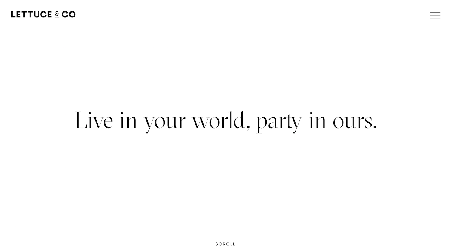
We are slowly getting to the real deal (not that the previous examples weren`t good). This event planning company hits the true soft sweet of minimalism. If you think about it, doing interior design, or any other highly visual job, requires your online representation to be on point. And we can see from the example of Lettuce that this professional vibe can absolutely be transmitted to your online endeavors.
A highly relevant element of minimalism is perfectly utilized here. If you haven’t guessed it by now, it’s the ever so important skill of white space. Yes, as much as the elements you put on your website matter, so do the elements you DO NOT. That’s the beauty, the blessing and the curse, of minimalism.
The white space provides a kind of a breathing space, an open spot for the user to stand and observe what you have to offer. In the animated moving menu on this website, we can see that the lack of special promotions and discounts is the exact thing that makes us stay. It sounds almost counterintuitive, but, nevertheless, it shows us that they mean serious business when it comes to aesthetics.
Always keep in mind who your target audience is, and how can you transmit as much info as possible without scaring them in the process.
4. Rubrasonic
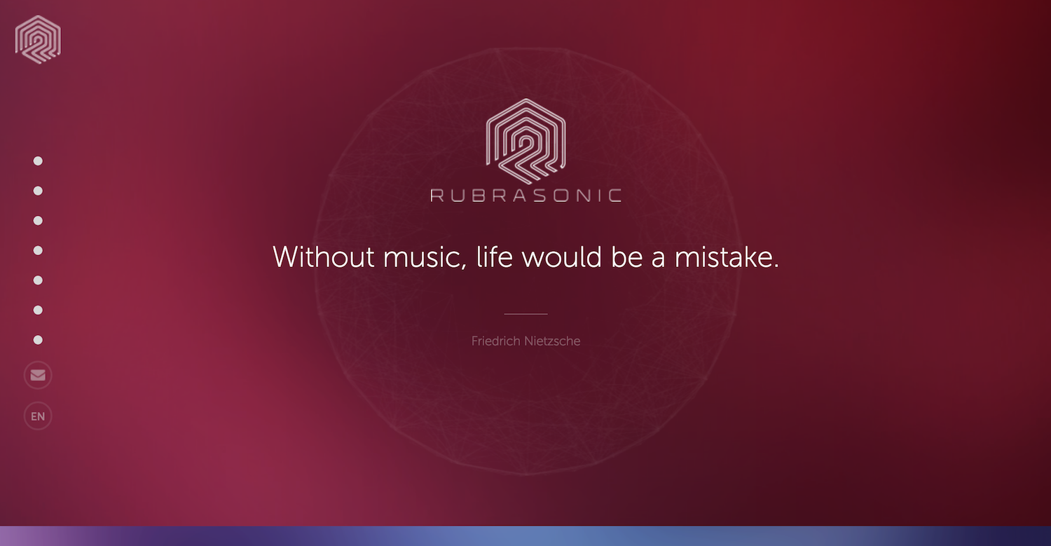
It’s time to scratch the surface of other senses besides our eyes. This background music-providing company incorporated audio as a part of their minimal design. With their minimal, geometric logo greeting you at the center of the page, there’s not much you can do. That is until you realize that hovering over bubbles at the bottom of the screen makes a melody.
Right after the melody, you’re able to scroll down, listening to the tune you yourself set in motion. This utilization of sound to sell their audio services is ingenious because it shows the importance of music as an essential part of a well-developed environment.
The website has a rotation of multiple quotes about sound by famous, historical figures. The ingenious catch the designer put here is hiding in plain sight. The website is kind of boring before you start the music by moving your mouse, thus proving that background music has the power to change moods, and change moods in a blink of an eye.
Although the sound is the biggest weapon of this particular UI, Rubrasonic made a slight mistake. They used a heavy color palette, which is kind of hard on the eyes. The combination of audio and video effects is still on point, but we must never forget the role colors play in design, especially in minimal design. The importance of balance cannot be stressed enough.
5. Rainy Mood
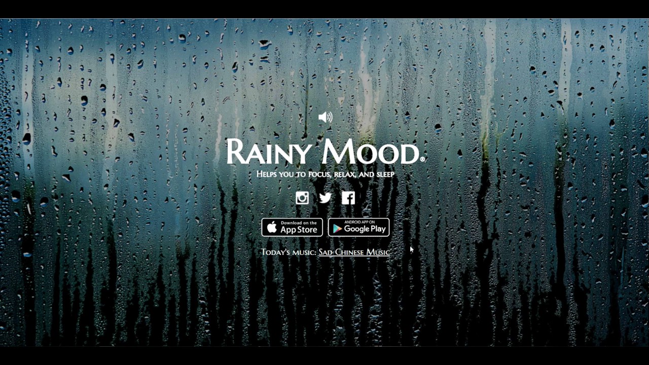
Speaking of sound, those of you who enjoy ASMR and other atmospheric music are surely familiar with this extremely minimal website. Rainy Mood is a one-page website that provides only a few options but does that oh-so-gracefully.
The power of this website lies in its solitary design. The sole purpose of the site is to play rainy, white noise, providing a relaxing and meditative feeling. With a single background image representing a window view of a grass field, with water splashed all over it, the rain sounds fit perfectly. The rest of the imagery includes a volume control knob and social media links designed as small white minimal icons.
From the example of Rainy Mood, we can learn that a single photograph can be exploited so much that it covers the whole entire website. Besides, recently they embedded a “daily song” feature which is a recommendation system that gives you song suggestions that go well with the sound of rain.
Even though this website doesn't sell a product nor a service, it delivers a relaxing ambiance with its simplicity. Exploiting the fact that we are bombarded with ultra-heavy marketing every day on every corner, there now lies the mastery of minimal design.
6. Instagram
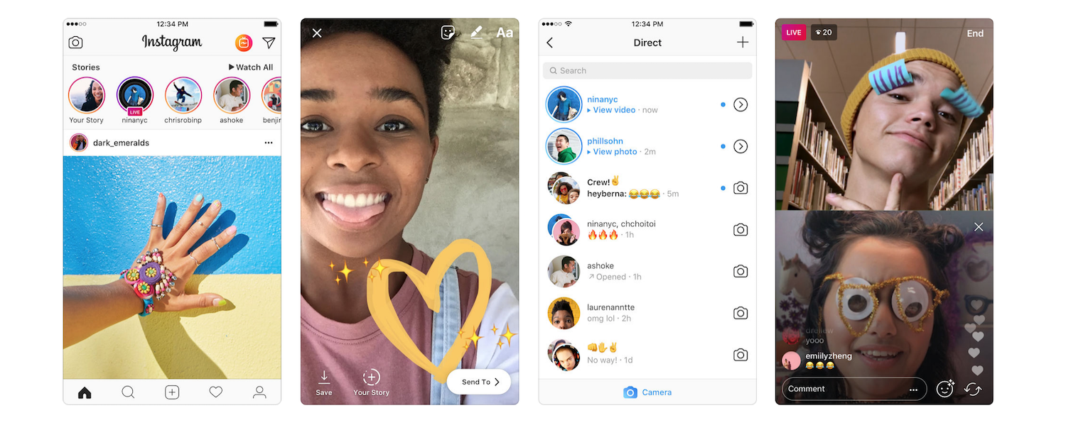
It is time to switch from audio to pure visuals now. We absolutely cannot talk about minimal design without mentioning Instagram, a design so scarce and rich at the same time. First of all, it’s important to make a distinction between the website and mobile app iteration of this photo-sharing platform.
To be completely honest, even though it’s functional, one notices that the website gives a slight incomplete vibe. When the minimalist expression comes to the point of giving off such a vibe, a reconsideration is in order.
But let's not forget, Instagram is made for and is mainly used by mobile users, and the app UI is close to flawless. Scroll, click an tap are the only movement options. And the only content you can see is from the users themselves — the website doesn't put out any additional elements for you to choose from. We can observe this and learn that adding a lot of choices can suffocate your web traffic, and Instagram danced around that obstacle with ease.
We are all more or less familiar with this platform and its purpose, but it’s important to look at it from a design perspective and compare it with other media from the same branch. Twitter, as mentioned, is one of the best minimal websites, and Instagram is breaking the mold of standard social network design. And they both do it without losing any credibility or without any lacking in the functionality department.
7. Pinterest
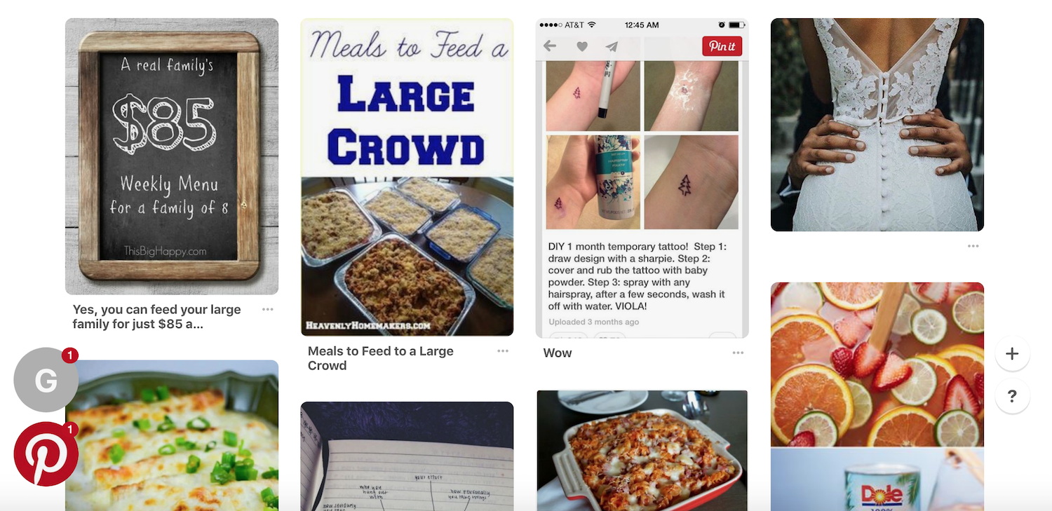
Speaking of carefully engineered websites that are based on communities, we can’t go on without mentioning Pinterest. Pinterest revolutionized not only the way we browse for ideas and inspiration, but more importantly, it revolutionized the way we curate content online.
With a structure that consists of only images, with a minimalist approach and little text connected to clutter the screen, Pinterest nails it when it comes down to the flow of the website itself. With little to no additional options besides the standard social package — putting a pin in the content you want to be saved for later or as a part of a collection is where it's at.
Pinterest is a website you can spend hours on without feeling it pressing on you or making you tired.
This is all thanks to the scroll system that developed the atmosphere of “counter-intrusiveness”, by not throwing links and suggestions your way every minute. Even though Pinterest has a HUGE database at the users’ disposal, it still looks and feels the same just as if you were browsing between just a few key images.
From a design point of view, the simple layout, with no text on-screen, brings the relaxed and modern feel to a heavy trafficked website.
8. Why We Explore
It's time to get away from social networks, likes and shares. In this wonderful example, we can see how minimalism is used for narrative purposes. This beautiful storytelling tool comes in the form of a left-to-right scrolling text adventure.
With a lot of white space cleverly used, the visitor of this rather minimal website can’t get tired, and the website has an image of the day section to keep it fresh and to give it replay value.
In the case of left-to-right minimal style websites, we can see that scrolling can be used instinctively to represent a chronologic order, and/or any hierarchy imagined.
Even though this particular website has 3D models even, they are blended smoothly into the black background which leaves enough empty space to give us the feel of the asteroid in the universe. Throughout the whole journey, the minimal environment keeps the visitor calm and focused on the info given. And to raise the bar a bit higher, there are subtle clickables around the asteroids for extra info.
As a few of the aforementioned sites have done, this website teaches us that more IS less, indeed. It shows us that even “not-so-conventional” educational websites can be tastefully done and in the minimalist style no less.
9. Velvet Hammer
A well-crafted website can be the best advertisement there is for your business. Velvet Hammer, a music production and PR agency, realized this and put it into work perfectly.
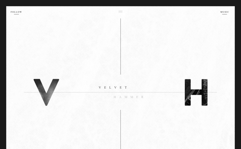
The website is almost monochromatic, keeping the colors in the range of black, white and gray. When you open the website, you get bombarded with a quick cut photo montage of the company's clients performing without any explanation. Soon enough, the company's logo appears, and the beautifully done typography follows. Scaled down to the size of an icon, all the bands Velvet Hammer has worked with are displayed with their logos.
With the texture behind the text and the background gradients getting more gray by the scroll, visitors attention stays focuses even though there’s no text to read.
A menu with more options (but not too many) is carefully placed on top. It’s a bit confusing but clean. And once you finish scrolling, the site turns black with more options popping up.
The white space here is used beautifully, and the page itself looks sophisticated and luxurious.
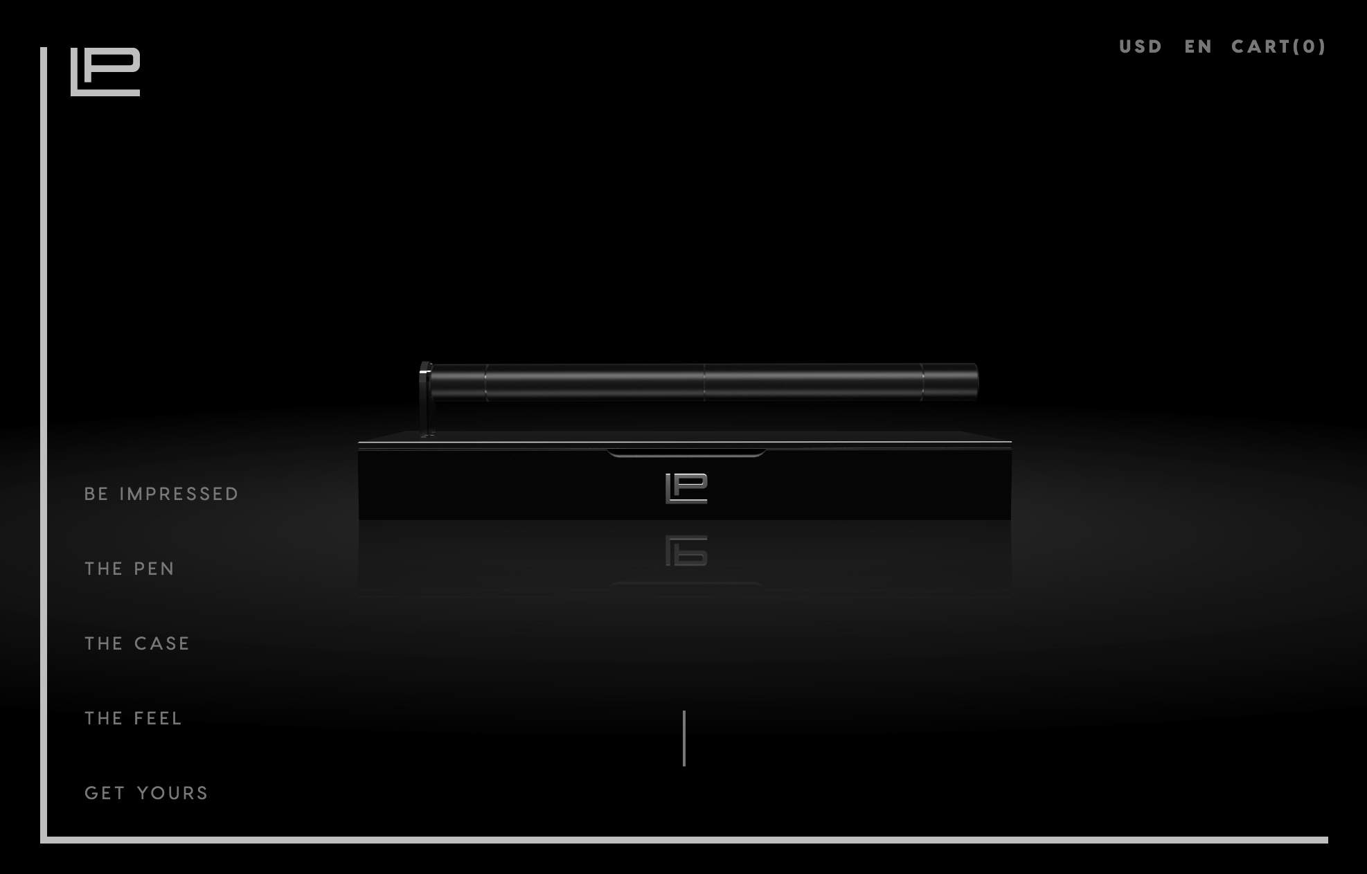
10. Levit Pen
Throughout this whole analysis, we’ve observed services free and paid, community-based and solo-centered. Now, it’s time to see how minimalism can be utilized to advertise a product.
Believe it or not, this is a website for a pen -- a luxurious one to be precise. It’s a multifunctional tool, with plenty of options. With the black color of the website, the designers gave it a serious touch, while the animations that follow the user around make it feel quite modern, even futuristic. As you scroll down the website, the pen gets dissected and the whole system within it is easily explained.
The use of white space is done neatly and tidily. This design advertises this pen as some sort of sci-fi piece of equipment. Everything gets dissected in front of your eyes, and even the non-tech savvy people understand the whole concept instantly.
This shows us that aggressive marketing approaches are definitely not the only way to go in order to sell. An ordinary item, with extraordinary design and website elements, becomes extraordinary itself.
So, How Do You Create A Minimalist Design?
Well, there lies the difference between a good and a great designer. Building a perfect minimal website or app to get just the amount of information across requires patience, experience and research. There are a couple of ways to create your perfect UI for the perfect UX, but the two main tactics are:
- Building Up
- Building Down
The former requires more experience and is by far harder than the latter. Building up basically means that you start from scratch and create only the necessary elements your site needs. This bears potential risks, even for the design veterans, because there are always elements that could be missed. That's why building down is always preferable. Working with a mobile App design agency can help you get a professional design that fits your brand.
Building down (or skimming) is definitely the longer route when creating a website (especially a minimalist one). Essentially, you get every possible element you can think of into one big mix. After that, you start skimming the unnecessary elements, and step-by-step, you'll get to only the most important features, functions and information. And after that filtering, the visual experience is enhanced by simplification.
Now, let's go through some examples of beautifully designed web UI, explore why are they good (or bad) and determine what can we learn from them.
Minimalist Website Designs Come In All Shapes And Sizes
And, there we go — a whole list of minimal websites to learn from. Some are more known than others, but every single one gives us a valuable lesson or two to extract. Lucky for you, we summed it up into actionable tips and tricks:
Less Is More... But How Much More?
Minimalism is generally always present to some degree. Lately, with the social network expansion of advertisers, minimalism is more desirable because it provides a less edgy marketing style. When looking for an adequate minimalist style for your venture, keep in mind that you still do need to get all the necessary info across to the potential client. The user interface needs to speak for you, so keep it simple, concise and tasteful.
Colors Can Be Tricky
This is a touchy area in minimalism. The general rule of thumb is to go with as few colors as possible, but don’t restrict yourself to black and white. Using a small amount of color here and there can help you really emphasize the main point you’re conveying. Nevertheless, color coding of external links or other parts of the website can be utilized as a navigation tool.
Sound Is Evolving
Yes, sound. Nowadays, we all have powerful-enough computers, home or pocket-sized ones, with ourselves. So yes, sound is a valid tool to be used within a platform. Keep it as instrumental as possible, and get an expert to match the sound with the topic your website is about. Lately, this seems to be quite impactful with technology being more and more advanced.
Don't Cut Just To Cut
This is one of the most common mistakes in the design world. People want to make their websites more effective, so they cut a lot of stuff out, just to be left with half the info necessary.
The whole point of a minimal design is to put all the attention and focus on the single thing you’re presenting. Try thinking of minimalism as a subtle, yet effective spotlight, and not as makeup.
There it is -- the study of well-executed websites, in industries that range from commercial e-commerce to educational and advertising. As you might have already concluded, image is everything and advertising is key.
In a world where the majority advertise themselves through quite loud, messy and chaotic channels, consider taking the calmer path. The passive-aggressiveness of minimal design is often louder than the regular voices.


-preview.jpg)


