White space allows your content to breathe and helps you draw users' attention to the important elements on the page. It reduces clutter and contributes to clean and modern web design.
This article explains the white space concept, its types, benefits, and examples. Keep reading to get inspired and advance your website design.
Table of Contents
- What Is White Space?
- Types of White Space
- Benefits of Using White Space
- 13 Stunning Examples Of White Space In Action
- Apple
- Dropbox
- Built by Buffalo
- Everlane
- Airbnb
- Chanel
- Welikesmall
- Eurovet
- Sonos
- Brontide
- Jannata
- Ceremony Coffee Roasters
- Max Chocolatier
- The Power of White Space in Web Design
- Examples of White Space: Final Thoughts
- White Space FAQs
What Is White Space?
White space is negative or empty space between text, images, animations, and other design elements. Regardless of its name, white space doesn't necessarily have to be white, although many brands choose this color to create a clean look.
White space promotes a clean, elegant, sophisticated aesthetic, making the design more appealing and engaging. Visitors feel overwhelmed, lose interest, and look elsewhere when the design has too many elements. To avoid losing leads, conversions, and sales, you must incorporate white space in your design and make it attractive and digestible.
Types of White Space
There are four main types of white space in design:
- Macro white space refers to a design's overall layout and composition. It includes the spacing between significant elements like sections, columns, or content blocks. Macro white space helps establish the overall structure and balance of a design.
- Micro white space refers to the smaller gaps and spaces between individual elements within a design: paragraphs, lines of text, buttons, icons, and images. It improves readability and helps create a sense of order and clarity within the design.
- Active white space is intentionally created to guide the user's attention or convey a message. It is strategically placed around key elements to make them stand out or build visual relationships. It emphasizes CTA buttons, highlights important content, or separates sections for better organization.
- Passive white space occurs naturally within a design and results from the layout or composition. It is the unintentional space that is left between elements when creating a design. While not deliberately planned, passive white space enhances readability and creates a visually pleasing design.
By understanding and using these different types of white space, designers can effectively create visually appealing and user-friendly designs.
Benefits of Using White Space
Because of its benefits, white space plays a crucial role in web design:
- Enhances readability. White space between text and other elements allows users to focus on the content without feeling overwhelmed or distracted. Just as paragraphs and line breaks make the text easier to read, blank space provides a similar effect.
- Highlights key elements. White space directs users' focus to where you want it to be. Surrounding essential page elements with white space makes them stand out and grab the user's attention. It creates a visual hierarchy, making it easier for users to understand the content's structure and navigate the webpage.
- Encourages visitors to take action. Highlighting calls to action (CTAs) with white space directs user attention to the desired outcome — purchase, subscription, or appointment scheduling.
- Improves user experience. By reducing clutter and creating an organized, polished look, white space contributes to a positive user experience. If you put it between clickable elements, it prevents accidental clicks, preventing user frustration.
- Conveys a sense of sophistication and harmony. It looks modern and refined, communicating your brand’s personality, style, and tone. Luxurious brands use white space to give a website a sense of elegance and simplicity.
- Mobile and responsive design. White space is essential for responsive design, where the page layout adapts to different screen sizes. It allows for better scalability and readability on smaller screens by adjusting the layout and spacing accordingly.
13 Stunning Examples Of White Space In Action

1. Apple
Apple’s white space lets the products take center stage. The clean, white background sets the stage for a dynamic and stunning user experience and user journey. The product photography is eye-catching, and the simple text adds enough context for the design to shine.
Apple makes excellent use of white space to highlight their gorgeous products, and you should follow their lead. In this example, white adds cleanliness to the negative space that makes up most of the design. It grabs attention immediately, fostering an atmosphere of excited anticipation.

2. Dropbox
Dropbox’s child-like illustrations and calming color tones make their service look fun, approachable, and exciting. The negative space lets the graphics and compelling text float to the surface.
Dropbox offers a complex service that many people might not understand or trust. Therefore, the brand had to invest time to provide context and simplify these complex concepts. It did it with clever, intuitive illustrations and a clean layout that quickly leads users along their journey. And it's with this negative space that an intuitive user experience is created.
3. Built by Buffalo
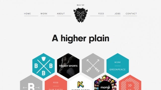
White space isn’t necessarily synonymous with minimalism. You can have a clean, breathable layout and use a more complex design. The clustered hexagons on Buffalo’s homepage would be overwhelming without the negative space. But, because they are coupled with colorful icons, the white line constantly holds your interest in the main categories while scrolling down.
The white space gives the almost-chaotic designs on the homepage room to thrive and breathe. They're colorful and creative, with a personality that captures the brand's essence.
4. Everlane
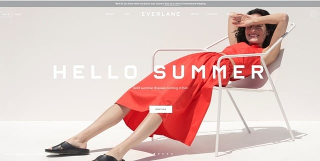
White space doesn’t imply the absence of color or pictures, and Everlane is here to demonstrate that. Negative space and pictures work well together if placed strategically on the page. Everlane uses pictures of its products as the background without tiring or confusing the visitors. A simple CTA in the center of the screen prompts visitors to shop without disrupting the UX.
Using photography in a bold and eye-catching way to engage and grab attention was a smart decision. This image lulls users along their journey and keeps them scrolling for more. And including a serene white space shows the brand's dedication to staying modern, fresh, and clean.

5. Airbnb
The white space on Airbnb’s homepage emphasizes its message and tells you clearly and concisely who they are and how they can help you. Most importantly, it gets you straight to what interests you — to search for a room, which is a CTA in disguise without being pushy.
The UX has heightened thanks to Airbnb's awareness. It knows what users want and connects them with it immediately — with this copious white space helping them navigate to the sections they want to see. It eliminates confusion and creates a concise and clear user journey.

6. Chanel
Chanel's website displays the products clearly, and the clean, white space creates elegance and an almost tangible luxury. Chanel uses negative space to showcase their products and help users find the necessary information. And it does so with creative and cool elements like photography, typography, and minimalism.
If you want to promote a regal, worldly, and stunning brand, product, and service, you can learn from this example of white space and its ability to elevate the design.

7. Welikesmall
The digital agency proves that white space and minimalism don't have to be static, empty, or boring. Instead, they chose to play a full-screen demo reel of their most recent projects in the background of the website’s homepage. They focused on the video with excellent use of negative space and minimal copy. The exciting video entices you to click on the CTA to learn more.
This is a dynamic use of white space that almost doesn't feel empty. The video and the layered image are exciting and enticing, pulling you in immediately. And the simplicity of the bright white text puts visitors in the mindset to explore, learn and discover.
8. Eurovet
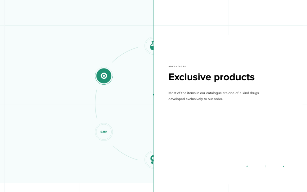
This website aims to inform. The design carries a lot of information, presented in a digestible manner. Scientific coloring and illustrations add context and clarity, and they’re set against an open and smooth background that allows these images and figures to pop.
White space provides the perfect backdrop for these numbers and illustrations. It makes the scientific design more approachable and friendly, giving it some breathing room and allowing users to interact with the design and understand the complex concepts.
9. Sonos
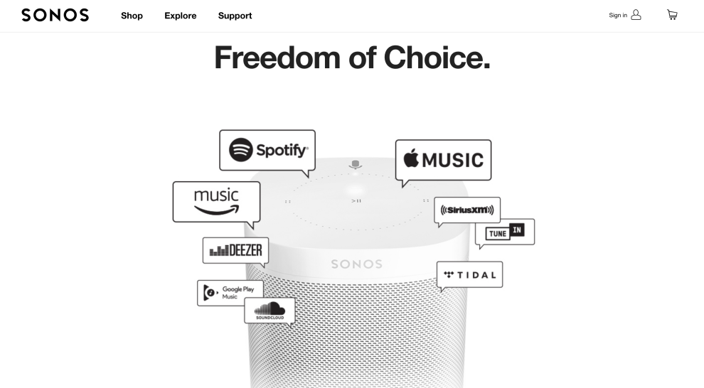
This is an easy-to-use product whose usability is mirrored in the intuitive and clean website design. It comprises product imagery, exciting videos, creative animations, and white space.
The white space is used to highlight products and promote branding. It’s a way to create a cohesive identity that users can easily interact with. It is also used to outline the product and its use, showing visitors to the site how easy it is to navigate the interface and the products.

10. Brontide
Brontide isn’t an average science-backed website — full of lines of text, dull imagery, and lacking design. It is exciting, creative, and fun — white space promotes that.
This design has little text but just enough to engage and inform. Subtle effects add to it, but white space provides openness and breathability, making it easier for users to learn and educate themselves on chemical compounds. As you can see, white space can make (almost) every experience more fun.

11. Jannata
Jannata’s website is a mashup of stunning and relaxing images and videos. The typography is bright, the images are captivating, and navigation is a breeze. Negative space contributes to this feeling. Made up of shadowed and layered images and a dark, soothing background to the menu bars and text, it emphasizes the entire design.
This example shows how negative space can help set the mood. A dark and mysterious color palette makes the white space a part of the design in an integral way, using emptiness to set the stage and engage on an emotional level.
12. Ceremony Coffee Roasters
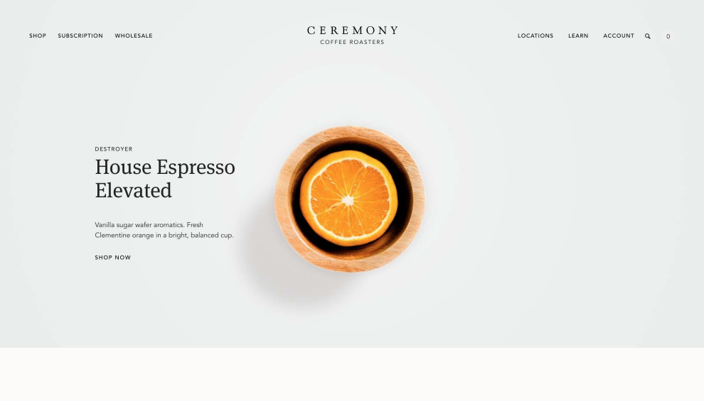
The Ceremony Coffee Roasters website is bright, airy, and sophisticated. Images of exciting ingredients and flavors sit at the forefront of the design, but the pastel coloring that makes up the negative space brings the full design circle.
This is a clean and colorful design, but it soothes thanks to the ample space that makes it easy for users to explore the many coffee offerings, understand more deeply the flavors these coffees embody, and how users can get their hands on them.
13. Max Chocolatier
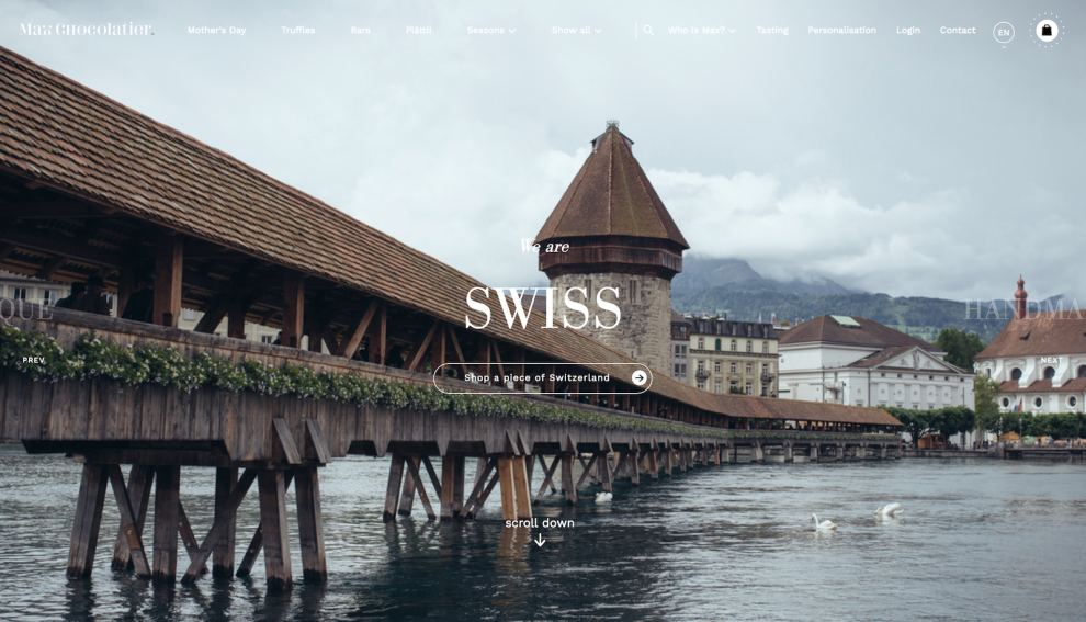
The Max Chocolatier website uses image-driven design to emphasize chocolate culture, heritage, and creation. The home page opens with a bold photograph of the Swiss landscape, suggesting where chocolate comes from and the dedication this brand has to quality chocolate.
Clean space makes it dreamy to interact with, allowing users to create their journey and navigate the site how they want to. This innovative and exciting use of white space adds some fun to the presence of emptiness.

The Power of White Space in Web Design
Clean, clear, and cohesive are just a few words used to describe designs that effectively use white space. White space adds lightness and brightness to any website design, which makes it more engaging to interact with.
Navigation is simplified when the layout is open and airy, precisely what negative space can do for a design. It can give it some breathing room, making it much easier and more pleasant for users to dive into your website and its content.
Space doesn't have to be white and dull. In some cases, it can be the most exciting part of a design, fostering enthusiasm and anticipation that keeps people scrolling, learning, and buying.
White space declutters the screen, making the overall UX and journey more appealing and efficient. If your website packs a lot of information, you should self-evaluate. You don't want users to be turned off by your design before ever focusing on your products and services.
Examples of White Space: Final Thoughts
Brands can learn from the above examples on the importance of using negative space and how to incorporate it into your designs.
Remember, the top web design agencies can help you harness white space on your website. You can also get in touch with the best digital agencies to ensure that your website and seamlessly aligns with your digital strategy.
White Space FAQs
1. Is white space good for a website?
Yes, white space is excellent for all sorts of websites. It promotes clean, modern, and sophisticated design, highlights important page elements, enhances readability and declutters, guides user journeys, and improves UX.


-preview.jpg)


