In 2017, $10.73 billion was spent on books in the United States.
There are hundreds of thousands of book published each year in the United States. Globally, these numbers are in the millions. So when your book is sitting on a shelf next to another of similar subject matter, how can you make sure yours gets picked?
You know that saying -- you can't judge a book by its cover? Well, turns out you can. And you should, because book cover designs are important.
They're what subconsciously makes you pick up a book from a display table or bookshelf and give the back cover a read.
Table of Contents
25 Creative and Effective Book Cover Designs
- The Utopia Of Rules by David Graeber
- Seven Brief Lessons On Physics by Carlo Rovelli
- We Are The Ants by Shaun David Hutchinson
- The Great Gatsby by F. Scott Fitzgerald
- The Psychopath Test by Jon Ronson
- Me (The Art Of Living) by Mel Thompson
- Last Last Chance by Fiona Maazel
- The Snowman by Jo Nesbo
- All We Saw by Anne Michaels
- Impossible Motherhood: Testimony Of An Abortion Addict by Irene Vilar
- Nicotine by Gregor Hens
- Experimental Geography by Nato Thompson
- Eat Pray Love by Elizabeth Gilbert
- The Thing About Life Is That One Day You'll Be Dead by David Shields
- Riot Days by Maria Alyokhina
- Gone: A Girl, A Violin, A Life Unstrung by Min Kym
- Beauty Salon by Mario Bellatin
- Tampa by Alissa Nutting
- On Tyranny: Twenty Lessons From The Twentieth Century by Timothy Snyder
- How To Behave In A Crowd: A Novel by Camille Bordas
- Invisible Monsters by Chuck Palahniuk
- Feathers: The Evolution Of A Natural Miracle by Thor Hanson
- Lesser Beasts by Mark Essig
- The Day The Crayons Quit by Drew Daywalt
- Red Queen by Victoria Aveyard
1. The Utopia Of Rules by David Graeber

It's fitting that a book about how people react and relate to bureaucracy has a cover design that is more than bureaucratic.
This design resembles a government form, with the title of the book and its author in place of the traditional required information. The off-white pink background resembles a pink slip. The copy is straightforward, bold and strong.
This design is strong and engaging. Even if you didn't know this was a government form, you're still intrigued by its format and layout. And that's the point. It makes you stop and look. It makes you think. It makes you keep reading to learn more.
2. Seven Brief Lessons On Physics by Carlo Rovelli

Who knew science could be so gorgeous?
I'm sure most scientists would raise their hands, but to those who've never had an interest in physics, a book with such a mesmerizing book cover is definitely hard to resist.
A black matte background takes on the persona of outer space while gold foil dots dance across the cover mimicking the stars. It's exciting. It's ethereal. It's deep. The gold color fades and glows, and it's mirrored in the typography which stands resolute and bold.
This eye-catching and inspiring design is bound to make even those with no interest in science ready to make a purchase. Check out some of the most inspiring website designs.
3. We Are The Ants by Shaun David Hutchinson

A book about aliens, the teenage experience and human nature, this novel touches on a lot of intriguing and deep topics -- which is why the cover seems to try and take on a grander design.
The majority of this cover is taken up by the night sky from what looks like the point of view of a telescope that mapped the starts in a full earth cycle. You see movement. You see depth. You see the universe whirling by.
You also see a constellation design to further promote the theme of space and the grandness of the universe around us. And considering this book is about a boy routinely visited by aliens, it makes sense.
But even if you don't know what this story is about, you're instantly interested in what the stars and the sky have to do with us as people.
The sans-serif lowercase typography further pushes you to ask questions. And that's what this book wants you to do. But it does give you one answer -- and that answer is yes, you want to read this book.
4. The Great Gatsby by F. Scott Fitzgerald
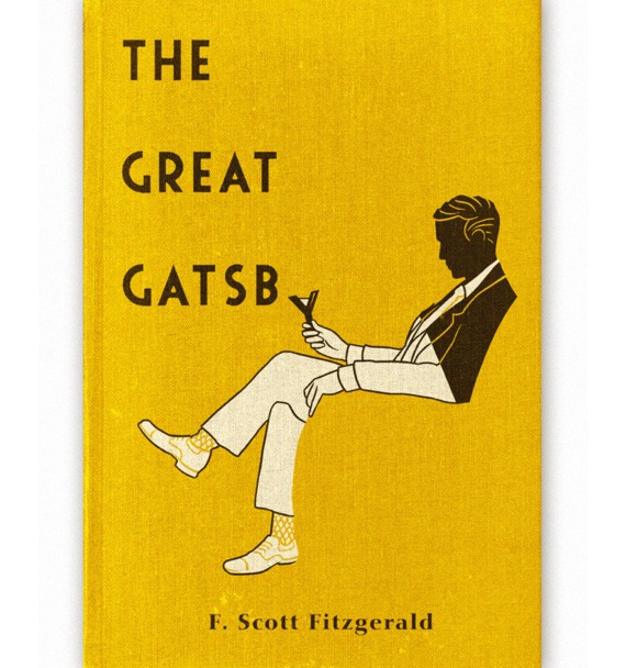
We've all read The Great Gatsby, haven't we? We've all heard the tale of Jay Gatsby and his eternal love for the girl he loved and lost. We all remember the symbolism of the green light across the water and the emptiness of his roaring 20s parties.
This book cover design might be an older iteration, but it is no less powerful. The textured, dirty yellow background captures the essence of years passed. The iconic, bold font emanates power. And the way the Y doubles as a martini glass is more than fitting.
Gatsby himself, as one would image, sits on the cover, the chair he's sitting in fading into the background just like the hopes and dreams of the character himself.
This design does a great job of embodying the heart of the story itself. It tells readers what the story is about without giving too much away. It's a powerful design that makes you want to read more -- even if you've never heard of the book in the first place.
5. The Psychopath Test by Jon Ronson

Bright, chaotic and unnerving, this book cover design is bound to put you on edge. This book delves into psychopathy, the study of psychology itself, health professionals and the effects of the media.
Knowing this, the dual nature of this cover is pleasing and understandable. On one hand, you have a very clinical and simple black and white design with a safe and careful bunny. On the right, you have a bright yellow background complemented by pink typography and sharp lines that give off signs of urgency and danger.
It's chaotic and rough and dangerous on one hand, and minimal, clean and safe on the other. The two sides balance each other out design-wise and pair well with the content of the book inside.
6. Me (The Art Of Living) by Mel Thompson
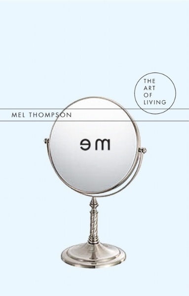
This novel asks the philosophical question, "who am I?" It's a novel about the self, and what it means to be an individual. It's a book about looking for the meaning of life and the meaning of being a human.
So a mirror being the main focal point of the cover design makes absolute sense. And the way the graphic designers reversed the word "me" is extremely impactful and insightful.
Whether you know this book is psychological in nature or not, you definitely feel an interpersonal pull from its light blue background, small, minimal copy, and lack of general imagery on the page. It pushes you to ask questions and think deeply in a way the book forces you to once you start reading.
7. Last Last Chance by Fiona Maazel

This enchanting and airy design immediately draws you to it. With a serene, soft and puffy cloudy sky and a picturesque rainbow, the photography here is truly stunning.
But that's not the design aspect that really makes you stop and stare. No, it's the jarring cut at the bottom right corner, like a piece was cut out and placed back in, in a haphazard manner. It's complicated. It's unorthodox. It's uncomfortable.
Why would you disrupt an otherwise perfect image? This calls to the story itself -- the story of a girl whose life is turned upside down.
This book cover design is one you can't resist giving a closer look.
8. The Snowman by Jo Nesbo
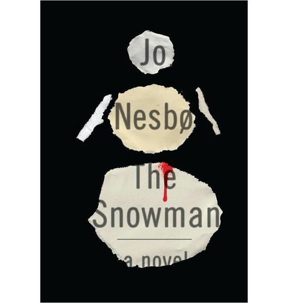
This crime novel is gritty, emotional and intense.
Even without knowing what the content of this novel was, you could probably decipher the genre though. Maybe it's because of the newspaper print beneath the cutout snowman. Maybe it's because of the streak of blood falling from said snowman's chest. Maybe it's the amount of black, dark and empty space that takes up the majority of the book cover.
Either way, the cover tells you something. It tells you that you're going to be in for a crime-ridden, dark and twisty rollercoaster ride. And it scares you just a little.
But the design also lets you know that it's going to be worth it.
9. All We Saw by Anne Michaels
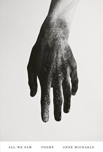
This work of poetry is immediately enchanting with it's black and white cover, the sole image being that of a hand dipped in glitter -- giving off an ethereal and out-of-this-world vibe.
This book of poetry centers around the question of what love makes us as people capable of doing, and what it prevents us from doing. It's a beautiful question to unpack, which is why this gorgeous imagery takes center stage.
There's very little else on the cover. At the bottom of the cover, hidden inside a stark white bar you have the simple copy, depicting the title, the author and the genre of the collection. It's out of the way and slightly hidden so that the dipped hand can make the majority of the impact.
10. Impossible Motherhood: Testimony Of An Abortion Addict by Irene Vilar
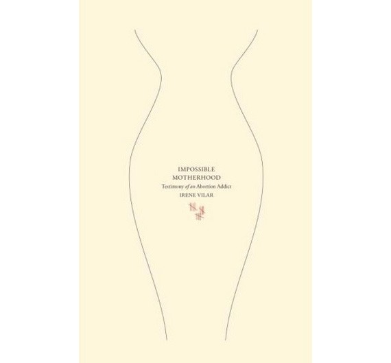
Abortion is a tough subject to touch upon. It's taboo. It's raw. It's uncomfortable.
Similarly, the yellowed, almost dirty looking color of the cover gives off a similar sense of disgust and confusion.
At the center of this design is the soft, subtle outline of a woman's body. Two thin black line float down the page outlining the female curves. Inside this shape lies the title and the author's name in very small, very simple font.
Beneath that are 15 red checkmarks which relate to the 15 abortions this woman had before her first child.
And fittingly, this imagery falls right onto the woman's womb.
This design was very intentional. It's direct and blunt and in your face -- but in a very graceful and elegant manner.
11. Nicotine by Gregor Hens
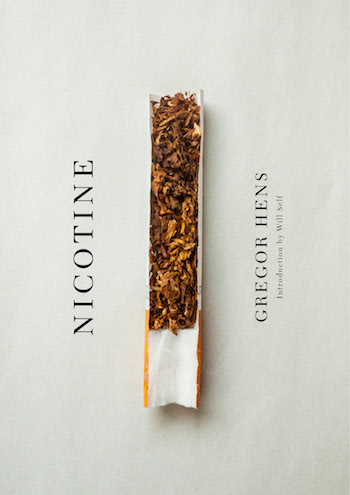
Nicotine is a book about the ups and downs of addiction, but you could probably guess that from the cover, which includes a cigarette cut in half, its contents laid out on the paper in a very organized and visually-appealing way.
Set against an off-white background, there is nowhere else to look but at this deadly little object. It's the only pop of color on the page itself.
On either side of the cigarette are the title and author's name. These follow the cigarette's orientation, lining the cover vertically in a way that causes you to tilt your head for closer inspection.
This is a very engaging, eye-catching design that uses photography and orientation to make you want to learn more.
12. Experimental Geography by Nato Thompson

This novel comprises a collection of essays and research that delves into geography, industrialization and the point where these two collide.
On the surface, it looks a bit like a textbook -- but one of those cool ones you got to read in high school. It's geometric and angular, the top half of the cover taken up by thin, blue vertical lines that give off the impression of the sky.
The bottom half is a kaleidoscope of colors that run across the cover horizontally. At the bottom, the colors start off orange and brown -- representing dirt, sandstone and the earth itself. Then it moves to the blues which represent the water beneath the surface. Then you have yellows and reds which is where you have additional information about the book itself.
At the center, you have white outlines of hills, mountains and valleys.
The cover designers definitely knew what they were doing when they created this sharp, strict and bold design -- which is essentially a break down of the earth's makeup itself.
13. Eat Pray Love by Elizabeth Gilbert

This is the story of a woman traveling the world to eat good food, answer deep questions and find love.
Fittingly, these three themes play a major role in the cover itself.
Set against a white tiled wall, the design that takes up the majority of this space is the title. The words "Eat Pray Love" are stacked on the image one on top of the other. But it's the mediums used that makes it so impactful.
The word eat is created using what looks like mustard. The word pray is created using rosaries beads of some kind. The word love is written out in colorful flower petals. Each medium represents the word itself in a stunning and majestic way.
It's a simple design that would otherwise go unnoticed had the designers not chosen to play with typography.
14. The Thing About Life Is That One Day You'll Be Dead by David Shields
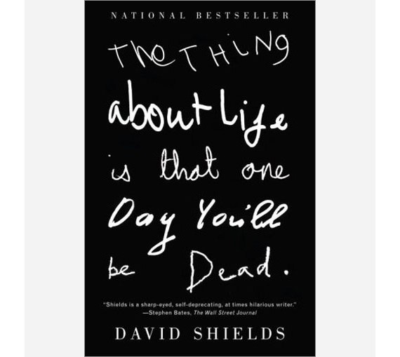
The title is grim enough. It tells you exactly the tone and mood of the piece you're about to get yourself into. It's dark. It's mysterious. It's straight to the point and isn't pulling any punches.
It is for that reason -- because of the power of the title itself -- that the title then makes up the entire design. There are no illustrations or eye-catching imagery.
Instead, you have big, bold typography. The cover itself is a bleak and strong black, so the text is white. It's written out by hand, though each line varies in boldness and incorporates subtly different fonts. Some lines are thin and whispy, some are curly and bold.
This book is a book about life, death and the human anatomy. And while you might not completely understand that at first glance, you do know that this book is going to intrigue you.
15. Riot Days by Maria Alyokhina

This book depicts the personal account of a Russian Pussy Rioter. You get this idea almost immediately, no need to check out the interior.
That's because of 1. the title and 2. the riot mask that transparently lays at the forefront of this design.
What looks like a pink mesh-like or woven mask hovers over the book's title and author. You see two eye holes and one mouth hole. This is extremely vivid, bright and exciting.
Beneath, you have a bright yellow background and big, bold and black text. It is slightly obscured by the riot mask, but you get the point.
This design works so well because it is both subtle and striking. The colors are engaging and fun, and the mask design is slightly fearful and daunting. You have a mix of emotions when looking at this book but you're more than ready to give it a read-through.
16. Gone: A Girl, A Violin, A Life Unstrung by Min Kym

This touching memoir recounts the life of a violinist whose violin was stolen, thus catapulting her into a journey of self-reflection and doubt.
From the first view, you understand the importance of the violin in this story. It's cut out of the book cover in a rushed, haphazard way. In its absence, you have the title. The first word you see is "Gone" in big and bold italicized font.
The background of the cover is made up of a black and white photograph of the author herself.
This simple, subdued design is rough around the edges -- literally. The use of shape and texture are key in creating this noteworthy design.
17. Beauty Salon by Mario Bellatin

On the surface, this design is bright, happy and carefree. The bright pop of pink that makes up the salon chairs perfectly contrasts with the bleak whiteness of the background wall. You almost wouldn't know this is a book about the detrimental effects of HIV AIDS on the gay community.
But in its hand-drawn nature, the slight dullness of the cover colors, and the empty space that takes up the rest of the space on the page, you do feel a sense of sorrow and emptiness from this design. And it perfectly captures the essence of the story itself.
Even the cursive blue font of the title leaves a tingling in the back of your mind. There's something slightly off about this image, and the design embodies this feeling in a subtle, yet powerful way.
18. Tampa by Alissa Nutting

Tampa is a book about sex. More importantly, it's a book about sex with an underaged individual -- the desire of a schoolteacher and the lengths she is willing to go to have her desires satiated.
It's pretty dark and uncomfortable, which is why the cover is equally jarring and uneasy.
Made up of what looks to be a buttoned shirt, the focal point of this design is the open buttonhole. What does it make you think of? Exactly. Sex. There's nothing like making a normal, every day object sexual to put you on edge. And that's the point the cover designer was making when creating this cover.
The dusty pink nature of the cover itself makes you think this could be a light topic -- it instills a false sense of security. But with this hole taking center stage, you need to read more to truly understand what it's all about.
19. On Tyranny: Twenty Lessons From The Twentieth Century by Timothy Snyder

Considering the powerful assertions this book makes about our political history, and the parallels it draws about our country's future, it makes sense that the designers behind this novel chose a powerful and stoic design that can stand on its own.
With an off-white background, bold, red vertical bars and strong black sans-serif font, this design isn't playing around. It's resolute and determined. It's powerful. It's authoritative. It's a simple but robust design that speaks to the heaviness of the words beneath the cover.
The claims that this book makes aren't something to mess with. And neither is this book cover design.
20. How To Behave In A Crowd: A Novel by Camille Bordas
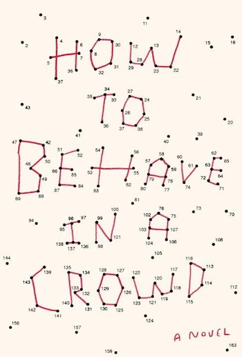
Who doesn't love a good drawing-by-numbers? That's the first, immediate draw to this book cover design. The eggshell background is the perfect backdrop for the bright red typography and the bold, stark numbers.
The cover designer for this piece certainly had some nostalgic fun with this design.
Full of fun, nostalgia and silliness, this cover perfectly captures the adolescent essence of the young female protagonist. It's a unique and out-of-the-box concept that points out the importance of getting in touch with your younger self.
This design is fun, flirty and cute -- fitting for the novel in question.
21. Invisible Monsters by Chuck Palahniuk

Images are powerful. Images stick with you and make you think. Designers -- whether they're book cover designers, graphic designers, print designers, web designers or package designers know this.
And when you look at this book cover design, you definitely feel its impact.
Set against a white background is the black outline of a beauty queen -- crown and all. It would be a cute and crafty image if it weren't for the splash of pink across her mouth in the style of blood.
And it's the only color on the entire cover.
Beneath this image is the boxed in title and author name. The title is written upside down, and it reads from right to left as opposed to left to right. It's unorthodox and uncomfortable, much like the ideas within the novel itself.
This book cover design uses color and powerful illustration to make it stand out from its competition.
22. Feathers: The Evolution Of A Natural Miracle by Thor Hanson
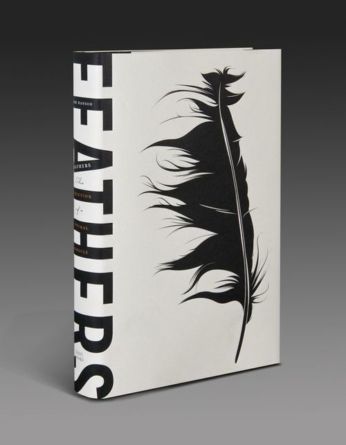
Feathers is a book about, you guessed it, feathers. It’s a book that delves into the history and evolution of these soft, aerodynamic appendages. And this book cover puts the topic of the book on bold display.
Set against a yellowed background, the dark, filled-in feather takes up the entire book cover. Along the binding is the book name is dark, bold, capitalized and sans-serif font. It’s a simple, minimalist design. It’s blunt, straight to the point and bold. There is no confusing what the topic of this book about, but there is just enough mystery that pulls you in and keeps you intrigued.
The off-yellow background has a very antique, educational vibe. It’s full of authority and regal sophistication. And the complementary black imagery stands strong as a result.
This is a book cover design that plays with shape and typography beautifully to create a design that jumps off the shelf.
23. Lesser Beasts by Mark Essig

Lesser Beasts is a book about the humble pig — but you probably got that from the book cover. This is an excellent example of a book cover design that makes it clear right from the start what the content of this book will be.
The soft blue, almost decaying color of the background stands as the perfect backdrop to the image that takes center stage. It’s dirty — almost like the way we look at the animal, a pig. And you can get an intimate understanding of the content that is sure to enlighten.
This pig that sits at the center of the design is bold, blunt and straightforward. The pig is sectioned off in the image, each section categorized by the meat it is used in.
It’s scientific and blunt — and it’s free of emotions which is exactly how people look at pigs in general.
This design certainly grabs attention and makes viewers think. Pigs are creatures too, and the discomfort of this book cover design makes that apparent.
24. The Day The Crayons Quit by Drew Daywalt
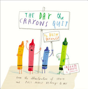
This cool and creative book cover is the perfect first impression for a children’s book. It’s fun, authentic and instantly eye-catching — whether you’re a child, or the adult buying it.
From the hand-drawn illustrations to the chicken scratch that makes up the typography — this fun and enthusiastic children’s book is elevated by a cover design that is happy and engaging and nostalgic.
It looks like the drawing you’d create as a child, and gives context to what you know will be a hilarious and silly story that sits on the pages.
There’s no looking away from this fun and exciting book cover design — but even grown adults with no children in their life can enjoy themselves with this design.
25. Red Queen by Victoria Aveyard
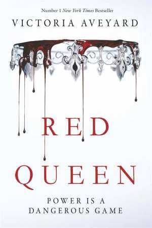
This dramatic book cover is oozing with sophistication and mystery. The gorgeous imagery of a crown dripping with thick red blood is certain to pull you in, and it deserves at least a skim of the first page.
There’s a luxury and a regalness that oozes from this design. It’s simple yet eye-catching and you simply can’t look away. The stark, white background works as the perfect, clean backdrop to the dramatic photograph that sits front and center.
It says a lot in a single image. The crow says loyalty and class while the blood says mystery, intrigue and curiosity.
It’s a thought-provoking design that is full of excitement. You’re full of questions and you’re hoping this book has all of the answers. It’s a simple, straightforward design. But it poses more questions than it answers. And this mystery is what pulls readers in and demands more. It’ll definitely be hard for you not to buy this book once you see it on bookstore shelves.
The Psychology of Color and Font
When it comes to reading and absorbing content, aesthetics are intricately and intimately involved. In order for a consumer to leave a piece of content with a favorable feeling, the text needs to look the part. In short, positive feelings come from good design — in typography and in color choice.
Studies show that good design in the form of text, shape and color produce a feeling of lightness and happiness in the reader.
One study by psychologist Kevin Larson showed that clear, creative and visually-appealing font led to a better mood within the reader.
High quality typography appears to induce a positive mood, similar to earlier mood inducers such as a small gift or watching a humorous video. This is an exciting finding because there are important differences between good and poor typography that appear to have little effect on common performance measures such as reading speed and comprehension. To help move the field of typography forward we need methods that can successfully measure aesthetic differences.
This study clearly outlines the effects font has on mood and demeanor. More specifically, it delves into how good-looking font can affect emotions. And it found that prettier, aesthetically pleasing font had a profound impact on mood and behavior that led to more positive vibes as opposed to more stoic and bland fonts that had the opposite effect.
And when it comes to color, there is another clear indicator that it matters. Sixty-two to 90 percent of assessments and judgments are impacted by color primarily. Similarly, color says a lot about a brand and the purpose of a product — and studies show that these distinct color choices certainly make an impact.
Long story short — font and color can grab attention, evoke emotions and shape consumer perceptions. From web design to app design and even in print materials — color and font are valuable elements that can entice users, create urgency and instill a sense of happiness.
Marketers and designers need to be aware of these elements and how they can leverage them in their designs. And in these book covers, the designers were definitely clued in.
These 25 book cover designs are inspiring, daring and imaginative -- they just work. And they offer the perfect inspiration for illustrators, authors and designers who are looking to up their game and create immaculate pieces of visual art.
You Can Judge a Book by Its Cover Design
Book cover designs make an impact on readers almost instantly. They're quite literally the first thing people see, and many times they're the only piece of content the reader will interact with before deciding on a purchase.
That means that yours needs to stand out if you want people to start flipping through its pages.
Book cover designs need to tell readers what the story is about while also leaving some to the imagination. They can't reveal too much, nor can they reveal too little.
From self-published books to ebooks and everything in between -- cover design is vital to the publishing experience.
Bright colors, intricate typography and stunning imagery are just a few of the key elements that go into a successful book cover design. That's because they immediately catch your eye and draw you in.
Unless you're an avid reader, it's not likely that you enter a bookstore without knowing what you want to buy. More likely than not, you already have an idea and you set yourself directly on the path to your specified section.
But if on the off chance, you do stumble into a bookstore to casually peruse, these book cover designs are sure to make an impact. And if you see any of these 25 covers out of the corner of your eye, you'll likely find it hard to resist taking a peek.
These book cover designs are helpful for designers and authors alike looking to create the next best selling work of fiction or nonfiction. Both are integral to the publishing process, after all.
Walking that fine line can be tricky, but if you use these 25 examples as inspiration, you could see your book on the next New York Times bestseller list.
Looking for a great graphic design agency to transform your product or business's identity? Check out DesignRush's Agency Listing section.


