"Logos are a graphic extension of the internal realities of a company."
This quote by graphic designer and filmmaker Saul Bass describes the importance of a logo succinctly.
Every brand wants an eye-catching logo, plain and simple. They want to make a statement. They want to stand out from the crowd.
Because brands understand how important it is to be noticed. They understand how important it is to have brand recognition and brand awareness. And they know that one of the easiest ways to do that is with an image, a design that makes people stop and think — a design that makes them feel.
This is based on general knowledge and scientific research. Studies show that logos directly affect consumer behaviors. This study in particular shows that branding and design directly impact the decision-making process a person undergoes when deciding whether or not to go through with a purchase or interact with a brand. But do you know why logos are so important?
Table of Contents
- Logo Design Inspiration Basics: Why Are Logos Important?
- What Goes Into A Great Logo Design?
- 8 Startups That Spark Major Logo Design Inspiration And Will Get Your Creative Juices Flowing
- Cheddar
- 42Floors
- Dropbox
- Snapchat
- Squarespace
- Zipline
- ClaimAir
- Airbnb
- Logo Design Inspiration You Shouldn’t Emulate
- Logo Designs That Makes An Impact
Logo Design Inspiration Basics: Why Are Logos Important?
"Everything is design. Everything." — Paul Rand, art director and graphic designer
Researchers have found that it takes less than a second for people to form a first impression, and only 2.6 seconds for their eyes to land on the areas of a website that most influences that first impression. And of the six areas of a web design that gained the most attention and drove the most first impressions, the company logo was most focused on with 6.48 seconds spent looking at it.
Even toddlers have the ability to recognize logos and form opinions on them.
Logos are vital for any company or brand that wants to make it in this increasingly globalized and technologically advanced society. They are important because logos can travel in ways words can't. An image has the power to transcend other forms of communication and design.
Brand awareness is vital in an increasingly global and technologically advanced world, and logos can help increase a brand's presence across the globe. Eighty-nine percent of marketers say brand awareness is their most important goal, meaning investing into a good logo is imperative.
Logos are included on all branded material a company produces and markets to the world. Logos give consumers a glimpse into your brand identity, and they reflect a company's image. A logo is the first impression your company gives to the public, and you want to make it a good one.
What Goes Into A Great Logo Design?
“If I had a dollar for every time someone asked, 'What do you think about this logo?' I’d be rich.” — Amber Hurdle, brand strategist
It's vital to know what goes into a good logo, and what will make an impact. Studies show that color has been known to increase brand recognition by 80 percent. Therefore, the color of your logo has a lot of power too.
But there's even more to a good logo than just color.
Not every person in the world can read English, Spanish or Mandarin, but they can remember and recognize a symbol. Think of the tailed mermaid of a popular coffee shop chain or the apple with a bite that represents one of the most powerful computer companies in the world.
That is the level of instant recognition that most businesses want to achieve and the reason the world’s biggest companies invest millions of dollars in logo design.
Don’t get the wrong idea, though. You don’t have to spend a fortune to design a groundbreaking company logo.
Coca-Cola spent nothing on their logo design, and some companies like Microsoft work on design in-house to keep costs low. Nike paid just $35 for the “swoosh” while Twitter’s iconic bird only cost $15. However, you do need to spend a considerable amount of time and energy thinking about what you want your logo to say about you.
There’s this perfect balance between simple and artistic that prevents you from being too clichéd while also conveying a meaningful message, and that’s where you should operate.
But, how do you achieve that? The five pillars of logo design can help.
1. Originality
In order for a logo to be successful, it needs to be original. And it needs to stand out.
A great logo design can't look like any other logo. If it does, how can you be sure it will resonate? If your logo just looks like any old logo, or if it closely resembles a competitor, you'll be in for a lot of confusion down the road.
Your logo needs to speak for itself. It needs to include elements that are specific to you and your organization. It needs to be uniquely yours and no one else's.
2. Simplicity
Another thing that drives successful logos is simplicity.
It needs to be simple. It needs to be clean. It needs to be minimal — not necessarily to an extreme, but enough that it can easily grow and adapt to the times and the growing technological mediums it can be seen on.
Don't overcomplicate your design with too many moving parts, too many words, too many illustrations or too much activity. Your logo should be simple and get its message across clearly and effectively.
3. Responsiveness
Another vital aspect of a logo that sells is responsiveness. Over 60 percent of global online traffic came from mobile devices, so responsiveness is necessary in order to survive.
In a world where technology is constantly evolving and how we consume media is constantly changing, it's important your logo can grow and adapt with the times. This means that while it needs to be a simple and clean design to start out with, it needs to look good regardless of its size.
If you think about it, your logo will be seen in a variety of different mediums and platforms. It could be seen on big billboards or tiny smartphone screens. It could be seen on your web page, but also as a little icon on your social media profile.
This means that it needs to grow or shrink on demand. If there is a wordmark or copy accompanying it that isn't as essential as an image that also exists, the copy needs to be able to effectively and efficiently drop so that the image can take center stage and become the emblem people can see most clearly
4. Creativity
While you should follow design trends, you should also let your own creativity flow when designing a great logo.
Creativity is vital to a logo that shines because it also tells your audience that you know how to think outside the box and have fun with yourselves, your designs and hopefully your brand as a whole.
It will also help create a logo that stands apart from the rest and stands the test of time.
5. Modernity
Design trends are always changing. Technology is always evolving. So you have to work hard not to get left behind. This might seem like a difficult task that'll force you to constantly be reevaluation yourself, your designs and your initiatives. But a good way to stay fresh and hip is to create a logo that is modern and cool.
Modernity, like minimalism, is in. People want to see things that are fresh and clean. They want cool. They want effortless. They want chic. And it's important to give audiences what they want, otherwise, they'll turn to someone who will.
8 Startups Logo Design Inspiration Overview
“Logos and branding are so important. In a big part of the world, people cannot read French or English — but are great at remembering signs.” — Karl Lagerfeld, creative director at Chanel
Now that we know why logos are important and what goes into creating one that grabs attention and successfully represents your brands, let's look at some companies that did well.
These companies know how to successfully incorporate the previous five principles of design with ease and finesse. They are exciting. They are fun. They are original and creative. They're modern and unique. And they certainly have the ability to evolve and adapt with the times.
These logo designs are the perfect inspiration for your brand or business. Are you a startup? Are you a company that's been around for a while? Do you need to create your first logo or are you looking to undergo a complete redesign? Whatever you're looking for, we have the inspiration for you below.
Here are 8 examples of amazing logo design for startups that can fuel your inspiration.
1. Cheddar
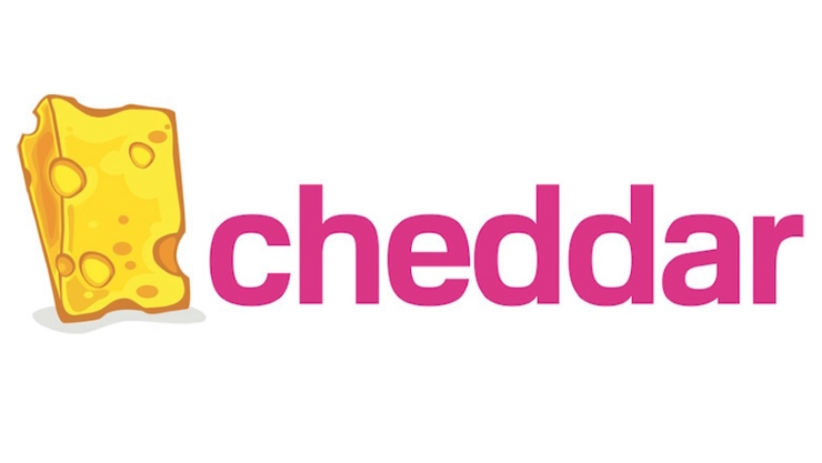
We don’t want to imagine how difficult it may be for Cheddar’s SEO team to compete with one of the most popular types of cheeses in the world for a top Google position. What we admire, though, is the creative way this on-demand video news network with a focus on business content embraced its quirky name and created a unique and memorable logo. Not only that the design is clean, but it’s also a fun representation of what they do. “Cheddar” is slang for “money” while pink is an electrifying color, just like their audience (millennials.)
The Cheddar logo design is a prime example of creativity and originality. The design fits perfectly with the theme of the organization and sets it apart from the competition.
2. 42Floors

42Floors is a startup that helps small businesses find and rent office space. One of the things we love about their logo is that you can get an accurate understanding of what they do just by looking at it. There’s no need to read between the lines or read the “About Us” section to learn how they can help you. The number 4, which is designed as an office building lets you know from the beginning that they’re in the real estate business. The typography is smooth and simple, and the color is very soothing. The two green windows are a nice addition that draws the attention instantly.
This startup logo design is a good example of a logo that is modern and simple. It's simply a wordmark, with a fun and exciting twist. It's easy to spot this logo from afar, and it will easily adapt to the times.
3. Dropbox

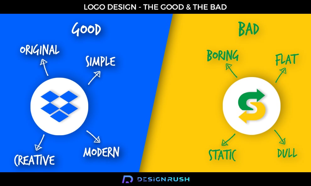
We know what you’re thinking: with over half a billion users, Dropbox fits the definition of a multinational company rather than that of a startup. But, you can’t deny the fact that their logo is a piece of art. Simple, meaningful, and with excellent use of negative space, it played a crucial role in making Dropbox one of the most powerful file storage services in the world. The logo offers a clear visual cue regarding its service. And, the calm blue color makes you trust them with your files and documents.
Dropbox was keeping the responsive design in mind when it created this logo. As something that is flexible, fresh and clean, the Dropbox logo looks good across all mediums.
4. Snapchat

If you are familiar with Snapchat, then you know that the premise on which this popular social network is based is that messages disappear after a few seconds. Their logo, a cute little ghost on a bright yellow background represents this idea vividly. What stands out is that Snapchat’s name is not mentioned anywhere in the logo. Sure, they are an insanely popular company now with instant brand recognition, but you must admit that it was a bold move for a startup.
Originality and creativity are key with the Snapchat logo. Who would have thought a little ghost would be the perfect image to represent a photo-sharing app?
5. Squarespace
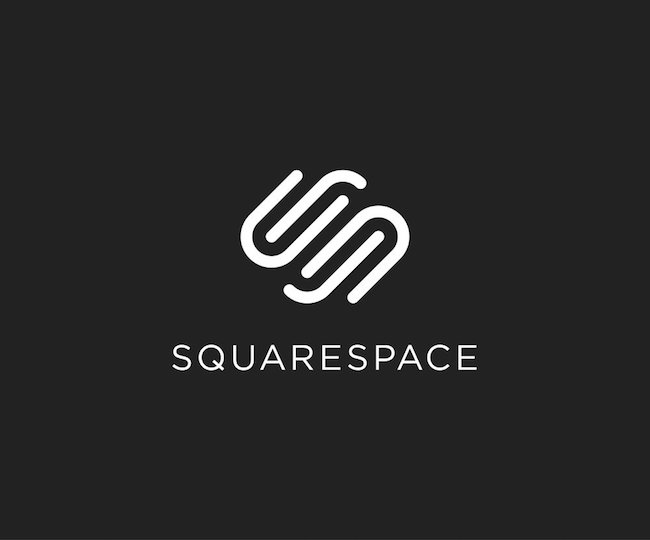
Squarespace is an online platform that makes it easy for businesses and individuals to build a website. There’s nothing remarkable about this logo at first sight. The typewriting is pretty standard, and the color scheme is rather bland. But, this simplicity in design is what makes the Squarespace logo stand out and make a lasting impression. It’s elegant and highly recognizable. And, it conveys their service perfectly: simple, without unnecessary bells and whistles.
The Squarespace logo falls under the pillars of modernity and simplicity. There's just enough going on that it is exciting and new, but it is also clean enough to capture elegant simplicity.
6. Zipline

Drones are both extremely popular and controversial. First, there’s your brother who doesn’t go anywhere without his drone. Then, there’s your uncle who believes they are instruments of destruction. But, in a highly competitive market where drone companies are trying hard to find their unique selling point, Zipline managed to stand out by being completely different. As a company specialized in drone delivery of vaccines, medicine, and blood across Rwanda, Zipline doesn’t even use the word “drone” in their name or logo. Instead, the letter Z is formed out of two paper planes flying in opposite directions, which represents their mission statement perfectly.
The Zipline logo is one of the simplest designs on this list, and it works beautifully.
7. ClaimAir

Raise your hands if you ever had flight troubles. Then, you’re in luck because ClaimAir is a company that promises to help you resolve everything from delayed or canceled flights to damaged or even lost baggage. Their logo is an excellent example of how a minimalist design can say more than 1,000 words. The lines are clean and simple, and the white over bright green background subconsciously conveys a state of calm and harmony.
Modern and exciting, the ClaimAir logo takes advantage of many of the five pillars of logo design. It's simple. It's creative. It's fresh. It's clean. It's responsive. It does it all.
8. Airbnb
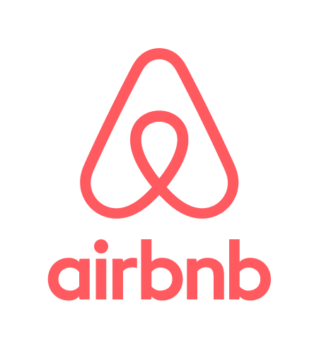
Airbnb is a startup that has quickly risen to international acclaim, and their logo has definitely added to their rise to stardom.
Shortly after hitting the scene, Airbnb redesigned its logo to give its brand a fresh new look. They wanted to encourage a sense of belonging to its community and across the globe, and aptly named their logo Bélo to help with their brand message.
This simple and whimsical logo immediately grabs attention with its bright, coral coloring. It’s not a color often seen in logo designs and pulls you in right away. Then you have the swirly, curly A design that gives off a very relaxed and welcoming vibe. It’s soft. It’s peaceful. It’s elegant. It walks the fine line between regal sophistication and whimsical fun.
The wordmark is also essential to this design. Its lowercase sans-serif font demands authority. Overall, this logo is fresh, clean and fun with design elements that make it extremely successful.
If we had to assign a design pillar to this logo, we'd choose modern and creative.
Logo Design Inspiration You Shouldn’t Emulate
“It’s through mistakes that you actually can grow. You have to get bad in order to get good.” — Paula Scher, graphic designer
Acclaimed graphic designer Paula Scher has it right when it comes to understanding the importance of learning from your mistakes. You won't nail your design on the first try. Sometimes it takes several tries to come to the design that makes it to the public's eye.
Sometimes, brands just don’t hit the mark though — even after several attempts. Sometimes, they try hard to create a logo that’s fun or simple or creative, and the designs simply fall flat. And with these next logo designs, there is definitely room for growth.
Subway

Subway redesigned their logo in 2016, changing their logo from an italicized wordmark, to a simpler, duller wordmark.
Seriously, the redesign leaves little to be desired. The wordmark is now separated into two different colors — yellow and green. The company hopes this would give them a fresh and exciting look, but it just looks off balanced and out of place.
The arrows on the end of the S and W had a place in previous logo iterations, giving the logo movement. But now that the wordmark stands straight and strong, the arrows look silly and out of place.
Trying to be simple and minimal did not work for Subway in its current logo design — and just because you know immediately that this is the Subway logo, doesn’t mean it’s a good thing. We can’t wait to see what new logo they come up with next.
Redbox

This Redbox logo redesign is simple and juvenile. With a wordmark in all lowercase font followed by a big purple period, there is no imagination and no creativity within this design.
This logo design is uninspired. It's boring. It's outdated.
There is nothing that stands out. There are no exciting designs, and even the colors are dull and lifeless.
And don't even get me started on the purple period. What does it mean? Why is it there? What does it add? The answer is nothing. The design team at Redbox are better off starting from scratch to create a logo that leaves an impression other than confusion.
Tourism Malaysia

If you want to talk about a logo design that flopped, just look at Tourism Malaysia's "Visit Malaysia 2020" logo. It's big, it's bright and it's certainly in your face. But not in a good way.
Utilizing outdated, animated animals wearing sunglasses, this logo immediately looks old and corny. It's like a bad dad joke, only without the endearment.
The design looks cheap. It looks silly. The colors don't complement one another and the typography is lacking in style and fun.
And many people have even taken to Twitter to vent their frustrations and poke fun.
At least everyone got a good laugh, right?
Am i doing this right? #VisitMalaysia2020
— le ajip (@ajipkasa) January 27, 2018
Logo Designs That Makes An Impact
A logo can be a deal breaker for a startup company. After all, it’s the first thing people see while scrolling through the App store or their social media feeds.
It's the main image that will bring a sense of comfort and familiarity when looking at a billboard, ad or brand resource. It's the part of a design that will immediately bring a sense of emotion and feeling.
Hopefully, these examples will inspire you and help you understand that it’s OK to step out of your comfort zone as long as the symbol you’re creating represents your business and adds value to it. You can have some fun. You can stretch your creative muscles. You can think outside the box.
But you do have to be careful not to create a logo that falls flat. Because a logo design that leaves a bad impression can be more detrimental than not having a logo at all.
You have to understand the five principles of logo design and follow them. If you don't, your audience will be underwhelmed.
But what does it take to create a logo that makes an impact? A great logo needs to be:
- Original
- Simple
- Responsive
- Creative
- Modern
It needs to tell your audience exactly what you want it to. It needs to tell a story and give audiences a glimpse into the brand itself. And these startups are killing it in the logo game thanks to their passion, dedication and drive for creating a logo that ensures maximum results.
Were these tips and tricks helpful? Because understanding and following these examples is imperative if you're in the market for a new logo or redesign.
And these logos are in it for the long haul.


-preview.jpg)