
Despite the surge in digital advertising and media, print designs are still an essential aspect of any brand's marketing presence. Even digital companies continue orchestrating multi-channel marketing strategies, including print and digital media.
Print design is a powerful tool not just for marketing purposes, but for overall branding. Because design can make an impact and can make or break a brand as a whole. And print designs are a fun and exciting way to get your brand visible outside of the digital world -- taking people by surprise in the process. Art prints, in particular, are a great tool for creative brands of all shapes and sizes.
This article explores some of the best fine art prints and posters created by top print designers.
What better way to promote love for fine arts than producing colorful, artistic posters and prints? In addition to our collection of the best print designs, discover these creatively done posters and how they beautify any place they're in!
Table of Contents
- Spoleto Jazz 2022 by Emanuele Serra
- Opera Balet by Vesna Skornsek
- El murciélago by Limon Studio
- Les Justes by Manon Senal
- AWA by Bavaroise Design
- Shakespeare in Love by Studio Soleil
- OMENS: PAINTED SKY OPERA 2023 by Shaliyah Jones
- ACT-TITUDE by Atelier lfg
- REWIND Film Fest 2021 by Marina Coll
- 15 Trendy Art Print Designs That Showcase Art In A Creative And Cool Way
- The Helsinki Philharmonic Orchestra plays with emotion-evoking colors in their poster designs.
- Art Print Designs Can Make A Major Impact On Creative Brands And Services
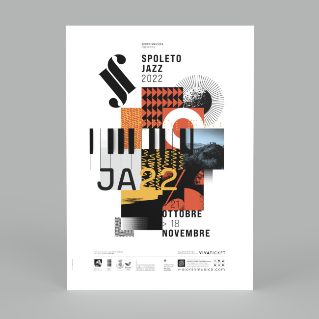
1. Spoleto Jazz 2022 by Emanuele Serra
Standout Features:
- Colorful photo collage
- White background
- Central layout
Designed by Emanuele Serra, the Spoleto Jazz 2022's event poster features a collage of different images, lines, and illustrations. They may look unrelated at first glance, but you'll get a glimpse of what the event will offer upon looking closely.
The varied elements complement one another, a nod to the jazz event's diversity. The white background contrasts the collage, and its central placement commands the attention of any audience.
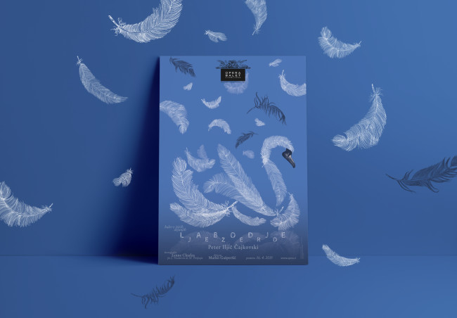
2. Opera Balet by Vesna Skornsek
Standout Features:
- Gorgeous feather art
- Calming color story
- Peaceful and elegant look
Print designer Vesna Skornsek created this unique Opera Balet fine art poster to promote the ballet production of Swan Lake in Ljubljana, Slovenia. The result is a calming poster showcasing ballet's lightness and elegance as an art form.
The print design shows feathers of different sizes forming a swan, ballet's memorable icon. The swan is set on a cornflower blue background as if floating on a lake. The additional feathers on the upper half of the poster add to the calming look of the poster, making it look like an actual painting.
Explore some of the best poster print designs.
3. El murciélago by Limon Studio

Standout Features:
- Heart graphics
- White background
- Detailed images
Design agency Limon Studio created this beautiful art print design for El murciélago, an operetta promoted by the Valencia Superior Music Conservatory. It features a series of hearts intertwined by a string.
The show's title is printed in bold font, blending seamlessly with the visual elements. Furthermore, having white as a background color ties everything in and makes it look neat and impactful.
4. Les Justes by Manon Senal

Standout Features:
- Simple line silhouette
- Legible typography
- Sans-serif font
Les Justes' print design features stunning line art of two people interconnected to each other. Simple yet very appealing, thanks to Manon Senal. It resonates with the audience effectively, with the two opposite colors representing two characters of the play.
On the other hand, the details on the left side of the poster are easy to read in a bold sans-serif font. Using this style is ideal as it complements the line art perfectly.
Check out these print designs with bold fonts.
5. AWA by Bavaroise Design

Standout Features:
- Rose pink filter
- Three-dimensional font
- Tridimensional aesthetic
For the dance troupe AWA, the design agency Bavaroise Design created a fine art poster print reminiscent of a 2000s film poster. It features a clever use of imagery and movement while maintaining the simplicity of the design.
The high-quality photos of the dancers add a concrete visual element, while the placement of the logo at the corners of the posters strengthens brand recall.
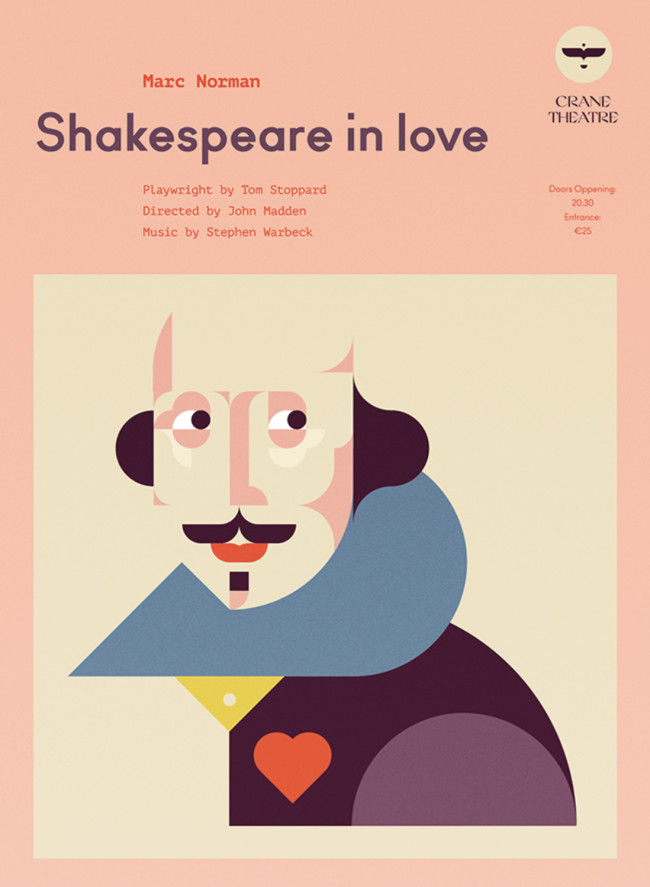
6. Shakespeare in Love by Studio Soleil
Standout Features:
- Pastel colors
- Geometrical stylized image of Shakespeare
- Bold sans-serif font
Studio Soleil's creation for the Shakespeare in Love poster incorporates modern design, appealing to a younger audience. The highlight of the poster design is a geometrical stylized illustration of Shakespeare in pastel colors. The agency used dreamy and romantic colors, alluding to the nature of the story.
While the bold, sans-serif font contrasts with the fluid illustration, the colors still match the image. This creates a cohesive look and a poster design that’s pleasing to the eye.
7. OMENS: PAINTED SKY OPERA 2023 by Shaliyah Jones

Standout Features:
- Stunning illustrations
- Monochrome palette
- Typography inspired by paintbrush strokes
Shaliyah Jones's design for OMENS: PAINTED SKY OPERA 2023 is a visually captivating blend of modern art and classic elegance. The eye-catching illustration captures the essence of the story and piques one's curiosity.
The agency created intrigue among audiences with this alluring creation in a green and gray color scheme. The unique paintbrush-inspired typography is huge but not overbearing. It complements the overall visual and lets the illustration shine. This design move ensures the opera's name is unmissable. The event details also take on a clear and legible font, providing easy readability.
Explore other print designs that leave a good impression.
8. ACT-TITUDE by Atelier lfg

Standout Features:
- Dramatic images
- Dark color story
- Informative text
Atelier lfg's design for ACT-TITUDE combines dramatic imagery with a profound color story to deliver a captivating visual message. The panoramic images of women create a narrative of intrigue and power that captivates the audience.
The dark color story adds mystery and depth to the overall design. Alongside the clearly visible, informative text, the design draws attention and includes essential event details. The emotional appeal and clarity encapsulate the brand's identity, boosting brand recall and audience engagement.
9. REWIND Film Fest 2021 by Marina Coll
Standout Features:
- Playbook-inspired design
- Vibrant photos
- Legible typeface
REWIND Film Fest 2021’s poster design by Marina Coll takes inspiration from playbooks distributed during festival screenings to relay basic needed information about the film festival without being too basic.
The layout is creatively done, with many vibrant photos used to make it look like a real playbook or a lifestyle magazine. Also, the basic information is easy to read, thanks to the legible sans-serif font used in the print design. This provides style and function at the same time.
Had enough? As it's not very likely, let's jump straight into additional...
15 Trendy Art Print Designs That Showcase Art In A Creative And Cool Way

The Helsinki Philharmonic Orchestra plays with emotion-evoking colors in their poster designs.
1. Helsinki Philharmonic Orchestra
The Helsinki Philharmonic Orchestra is based in Helsinki, Finland. Consisting of over 102 musicians, the orchestra produces breathtaking sound and emotionally moving symphonies that are sure to bring goosebumps to any concertgoer. The orchestra wanted to forge their brand image and visual identity, and what resulted was a genius print design that conveys the sheer power and energy of the music.
The logo features the font Grotesk Condensed, with each of the 102 musician names vertically mirroring one another like a soundwave of musical notes. The business cards feature indented vertical lines on top and vertical lines on the bottom, which pop out to give them a beautiful textured experience.

2. Opéra de Saint-Étienne
Graphéine was commissioned to work on the new identity of the Saint-Étienne Opera House. With more than 150 curtain lifts for around 60 performances throughout an average year, the Saint-Étienne Opera House is a landmark of great cultural importance. Naturally, they want to print designs to reflect that.
The typography used in the logo -- and throughout the printed material -- represents the intimate link between music and dance. For that reason, even the tiniest of details were taken into deep consideration. For example, the space in the center of the “O” is stressed to create an emotive sense of surprise and joy.
For the colors used on the print materials, a broad spectrum was used, stretching from dense yellow to purple. Each of the colors is slightly faded to add some age to the shades, but it doesn’t detract from their brightness too much. The designs blend elements of class and creativity, a combination often associated with the opera.

3. Natural Highs Festival 2017
Natural Highs Festival 2017 is an electronic music festival that takes place in Antwerp, Belgium. Serafim Mendes was chosen to design the posters and brand identity, and he achieved breathtaking results.
The use of geometric shapes and tubes forms a synergistic melody of intellectual awakening, with green and red plants built from metallic dystopian circular rings of silver.
Overall, the print design is visually magnetic and alluring. It bursts with colors and symbolism that vacuum attention like a black hole vacuums up collapsed stars.

4. The Rocky Horror Picture Show
The Rocky Picture Horror Show was a 1975 film that developed a cult-like following. As such, a modern play was created where "Shadow Casts" of fans act out the entire movie, and Shanti Sparrow created the print designs for promotional posters.
A red font that shivers in style is seen with the capital words "I see you shiver in antici..." (...pation. We know.) Black bar-shaped strips contain white font with the words "The Clinton Street Theater Presents: The Rocky Picture Horror Show." The textured and blurry background shows a female character dressed in costume, only further highlighting the creativity and artistic style of The Rocky Picture Horror Show.
The designs combine relevance and repetition to create a fantastic print design. The use of popular movie phrases, appropriate horror-styled fonts, and expert color contrasting techniques results in an iconic set of print designs.

5. Mr. Marcel School
Mr. Marcel School is a graphic design and art school dedicated to teaching new techniques and methods for students to fulfill their digital artistic potential. Tata&Friends was chosen to tackle a new identity and branding challenge for Mr. Marcel School.
Light blue and green backgrounds feature hands in a black-and-white gradient filter -- which is of particular relevance due to the fact artists rely on their hands to create. The modular identity is displayed in four different backgrounds of green, brown, turquoise, and purple. Each color shows a different hand position and learning concept.
Overall, the design is strongly representative of a ‘hands-on’ approach that the school wants its students to adapt, and the designs do an excellent job of promoting this.

6. The Korean Film Festival
The Korean Film Festival brochure, designed by Il-Ho Jung, is a colorful expression of print design. It has five cover options, with five primary colors and five design elements, including badminton shuttlecocks, kites, and wands.
As users flip through the pages, each film is represented by a different color for the text and is paired with black and white photography, which pulls the pages together. Pertinent film information, including the credits, runs vertically on the outside of the page, which is also color-coordinated based on the section.
The colors encompass everything from muted pastels to bright hues. They form an argyle-style background and fun type that resembles film. The font is a quaint sans serif typeface, completing the well-rounded design.

7. Atamira Dance Company
A creative, jaw-dropping dance show deserves a promotional print design that matches the spirit of the show. Osborne Shiwan Design managed to capture the creativity and storytelling of Atamira Dance Company with this printed layout.
The dark pages help highlight the black and white action shots, with the red color used throughout the brochure to tie everything together. White pages with more information contrast these gripping, interesting dark pages. The typography on the white pages is bold, but not distracting. The red color maintains consistency and helps pull the viewer’s eye around the page to the different elements and sections.
The photography is inspiring, and importantly, the print designer allows the dancers of the show to be the star of this booklet. They used the creative canvas prints of the dancers’ bodies and built their design around that.

8. Parc Olympique
Parc Olympique is a unique Montreal site that caters to both tourists and citizens from the area who use it as a community space. To cement their status, they needed an advertising platform to rebrand. Not only do these ads showcase the park's activities, but they also display the various shows and games that take place within it. By using actual cut-out shapes instead of an entirely digital approach, the design achieves a beautiful 3D effect.
The final design achieves a surprising result that stands out, not only for the simple, bright color palette but also for the labor-intensive technique used to create this 3D effect.

9. Norme Tributi Mese Covers
Geometry is the base of design and the underlying structure of everything humans have created since prehistoric times. These Norme Tributi Mese covers show a series of beautiful elemental transpositions, and are complemented by bold colors, shadows, and forms that build a noteworthy intention in the viewers' collective mind.
There is also a slight color connection with the 'Mese' title, which helps sell the product. Overall, this is a beautiful design and a perfect example of geometry in design.

10. Art Walk
Marta Veludo was tasked with creating the visual identity for Art Walk Mexico — an event that takes users through a city to discover art galleries and exhibition spaces.
The designs implement a creative and colorful geometric map with crossing paths and colored shapes, and the symbolism is perfect for the target audience of curiosity-seeking creative admirers of original art. A vivid red contrasts with a deep blue background, and a pastel pink pops out from a Bahamian sea green.

11. Hong Kong Ballet
The Hong Kong Ballet is a world-renowned dance company that puts on performances across the world. And to promote a new performance with a new theme — “Never Stand Still” — the company went with a print poster campaign to raise awareness and show audiences about the dancers’ remarkable capabilities.
The resulting print design was a stunning visual display of talent and expertise. Dancers stand in eye-catching positions against bold backgrounds that draw your eyes all over the design. And there’s a dynamic element that comes from the intricate posing and powerful use of color that reels you in, making you want to learn more and experience this adventure.
These designs fit in wonderfully with the new performances, displaying dancers in acrobatic settings and in real-world settings. It gives the brand sophistication and authenticity, but still aligns the dance company as an approachable and friendly persona that anyone can interact with. Even if you don’t normally watch ballet, you’ll enjoy this performance — and that’s a guarantee.
There is minimal text on these designs, the imagery taking center stage and promoting a positive, lively, and enthusiastic performance bursting with a dynamic energy and a bold spirit. This design relies heavily on photographs, and that almost adds to this design — the tangible, real-life qualities really help these posters stand out against the mundane walls and backgrounds they’re set against.
This artistic performance is enriched thanks to this print campaign.

12. The Maison Theatre Book
This stunning and serene lookbook captures your attention almost immediately — and you’re almost surprised by it.
Created to dazzle attendees of a charity dinner, this book adds playfulness and a modern and fun tone to the event in a creative way — and it fits right in with the theme of the night, with attendees coming together to bring the theatre experience to underprivileged children.
Embedded with creative fold-outs, enticing designs, and contrasting colors, this lookbook is full of artistic mastery that pulls you in and keeps you flipping from page to page. The unique nature of the design puts an emphasis on the content inside, leading readers from section to section and taking them on an artistic journey. Black and white photographs overlaid with modern and futuristic imagery further elevate the design and makes it one that modern audiences can truly appreciate.
Abstract shapes, colors, and imagery add a modern and fresh persona to the book and to the event itself. This lookbook helps the event transcend the traditional charity dinner, making it something so much more — a celebration of the arts.
The tangible nature of this design makes it stick with the viewer in a lasting way, promoting the creativity and the power of art and the cause itself. And not just that — attendees can actually take this piece home to cherish and remember — further perpetuating that creativity and the importance of art in general.
This design is wearing a lot of hats, but that only makes it even better to interact with.

13. VR Fest
VR Fest is the first-ever immersive festival in Mexico, and in 2016 it was a stunning success. It brought together the industry’s best and brightest minds to talk about virtual reality, augmented reality, and the technological world in general.
And to promote such a futuristic event, the team went with a very modern and innovative design infused with crazy colors, eye-catching shapes, and holographic elements to stand out from the walls it was plastered against.
This overall design captured the identity of the festival itself, integrated with pleasing and psychedelic patterns, designs, and three-dimensional effects.
A synthetic color palette of blues, violets, pinks, and greens adds depth and excitement to this poster design, standing out and creating an atmosphere of creative ingenuity and innovation that perfectly matches the technological feel of the event.
The event isn’t a normal festival — it’s one that pushes boundaries and tackles complex and futuristic concepts. So the design needs to match that look and feel — and it certainly does — with the fluid and flowing shapes that cascade across the print in a curvy way, bringing the design to life. The letters VR are embedded in an off-balance way that adds sleekness. Match that with the bold, black blocking and simple text — this design is the perfect print to showcase an innovative art and technology festival.

14. The School Of Visual Arts
The School Of Visual Arts is an innovative and robust program with a curriculum catered to all things art and forward-thinking technologies. And to craft an identity on paper that matched it’s powerful and unique spirit, the team turned to creative studio Hinterland to craft a printed booklet to give students and parents a look into the school’s initiatives.
The resulting booklet is overflowing with artistic excellence, creative talent, and an evident passion for the arts and innovation.
And it starts with the reader.
This is a “Create Your Own Adventure” book with readers choosing where they want to go, what adventure they want to embark on, and what they want to learn from the pages within. This isn’t your traditional, linear narrative. Instead, it’s all over the place, capturing the artistry of design and the life of a designer.
Right from the start, this book wants people to experience it. The textured, bright orange color makes you want to reach out and grab it. And once you do, you’re mesmerized by the images, colors and overall designs that cover the pages from top to bottom.
This design really does do a lot in an otherwise simple form, but it does so with beauty and with a clear intention — fostering a feeling of artistic transformation, which is exactly what students will experience as well.

15. NYC Women’s Surf Festival
The NYC Women’s Surf Festival is a festival dedicated to female artists and filmmakers — all with the same passion for surfing. It’s a niche event, with a smaller crowd than other film festivals — but one that still celebrates art and brings together a community of creative adventurers who all have a love for the same materials.
And to bring vibrancy and enthusiasm to this event, the team went with a poster design that really does put an emphasis on its theme — surfing.
Female surfers take center stage, lying on surfboards and swimming along the ocean. They are set against serene and peaceful pinks and greys — capturing the essence of the ocean in a cool and modern way.
In some of these posters, this imagery takes up the entire design. In others, it just sits as the focal point of the entire poster. But it certainly grabs your attention and demands a closer look.
Flowing, bubbly, and pink font adds context to the imagery, giving details about the event in a fun and playful way that further adds to the creativity and uniqueness of the design.
Compared to some of the others on this list, this design can seem rather subdued and simple — but it still captures the heart of the event and puts it on full display, which is exactly what great print designs are meant to do. Check out our article on the best event posters here.
Art Print Designs Can Make A Major Impact On Creative Brands And Services
The best designs have an innate understanding of the consumers they target. Whether it's a web design, app design, package design, or print design. And these exciting print designs engage their targeted audience -- an audience that is creative, artistic, and interested in the arts. These offline creations capture the fun and unknown excitement of discovering new information but also offer a unique life experience.
These print designs are fun and sophisticated. They're engaging and cool. They capture the essence of the brand or event they are trying to promote and do so in a way that's easy to digest and absorb by the viewer.
In a world that's increasingly reliant on technology, print designs can come off as a breath of fresh air. And especially when they are promoting experiences, they can have a major impact.
Use these examples as a guide for your next print design campaign -- and don't be afraid to get a little creative. You never know if something will work until you try it, and these print designs are evidence that the benefits have the potential to outweigh the costs tenfold.
Our design experts recognize the most innovative and creative designs from across the globe. Visit Design Awards to see the:
- Best Logo Designs
- Best Website Designs
- Best Video Designs
- Best Print Designs
- Best Packaging Designs
- Best App Designs
Our team also ranks agencies worldwide to help you find a qualified agency partner. Visit our Agency Directory for the top Logo Design Companies, as well as:
- Top Web Design Agencies
- Top Video Production Companies
- Top Print Design Companies
- Top Packaging Design Companies
- Top Mobile App Development Companies


