You might hear a lot of people saying that print is dead, but that’s far from the truth. In fact, custom print designs are some of the best ways to advertise your brand because they give consumers a refreshing medium to absorb your information.
Everything is digital in this day and age, but that also means that digital content can get tiring. It’s all we see and all we absorb, so jumping on the subway and seeing a print poster plastered n the walls is actually really appealing.
This article covers some of the top poster designs created by the best print designers in the industry today.
Posters have always been an effective way of advertising an event, expressing your thoughts, and promoting your brand. Aside from having a clever copy, designs play a huge role in making the best print designs. Here's a list we've gathered of the most impactful posters today!
Table of Contents
- Mask of The Schwarzen-Löwenbergs by Tim Wikkerink
- Agela Mallen (Citas con la Poesia) by VICTORIA O'MAY
- City of Durham - Social Distancing Signage by Kasia Konopka
- 80s Vintage Taiwanese Style by AMY WANG
- BZRT by Marta Golub
- Aurora by Carol Petri Design
- SCaBS by Ronnie Mejia
- The Practice of Commons by DAVID JACOB
- The 10 Best Custom Poster Designs To Elevate Your Next Ad Campaign
- Top Custom Poster Designs — How Print Ads Can Give Your Brand A Boost
1. Mask of The Schwarzen-Löwenbergs by Tim Wikkerink

Standout Features:
- Gorgeous illustration
- Muted colors
- Lounge view graphic
Poster designer Tim Wikkerink's work on the design for "Mask of The Schwarzen-Löwenbergs" showcases the importance of illustration in storytelling. The design piques curiosity and has everyone excited about the Viennese production.
The muted color palette exudes a sophisticated yet mysterious vibe, catching people's interest and keeping them hooked. The focal point of the design is the lounge view graphic, capturing the ambiance and setting of the series.
Check out these fantastic fine art posters and print designs.
2. Agela Mallen (Citas con la Poesia) by VICTORIA O'MAY

Standout Features:
- Paintbrush stroke typeface
- White background
- Fiery silhouette
Poster designer Victoria O'May utilized her design skills to create an evocative poster for Angela Mallen's "Citas con la Poesia." One standout feature is the paintbrush stroke typeface, which adds an artistic and personal touch to the design. This typeface also mirrors poetry's intimate and expressive nature.
The white background offers a clean canvas that brings other design elements into focus. The most striking of these elements is the fiery red silhouette of a woman. This bold use of color draws the viewer's attention and symbolizes the passion and depth of poetry.
3. City of Durham - Social Distancing Signage by Kasia Konopka

Standout Features:
- Creative illustrations as measurements
- Calm blue background
- Informative text
Designer Kasia Konopka created an effective and engaging social distancing poster for the City of Durham. She cleverly used familiar figures like dogs and motorcycles to illustrate distance uniquely. This approach enhances the understanding of safety measures in a creative way.
The blue background sets a calm and positive tone that allows the illustrations and informative text to stand out.
4. 80s Vintage Taiwanese Style by AMY WANG

Standout Features:
- Vintage Taiwanese pop elements
- Familiar colors
- Newspaper-like photo effect
In her design for the 80s Vintage Taiwanese Style poster, print designer Amy Wang brilliantly incorporates vintage Taiwanese pop culture elements. She transports viewers back to the 80s using familiar colors and a newspaper-like photo effect.
The designer effortlessly captures the era's essence with elements like cassette tapes, CDs, and soda bottles. Overall, Amy Wang's homage to the golden age of Taiwanese pop is a masterclass in nostalgia, making it a standout entry in this list of the best poster designs.
Explore other poster print designs.
5. BZRT by Marta Golub

Standout Features:
- Bold and bright colors
- Fun comic illustrations
- Bold sans-serif text
For the BZRT food festival, designer Marta Golub created a bright and playful poster design. The poster features bold, eye-catching colors with fun, comic-style illustrations to reflect the event's friendly and fun atmosphere.
Even with the colorful illustrations, the festival details still stand out with big, bold letters. This mix of fun photos and clear text perfectly captures the festival's fun and playful vibe.
Check out these print designs with bold fonts.
6. Aurora by Carol Petri Design

Standout Features:
- Poster design variations
- Sleek serif font
- Striking artist photos
Design agency Carol Petri Design delivered a set of phenomenal posters for Aurora, a Norwegian pop singer. They chose to highlight the singer herself, placing large photos of her as the highlight of the design, immediately drawing the viewer's attention.
Using a sleek serif font complements the artist's photos and adds a touch of elegance to the design. The agency's poster variations, plus the elements in each design, work together to create dynamic and stunning promotional materials that represent Aurora's unique artistry.
7. SCaBS by Ronnie Mejia

Standout Features:
- Combination of different fonts
- Textured background
- Simple yet informative
Ronnie Mejia created a practical poster design for SCaBS, using typography to engage viewers. The design agency used a mix of serif and sans-serif fonts, creating a hierarchy that guides the viewer through the information presented. This ensures all essential details are noted.
Unlike flat color backgrounds, the textured background accentuates the textual elements. The text is still clear and legible, contributing to an aesthetically pleasing and informative poster.
8. The Practice of Commons by DAVID JACOB

Standout Features:
- Minimal color palette
- Geometric, grid-like design
- Evocative
The poster design for "The Practice of Commons", a series of lectures, conferences, and discussions held by the Goethe-Institut in Athens is a textbook example of pleasant, albeit actionable minimalism.
David Jacob derived the idea for the typeface from picking up the concept of commoning and using a 'toolbox of common geometrical shapes' to create a modular type system for various applications and use. This, when combined with the rounded jigsaw-like shapes, creates a harmonious unity that masterfully embodies the whole point of showcased events.
The 10 Best Custom Poster Designs To Elevate Your Next Ad Campaign
1. Cool Posters
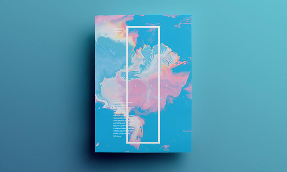
Graphic designer Mane Tatoulian created a line of artistic, colorful, and exciting promotion posters to showcase his talent and get people more intuned with their senses. And these designs certainly strike a chord.
This poster line utilizes many creative and stylistic design elements. Bright watercolors, smooth lines, and dynamic typography stand out and grab attention almost immediately. And the vivid nature of these posters opens up the senses upon impact.
There’s a tie-die nature to these designs, as well as an electric quality that shocks and stuns. Bold shapes matched with strong and simplistic fluidity make a statement — and there’s a mystery surrounding them that pulls you in and encourages you to ask questions.
These designs are extremely disruptive and chaotic — but they’re supposed to be, and that’s the point. They make you think, ask questions, and probe. They’re psychedelic, putting you into a trance and altering your state of mind to truly absorb all that is happening within them.
These posters are meant to alarm and evoke emotion. They’re meant to be different, dynamic, and out of the box. That’s how they make their mark. That’s how they ensure that they’re seen, heard, and experienced.
Your brand could learn a lot from this kind of design technique — using color, illusion, mood and wonder to engage with audiences and leave them wanting more.
2. Raw Wine
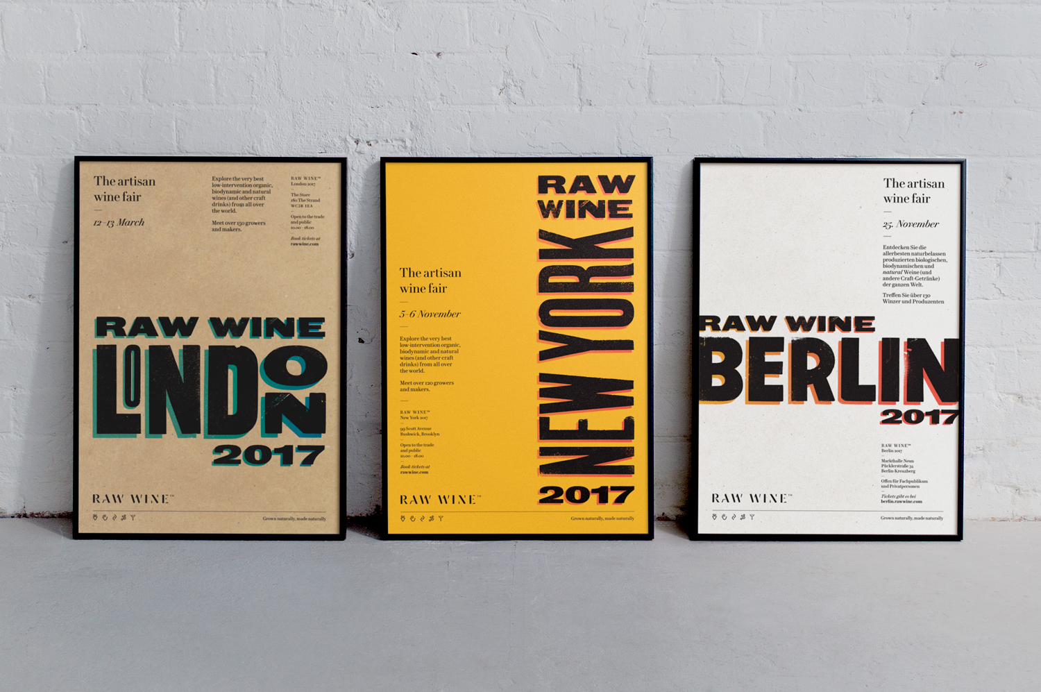
Raw Wine is an international wine festival held all over the world. And to promote their upcoming events, the brand enlisted the help of a designer to help promote the festival and encourage wine drinkers across the world to attend.
These posters are authentic, engaging, and retro. There’s an old-school vibe to the natural-looking backgrounds and the thick, regal font. There’s a simplicity to this design — it’s made up of bold colors and bold typography. And it’s this typography that elevates this design in such a way that makes it impossible to ignore.
The large, black block letters take on a three-dimensional shape, popping from the page. They have a slight shadowing that gives them an edge that is almost futuristic and bold. There is no looking away from these strong and sleek letters.
There is additional copy scattered across this design, but it’s the empty, negative space that really adds modernity and sophistication when paired with the big, black lettering.
This poster puts the festival center stage — highlighting the cities in which they will be running. That’s the point of this design — to promote an event. And they make sure that all viewers know immediately that these posters are there to guide them.
Raw Wine is a brand that cares about all-natural wine and the authentic wine-making process. And these designs emulate that mission and ethos in their simplicity, organic vibes, and emphasis on creative artistry.
3. Transport For London
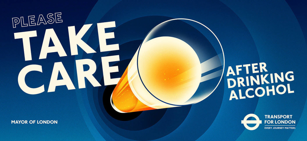
Transport For London is London’s transportation service, and in their recent ad campaign, the brand knew that it needed to promote travel precautions and safety. And in order to do this, the transport authority turned to a widespread print campaign to grab attention and to enlighten.
To lessen the number of transportation-related accidents, Transport For London decided that it would line the walls of Underground stations and buses with bright, dynamic, and creative posters that capture attention and inform users about the hard facts.
Using dynamic illustrations, smooth color gradients, and popping typography, these poster designs hit the mark and demand to be seen. They are immediately engaging, with images that rise from the paper and call you to action.
The bright, vivid, uppercase copy is simple but strong and sleek. It encourages people to read and absorb. It promotes precaution and awareness. If they can take a few seconds to pay attention to this ad, they can take the time to be a little more cautious when it comes to using the tube, buses, and commuter trains.
This is a playful and bombastic design — it takes a very serious subject and adds some fun to it that makes it more approachable and friendly — which means that people are more likely to interact with it.
And for this authority, that was vital. These custom poster designs are innately engaging and interactive, and they're definitely hard to miss. They inform in a creative and cool way that people actually enjoy.
4. Goodwill Vintage How & Sale
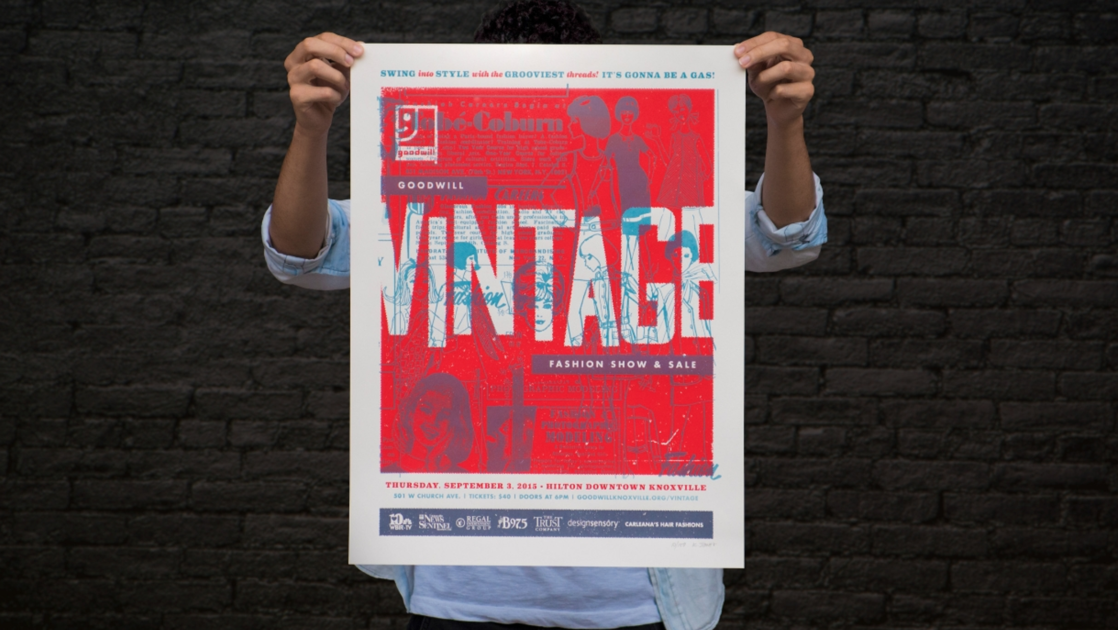
The Goodwill Industries Vintage Fashion Show happens every year. It’s an event that pulls people together for a charitable event where fashion and goodwill are put on display. And in 2015, the brand decided it wanted to bring the vintage theme full circle with a series of custom posters ads.
These print designs are gritty, vintage, and creative. There’s a mishmash of colors, lines, shapes, and words that add an urban, almost dirty vibe that is instantly thought-provoking and engaging.
Iconic images, clever outlines, and retro typography elevate this design, giving it the old-school and sophisticated edge the brand wanted to offer its upcoming fashion show.
This image makes use of design trends that are always coming back in style to replicate the fashion designs that it’s promoting, which are also coming back in style. And this design certainly gives the Goodwill brand an edge that it didn’t have before.
With the help of the posters, suddenly the brand is cool, modern, and fresh. It knows what it’s doing and knows how to interact with audiences in a playful and sophisticated way.
These posters show authenticity and authority. They show dedication and passion. And they show a touch of creativity that you never knew the brand had.
These designs are gritty and chic — there’s an edge to the bold typography, retro illustrations, and colorful contrasts. It looks like a poster you’d see in the 1960s, but there’s an obvious modern twist that makes it even cooler.
Turning to vintage inspiration is a great way to engage with audiences, and print designs are the perfect medium to do so.
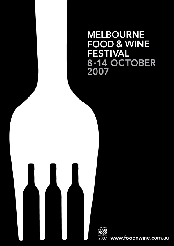
5. Melbourne Food And Wine Festival
Back in 2007, the Melbourne Food And Wine Festival went with a moody and modern print design to promote their event and align themselves as a cool brand worth getting to know. They went with a minimalist campaign that oozed sophistication and mystery — urging people to attend to find out more.
This poster design is simple in nature, and extremely moody in shape and color used. This design is made up of a sleek black background with white imagery that certainly pops from the page.
The image is that of a fork. It extends down the entire length of the poster — only in the spaces between the prongs, you see wine bottles. To the right is the event info in small, simple typography.
This minimalism is extremely captivating, pulling you in and keeping you engaged. It’s extremely unique and creative, getting its point across with effortless design. This is a festival for food and wine, and those two images steal the show. And the way in which they fluidly combine is artistic genius.
Poster designs can be minimal too. They can raise eyebrows and let users come to their own conclusions. Minimalism is a popular, modern design trend — from print design to web design and beyond. So going with a minimal design is also a fantastic way to align your brand as one that’s cool, modern, and innovative.
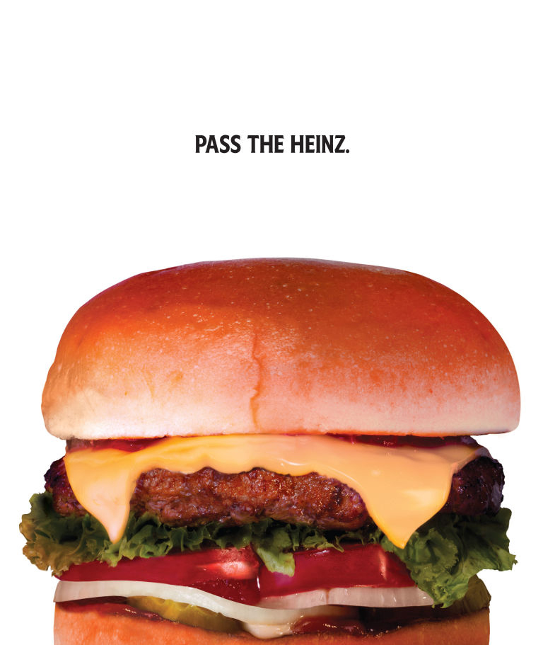
6. Pass The Heinz
We all know Heinz as the popular ketchup and condiment brand. It’s a brand known for its delicious sauces that we use to make our burgers, hot dogs and club sandwiches taste phenomenal. But instead of going with a dynamic and sensational design for their recent ad campaign, they went with a very simple, clean design that engages on a whole new level.
These print designs are promoting brand identity. They are promoting products in a simple, sophisticated, and clear way.
These designs are made up of a simple image set against a white background. A simple line of text sits at the center — “Pass The Heinz.”
It’s extremely minimal and bare. And sometimes, this could bore and fall flat. But here, these designs really shine. The imagery of a burger is tantalizing and makes your mouth water. And the phrase adds context and clarity. You’re compelled to agree. You’d say the same thing if confronted with a burger that looked that good.
And by focusing less on the product, and more on the context, this brand is creatively elevating its status as a leader in their niche.
These prints are meant to grab attention. They’re meant to make you stop and stare. This isn’t a long-standing print campaign. It’s a publicity stunt. It’s a campaign that makes you think and ask questions but ultimately nod your head in agreement.
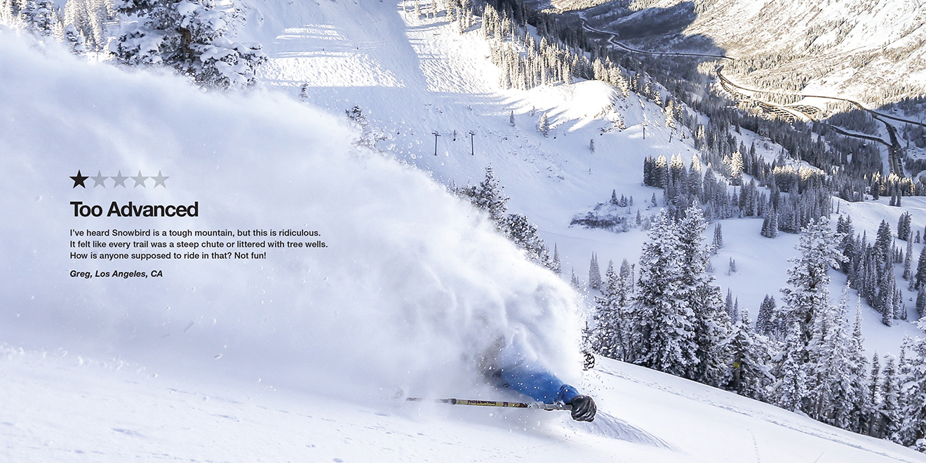
7. Snowbird Mountain
Snowbird Ski Resort went a very unconventional route with its poster ads — instead of promoting the brand in a positive way, or through illustrative design, the resort decided to promote its one-star reviews to grab attention.
But looking at these ads, it definitely works.
These one-star reviews are hilarious, captivating, and engaging. From the first word to the last, you’re intimately interested, reading along regardless of how long it takes to read through.
At first glance, viewers are captivated by the stunning photography. These shots of the mountain, and of expert skiers navigating the slopes, are supremely intelligent, bright, and eye-catching. They are beautiful, serene, and inviting. These shots alone are enough to amaze and enlighten.
There is also little to no typography here save for the review. No brand name or moniker. These photographs stand alone, showing off the natural beauty of the resort all on its own.
Then there are the reviews. These reviews could shed a negative light on the resort, but instead, they add a playful edge and energy to the brand that makes the viewer want to check it out for themselves.
These reviews add character and authenticity. They show that this brand isn’t afraid to have some fun at its own expense. It’s also a way to show that this brand is authentic and transparent. Not everyone has a good thing to say, but instead of hiding it, they put it on full display.
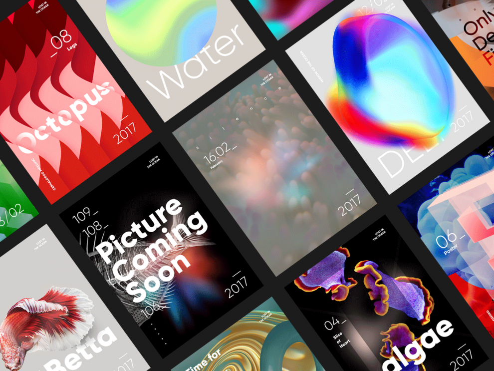
8. Lost In The Ocean
These print designs are a pet project for a Georgia-based graphic designer. They aim to enlighten and inspire — the ocean is a vast place, full of life and wonder. And we as people should take more time to understand and appreciate it.
And these designs have an innate aquatic vibe. The earth is 70 percent water, and the designs emulate that in their fluid and smooth nature. Bright colors and soothing hues lull you into the depths and keep you focused.
Strong contrasts, dynamic color mixes, and a play on light and darkness make up these enigmatic and intriguing designs. They are immensely engaging and pull you in with their richness and stunning nature.
These posters inform and inspire thanks to soft and subtle design elements. There is no typography to lend context — it’s all done with shape, hues, and creative movement.
These abstract poster designs are the perfect inspiration for a brand that wants to flex its creative muscles and have some fun with its design.
Abstract creativity engages and captivates. And it gives viewers the ability to come to their own conclusions and come up with their own happy opinions. These posters are hard to miss, that’s for sure.
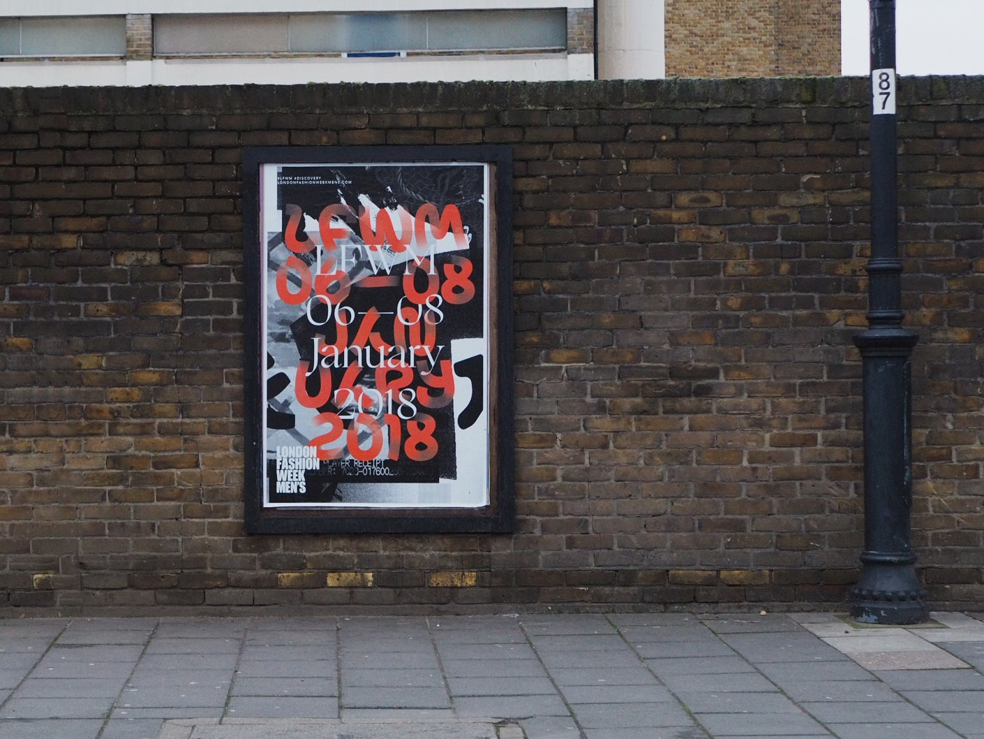
9. London Fashion Week Mens
London Fashion Week is known for its stunning pieces, exciting celebrity interactions, and in-depth dives into the latest trends. And for the men’s line this past year, London Fashion Week went with a modern and edgy design that added urban grunge to the event.
The modernity and edginess are apparent in the graffiti-like writings and dark, moody background. This contrasts beautifully with the light, bright and airy nature of the women’s line. And it adds strength and resilience that can’t be ignored. These prints are powerful. They're modern. They’re sophisticated.
They elevate the event and create urgency in anyone who views them.
These abstract prints play with shape and typography in a refreshing way. There’s a creative layering that instills a little bit of chaos, but it's decipherable if you try. And that’s the point. These designs encourage interactivity. They encourage users to get up close and personal with them. They inspire an edgy leadership that others can look to.
These designs set the mood. They are deep, dark, and depthful. They ooze sophistication and excellence. They prove that the event is one that you won’t want to miss.
Playing with designs like this one is a creative and playful way to promote an event, and it will definitely give your audience something to talk about.
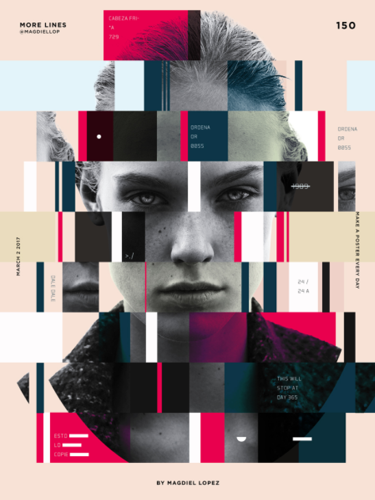
10. A Poster Every Day
Graphic designer Magdiel Lopez decided to challenge himself with a personal project — pushing himself to create one poster every day to see how his talent and creativity could be stretched and to see how it could evolve.
The result was an array of fantastic, enlightening, and inspiring print posters that steal the show and ill you with an innate sense of wonder and curiosity.
These artistic and colorful posters are embedded with meaning and passion. The colors are soft and inspiring, grabbing your attention in leading you through the design. The focal points are big and moody — taking up most of the design and giving off an enigmatic vibe.
These posters focus on the human image and pay special attention to specific features of the human body.
There’s an air of self-expression to these designs. Human features are explored, but only in part. They are still shrouded in mystery to some extent. In other designs, shape, and depth are explored more intricately.
This is a series of posters that amazes while simultaneously setting the scene and setting an obvious mood. They’re dark and captivating, with minimal copy and a focus on color, imagery, shape, and self-expression which adds depth.
Each poster is unique, but the overall moody and seductive theme is present throughout the collection. There’s an obvious style that, while depicted in a slightly different way depending on the poster, brings with it a cohesive understanding. These designs are an example of how the theme can tie a campaign together and create a cohesive and consistent brand image.
Top Custom Poster Designs — How Print Ads Can Give Your Brand A Boost
Posters have the potential to engage and inspire right at the ground level. They offer your audience a tangible medium with which to interact and offer a way for consumers to get intimately involved.
Print designs can inspire and excite just as much as a good web or app design. Just because we’ve gone digital doesn’t mean we should throw the rest by the wayside. Mastering effective poster print designs can take your brand to a whole new level, leaving your competition in the dust.
But you have to make sure you’re creating the ads your audience wants to interact with, and that you’re reaching the right audiences. You can create an attention-grabbing design, but if it doesn't offer the right information or the right vibe, your audience won’t interact with it.
These previous poster designs are just a few of the exciting ways you can use print ads to your advantage to boost your next advertising campaign. They are bright, edgy, and modern. And they’re also smooth, fluid, and sleek.
But most of all, these ads are targeted, focused, and full of content that their audience will immediately interact with. Use this inspiration to fuel your next print design endeavor and get ready to be amazed.


