- Designer: Keurig Dr Pepper’s Internal Creative Team
- Category: Packaging Design — Beverage
- Project Brief: Create packaging design for 7UP Pink Lemonade Zero Sugar that combines its lemon-lime heritage with a vibrant pink lemonade-inspired visual identity.
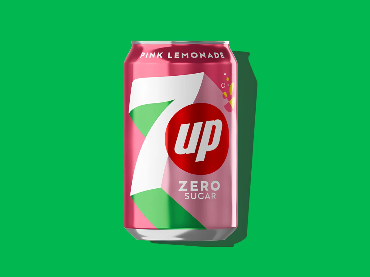
Beverage packaging built on a legacy brand has to update the look while keeping the logo untouchable. Keurig Dr Pepper's internal team drops the 7UP mark onto a pink field for the Pink Lemonade Zero Sugar can, swapping the color story while the core identity holds.
The color does the flavor talking. A warm pink base signals raspberry and lemonade at a glance, and the classic red 7UP roundel stays put so the variant still reads as 7UP from across the aisle.
The oversized "7" anchors the front. The number wraps most of the can in white with a green corner peeking through, a nod to the brand's signature green that keeps continuity while the pink takes the lead.
The layout keeps the sub-brand clear. "Pink Lemonade" arcs across the top and "Zero Sugar" sits under the logo in clean caps, so a shopper reads flavor, brand, and formulation in one quick scan.
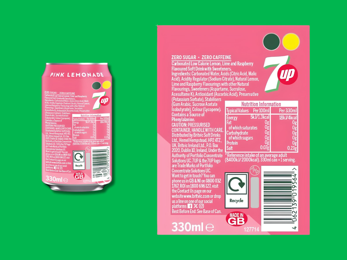
The back panel stays on system. The pink carries around with the recycling and traffic-light icons organized in a tidy block, so the information side looks as considered as the front.