- Designer: Coty Internal Design Team
- Client: Megan Thee Stallion
- Category: Packaging Design — Fashion & Beauty
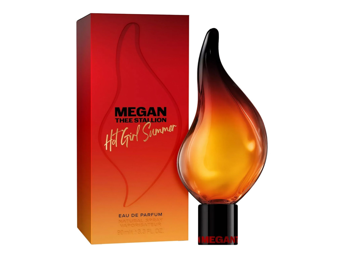
Most fashion and beauty packaging plays it safe with a rectangle and a nice cap. Hot Girl Summer throws that out and molds the whole bottle into a flame, taking Megan Thee Stallion's catchphrase about as literally as a bottle can.
The color is what sells it. The glass runs from warm amber at the base up to a scorched black tip, so it looks less like a bottle with flames on it and more like someone caught actual fire in glass.
The box does not fight the bottle for attention. That red-to-orange gradient, the embossed flame outline, the gold script, all of it points back to the shape inside, with Megan's name and the tagline right where you would expect them.
The whole thing still holds together when it shrinks. The little 10ml rollerball drops the sculptural shape for a plain tube, but the gradient and gold lettering carry over, so it reads as the same fragrance even without the showpiece silhouette.