- Agency: Prime's Internal Creative Team
- Client: Prime × Pop-Tarts
- Category: Packaging Design — Beverage
- Project Brief: Design a limited-edition beverage packaging system that merges Prime's modern protein shake identity with Pop-Tarts' iconic flavor branding, creating eye-catching cans that celebrate both brands while maximizing shelf impact and product recognition.
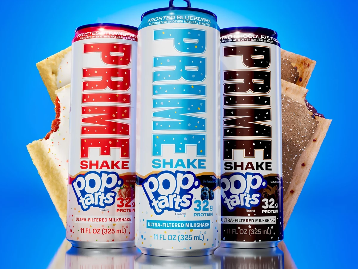
Beverage packaging for a co-brand usually forces one logo to swallow the other. Prime Shake x Pop-Tarts refuses the choice, giving the pastry brand and the drink brand equal billing down a single slim can.
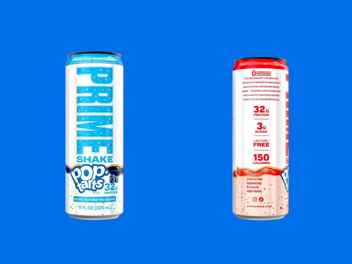
The layout splits cleanly by owner. Prime's tall block letters run vertical up the top two-thirds, then the Pop-Tarts logo and its glossy pastry artwork take the bottom, so both trademarks read at once without fighting.
Color codes the flavors straight off the toaster pastry. Red for Frosted Strawberry, blue for Frosted Blueberry, and brown for Frosted Chocolate Fudge, each matched to the crumb-and-frosting look of its box.
The speckled frosting sprinkles scattered across the can tie the whole system to the product inside. Prime's team kept the nutrition claims bold on the back, 32 grams of protein at 150 calories, so the can sells indulgence on the front and the macros on the flip.