- Designer: Mars Snacking North America Internal Creative Team
- Client: Pringles
- Category: Packaging Design — Food & Beverage
- Location: Chicago, Illinois, United States
- Project Brief: Design limited-edition packaging for Pringles Pop Dog Buns that extends the brand's iconic identity into a playful food innovation, creating a memorable unboxing experience that celebrates summer entertaining and bold flavor.
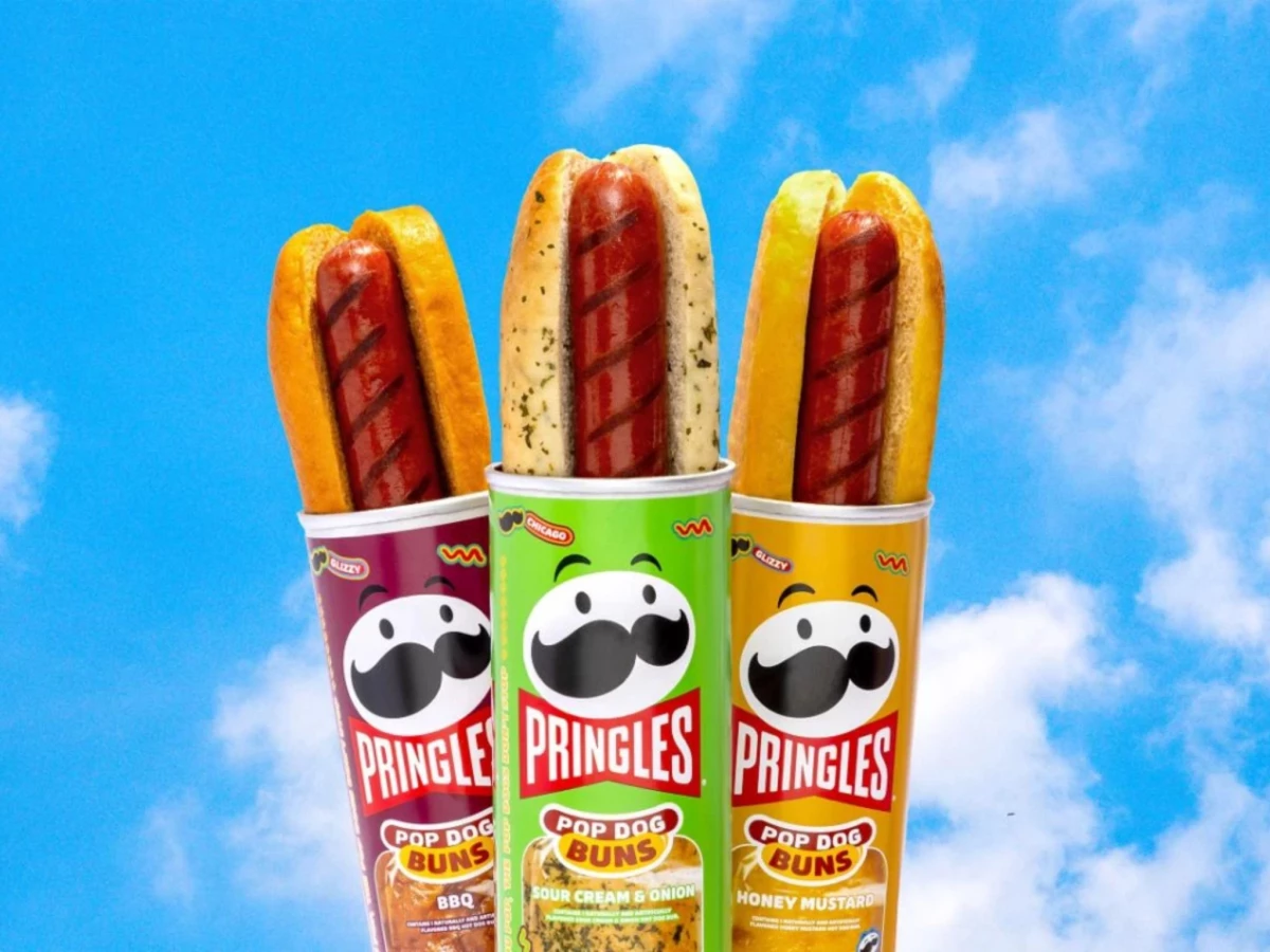
A food packaging design makes its strongest case when the product idea and the container are inseparable. Pringles' Pop Dog Buns does exactly that, sizing 7.5-inch hot dog buns to fit inside the brand's iconic cylindrical can.
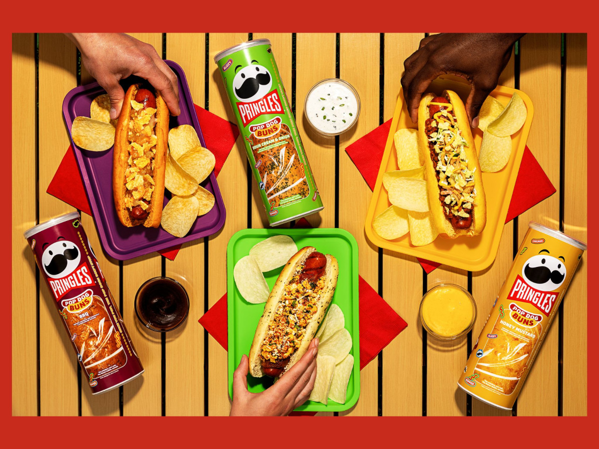
The can labels extend the existing Pringles visual language without breaking it. Purple, green and gold map each flavor directly to the crisp lineup, so the bun packaging reads as part of the same family at a glance.
Mr. P's mustached face anchors each can with the same mascot equity the brand has built for decades. The "Pop Dog Buns" sub-brand lockup sits below in the same red badge system as the core range, keeping the limited-edition product instantly recognizable.
The three-pack bundle wraps all six cans in clear plastic with a circular badge confirming the pairing. The packaging makes the use case obvious before the consumer reads a word: same can, same flavor, one for the bun and one for the chips.