- Designer: James Herring
- Client: The Economist
- Category: Print Design — Whimsical
- Project Brief: Create a whimsical print design concept that uses The Economist’s signature wit and minimalist visual language to comment on foldable technology.
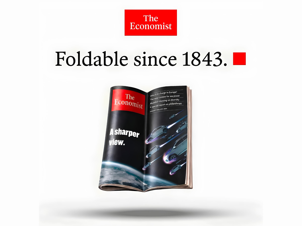
Print work that lands as whimsical usually rides on one sharp idea. James Herring newsjacks Apple's foldable iPhone launch with a spec ad that reframes The Economist's print edition as the original foldable device.
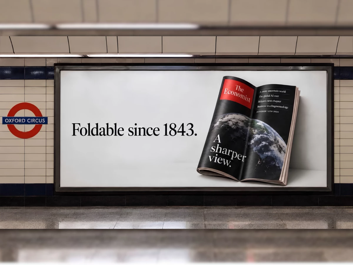
The joke lives entirely in the copy. "Foldable since 1843" pairs with a folded magazine, so the 182-year-old newspaper answers a phone announcement with a single dry line.
The brand mimicry sells the gag. Crisp serif type, the red masthead block, and vast white space copy the magazine's Ogilvy-era house style so closely that many pros took it for an official response.
The mockup completes the illusion. Dropping the ad into an Oxford Circus Underground frame gave it the weight of a real transit campaign, which is exactly why commuters believed a physical billboard existed.